How to Make Heatmaps in R with pheatmap?
Last Updated :
11 Jul, 2023
One of the widely used visualizations is heat maps. They proved to be very helpful in analyzing the highly correlated features in the input data. In this article we will learn different ways by using which we can draw heatmaps using the pheatmap package in R.
What is a Heatmap?
Heatmaps are a popular way of visualizing complex data sets in a two-dimensional form. Heatmaps represent data using a color scale, where the intensity of the color represents the magnitude of the data value. In R Programming Language, pheatmap is a widely used package for creating heat maps. This package provides many customization options to make heatmaps more visually appealing and informative.
Concepts related to the topic:
Before we dive into creating heatmaps with pheatmap, let’s quickly go over some key concepts related to heatmaps:
- Data Scaling: Data scaling is an important preprocessing step for creating heatmaps. It involves transforming the data values into a standardized scale to ensure that data points with vastly different magnitudes do not skew the color scale.
- Row and Column Clustering: Clustering refers to grouping together similar rows or columns based on their data values. This can help identify patterns and trends in the data.
- Color Schemes: Color schemes are used to map the data values to specific colors on the heatmap. Different color schemes can be used depending on the type of data being visualized and the message that needs to be conveyed.
R
library(pheatmap)
data(iris)
pheatmap(iris[, 1:4])
|
Output:

Heatmap using pheatmap package in R
Custom Color Palette and Clustering Method
This code loads the mtcars dataset, creates a custom color palette, and creates a heatmap of the first six columns of the dataset using pheatmap. The clustering_distance_rows argument specifies that the rows should be clustered using euclidean distance, while clustering_method specifies that both rows and columns should be clustered using the ward.D method. This example demonstrates the use of custom color palettes and different clustering methods in pheatmap.
R
library(pheatmap)
data(mtcars)
cols <- colorRampPalette(c("blue", "white", "red"))(100)
pheatmap(mtcars[, 1:6],
color = cols,
clustering_distance_rows = "euclidean",
clustering_method = "ward.D")
|
Output:

Color Pallete along with Heatmap
Changing Font Size and Cell Size
This code loads the built-in faithful dataset and creates a heatmap of the data using pheatmap. The fontsize_row and fontsize_col arguments control the size of the row and column labels, respectively. The cellwidth and cellheight arguments control the size of each heatmap cell. This example demonstrates how to customize the appearance of the heatmap by adjusting label sizes and cell dimensions.
R
library(pheatmap)
data(faithful)
pheatmap(faithful,
fontsize_row = 8,
fontsize_col = 8,
cellwidth = 15,
cellheight = 10)
|
Output:

Customizing font size and cell size of heatmaps
External Color Palettes and Adding Row Dendrograms
This code loads the iris dataset and creates a heatmap of the first four columns using pheatmap. The brewer.pal function from the RColorBrewer package is used to create a custom color palette for the heatmap. The cluster_rows argument specifies that the rows should be clustered using default parameters, while show_rownames argument specifies that the row names should not be displayed in the heatmap. The treeheight_row argument controls the height of the row dendrogram and the fontsize_row argument controls the size of the row label font. This example demonstrates how to use a custom color palette and control the appearance of the dendrogram and row labels in the heatmap.
R
library(pheatmap)
library(RColorBrewer)
data(iris)
cols <- brewer.pal(9, "YlOrRd")
pheatmap(iris[, 1:4],
color = cols,
cluster_rows = TRUE,
show_rownames = FALSE,
treeheight_row = 0.1,
fontsize_row = 10)
|
Output:
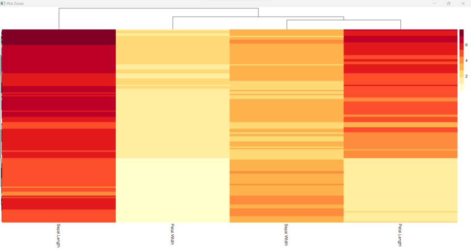
External Color Palettes and Adding Row Dendrograms in heatmap
Quantile Color Scale
We can use the breaks parameter to set the breaks for the color scale. Here is an example code to use a quantile color scale:
R
library(pheatmap)
data(iris)
iris_subset <- iris[,1:4]
my_breaks <- quantile(as.matrix(iris_subset),
probs = seq(0, 1, by = 0.1))
my_palette <- colorRampPalette(c("#FFEDA0",
"#F03B20"))(length(my_breaks)-1)
pheatmap(iris_subset,
breaks = my_breaks,
col = my_palette)
|
Output:

Quantile Color Scale in heatmaps
Sorting Dendrograms on Heatmap
We can use the scale parameter to perform the transformation in the scale of the values. Here is an example code to perform the transformation in the scale of the values:
R
library(pheatmap)
data(iris)
pheatmap(iris[, 1:4],
scale = "row")
|
Output:

Sorting Dendrograms on Heatmap
Rotation of Column Labels
We can use the angle_col parameter to rotate column labels. Here is an example code to rotate column labels:
R
library(pheatmap)
data(iris)
pheatmap(iris[, 1:4],
angle_col = 45)
|
Output:

Rotation of Column Labels in Heatmaps
Share your thoughts in the comments
Please Login to comment...