Comprehensive Guide to Scatter Plot using ggplot2 in R
Last Updated :
20 Dec, 2023
In this article, we are going to see how to use scatter plots using ggplot2 in the R Programming Language.
ggplot2 package is a free, open-source, and easy-to-use visualization package widely used in R. It is the most powerful visualization package written by Hadley Wickham. This package can be installed using the R function install. packages().
install.packages("ggplot2")
A Basic Scatterplot with ggplot2 in R uses dots to represent values for two different numeric variables and is used to observe relationships between those variables. To plot the scatterplot we will use we will be using the geom_point() function. Following is brief information about ggplot function, geom_point().
Syntax : geom_point(size, color, fill, shape, stroke)
Parameter :
- size : Size of Points
- color : Color of Points/Border
- fill : Color of Points
- shape : Shape of Points in range from 0 to 25
- stroke : Thickness of point border
- Return : It creates scatterplots.
Basic Scatterplot with ggplot2 in R
R
library(ggplot2)
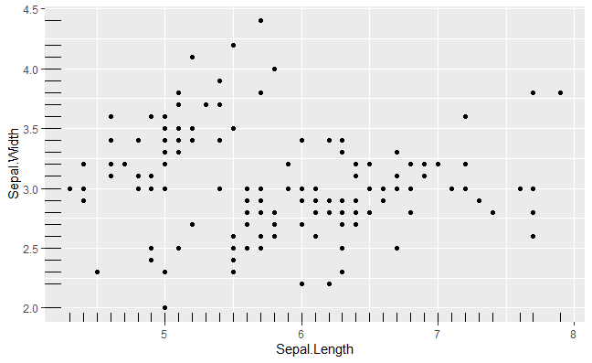
ggplot(iris, aes(x = Sepal.Length, y = Sepal.Width)) +
geom_point()
|
Output:

Basic Scatterplot with ggplot2 in R
Basic Scatterplot with ggplot2 in R with groups
Here we will use distinguish the values by a group of data (i.e. factor level data). aes() function controls the color of the group and it should be factor variable.
Syntax:
aes(color = factor(variable))
R
ggplot(iris, aes(x = Sepal.Length, y = Sepal.Width)) +
geom_point(aes(color = factor(Sepal.Width)))
|
Output:

Basic Scatterplot with ggplot2 in R
Changing color in Basic Scatterplot with ggplot2 in R
Here we use aes() methods color attributes to change the color of the datapoints with specific variables.
R
ggplot(iris) +
geom_point(aes(x = Sepal.Length,
y = Sepal.Width,
color = Species))
|
Output:

Basic Scatterplot with ggplot2 in R
Changing Shape in Basic Scatterplot with ggplot2 in R
To change the shape of the datapoints we will use shape attributes with aes() methods.
R
ggplot(iris) +
geom_point(aes(x = Sepal.Length, y = Sepal.Width,
shape = Species , color = Species))
|
Output:

Basic Scatterplot with ggplot2 in R
Changing the size aesthetic in Basic Scatterplot with ggplot2 in R
To change the aesthetic or datapoints we will use size attributes in aes() methods.
R
ggplot(iris) +
geom_point(aes(x = Sepal.Length,
y = Sepal.Width,
size = .5))
|
Output:

Basic Scatterplot with ggplot2 in R
Label points in Basic Scatterplot with ggplot2 in R
To deploy the labels on the datapoint we will use label into the geom_text() methods.
R
library(ggplot2)
color_palette <- c("blue", "green", "red")
ggplot(iris, aes(x = Sepal.Length, y = Sepal.Width, color = Species)) +
geom_point(size = 3) +
geom_text(aes(label = Species),
position = position_nudge(x = 0.05, y = 0.05),
size = 3,
show.legend = FALSE) +
scale_color_manual(values = color_palette) +
theme_minimal() +
ggtitle("Sepal Length vs. Sepal Width") +
xlab("Sepal Length") +
ylab("Sepal Width") +
theme(legend.position = "right")
|
Output:

Basic Scatterplot with ggplot2 in R
Regression lines in Basic Scatterplot with ggplot2 in R
Regression models a target prediction value supported independent variables and mostly used for finding out the relationship between variables and forecasting. In R we can use the stat_smooth() function to smoothen the visualization.
Syntax: stat_smooth(method=”method_name”, formula=fromula_to_be_used, geom=’method name’)
Parameters:
- method: It is the smoothing method (function) to use for smoothing the line
- formula: It is the formula to use in the smoothing function
- geom: It is the geometric object to use display the data
R
ggplot(iris, aes(x = Sepal.Length, y = Sepal.Width)) +
geom_point() +
stat_smooth(method=lm)
|
Output:

Basic Scatterplot with ggplot2 in R
Using stat_mooth with loess mode in Basic Scatterplot with ggplot2 in R
R
ggplot(iris, aes(x = Sepal.Length, y = Sepal.Width)) +
geom_point() +
stat_smooth()
|
Output:

Basic Scatterplot with ggplot2 in R
geom_smooth() function to represent a regression line and smoothen the visualization.
Syntax: geom_smooth(method=”method_name”, formula=fromula_to_be_used)
Parameters:
- method: It is the smoothing method (function) to use for smoothing the line
- formula: It is the formula to use in the smoothing function
R
ggplot(iris, aes(x = Sepal.Length, y = Sepal.Width)) +
geom_point() +
geom_smooth()
|
Output:

Basic Scatterplot with ggplot2 in R
In order to show the regression line on the graphical medium with help of geom_smooth() function, we pass the method as “loess” and the formula used as y ~ x.
geom_smooth with loess mode in Basic Scatterplot with ggplot2 in R
R
ggplot(iris, aes(x = Sepal.Length, y = Sepal.Width)) +
geom_point() +
geom_smooth(method=lm, se=FALSE)
|
Output:

Basic Scatterplot with ggplot2 in R
The intercept and slope can be easily calculated by the lm() function which is used for linear regression followed by coefficients().
Intercept and slope in Basic Scatterplot with ggplot2 in R
R
ggplot(iris, aes(x = Sepal.Length, y = Sepal.Width)) +
geom_point() +
geom_smooth(intercept = 37, slope = -5, color="red",
linetype="dashed", size=1.5)
|
Output:

Basic Scatterplot with ggplot2 in R
Change the point color/shape/size manually
scale_fill_manual, scale_size_manual, scale_shape_manual, scale_linetype_manual, are builtin types which is assign desired colors to categorical data, we use one of them scale_color_manual() function, which is used to scale (map).
Syntax :
- scale_shape_manualValue) for point shapes
- scale_color_manual(Value) for point colors
- scale_size_manual(Value) for point sizes
Parameter :
- values : A set of aesthetic values to map the data. Here we take desired set of colors.
Return : Scale the manual values of colors on data
Changing aesthetics in Basic Scatterplot with ggplot2 in R
R
library(ggplot2)
ggplot(iris, aes(x = Sepal.Length, y = Sepal.Width, color = Species)) +
geom_point() +
geom_smooth(method=lm, se=FALSE, fullrange=TRUE)+
scale_shape_manual(values=c(3, 16, 17))+
scale_color_manual(values=c('pink','yellow', 'green'))+
theme(legend.position="top")
|
Output:

Basic Scatterplot with ggplot2 in R
Marginal rugs to Basic Scatterplot with ggplot2 in R
To add marginal rugs to the scatter plot we will use geom_rug() methods.
R
ggplot(iris) +
geom_point(aes(x = Sepal.Length, y = Sepal.Width,
shape = Species , color = Species))+
geom_rug()
|
Output:

Basic Scatterplot with ggplot2 in R
Here we will add marginal rugs into the scatter plot
Marginal rugs in Basic Scatterplot with ggplot2 in R
R
ggplot(iris, aes(x = Sepal.Length, y = Sepal.Width)) +
geom_point()+
geom_rug()
|
Output:
Basic Scatterplot with ggplot2 in R
Scatter plots with the 2-D density estimation
To create density estimation in scatter plot we will use geom_density_2d() methods and geom_density_2d_filled() from ggplot2.
Syntax: ggplot( aes(x)) + geom_density_2d( fill, color, alpha)
Parameters:
- fill: background color below the plot
- color: the color of the plotline
- alpha: transparency of graph
Scatterplots with 2-D density estimation
R
ggplot(iris, aes(x = Sepal.Length, y = Sepal.Width)) +
geom_point()+
geom_density_2d()
|
Output:

Basic Scatterplot with ggplot2 in R
Using geom_density_2d_filled() to visualize the situation of color inside the datapoints
Adding aesthetics
R
ggplot(iris, aes(x = Sepal.Length, y = Sepal.Width)) +
geom_point()+
geom_density_2d(alpha = 0.5)+
geom_density_2d_filled()
|
Output:

Basic Scatterplot with ggplot2 in R
stat_density_2d() can be also used to deploy the 2d density estimation.
Deploy density estimation
R
ggplot(iris, aes(x = Sepal.Length, y = Sepal.Width)) +
geom_point()+
stat_density_2d()
|
Output:

Basic Scatterplot with ggplot2 in R
Scatter plots with ellipses
To add a circle or ellipse around a cluster of data points, we use the stat_ellipse() function. This function automatically computes the circle/ellipse radius to draw around the cluster of points by categorical data.
R
ggplot(iris, aes(x = Sepal.Length, y = Sepal.Width)) +
geom_point()+
stat_ellipse()
|
Output:

Basic Scatterplot with ggplot2 in R
Share your thoughts in the comments
Please Login to comment...