Building a Component Library with React Hooks and Storybook
Last Updated :
02 May, 2024
Building a component library is a powerful way to streamline the development process, ensure consistency across projects, and promote the reusability of UI elements. In this article, we’ll explore how to create a component library using React Hooks and Storybook, a tool for developing UI components in isolation. We’ll cover each step in detail, from setting up the project to publishing the library for others to use.
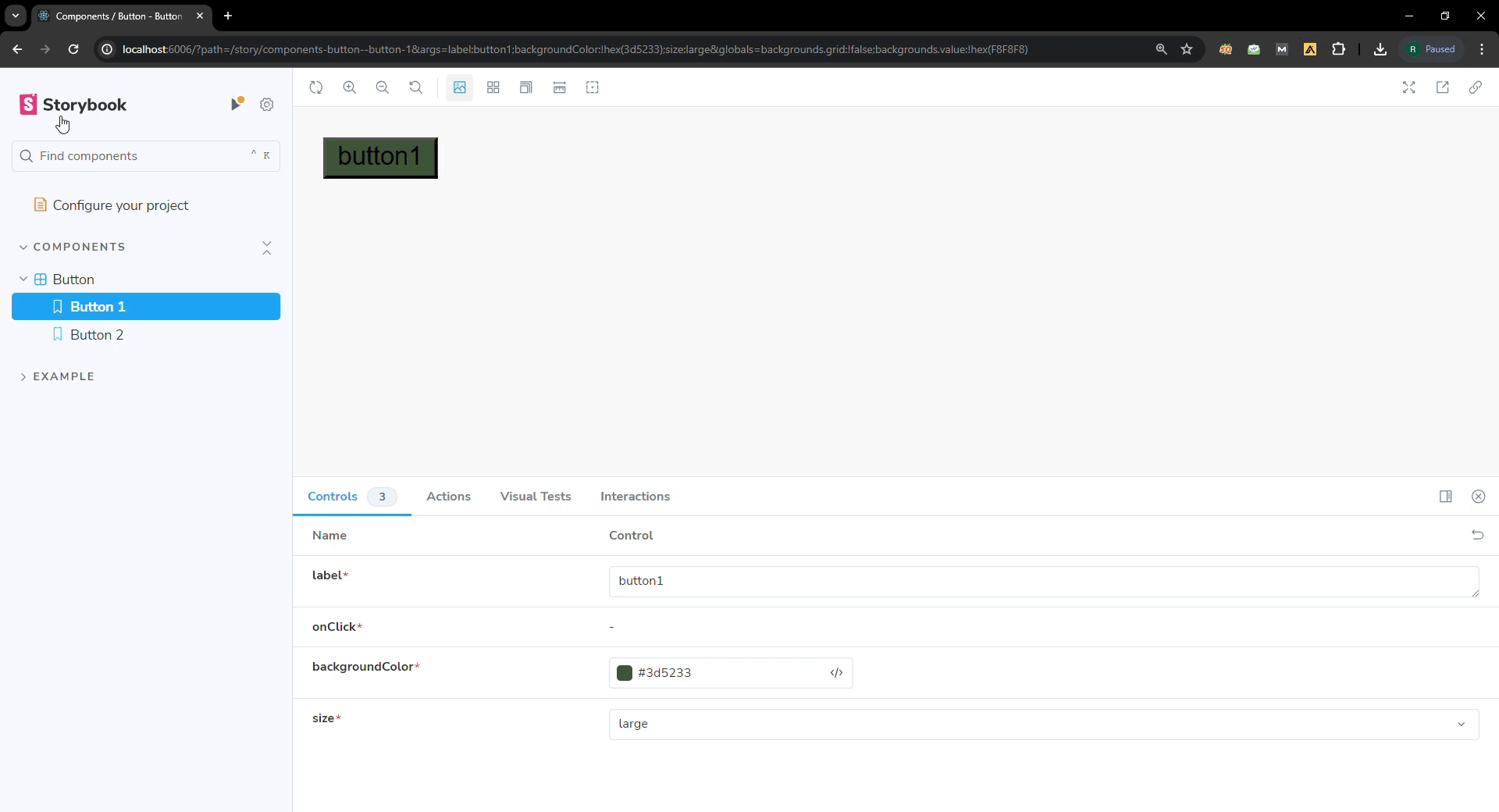
Output Preview:
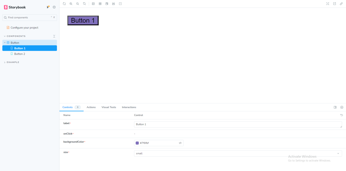
Output
Prerequisites:
Approach
- Create reusable UI components using React Hooks.
- Showcase components and their variations using Storybook.
- Test components in isolation to ensure they function correctly.
- Customize and style components to fit different design requirements.
Steps to create the project
Step 1: Initialize a new React project
npx create-react-app my-component-library
Step 2: Navigate to project directory:
cd my-component-library
Step 3: To add storybook in your project, in your terminal write the command.
npx sb init
Step 4: Steps to run the application
npm run storybook
Project structure:
.png)
project structure
The updated dependencies in package.json file will look like:
"dependencies": {
    "@testing-library/jest-dom": "^5.17.0",
    "@testing-library/react": "^13.4.0",
    "@testing-library/user-event": "^13.5.0",
    "react": "^18.2.0",
    "react-dom": "^18.2.0",
    "react-scripts": "5.0.1",
    "web-vitals": "^2.1.4"
  }
Example: Implementation to Build a Component Library with React Hooks and Storybook.
JavaScript
// Button.js

import React from 'react';
import PropTypes from 'prop-types';

const Button = ({
  label, onClick,
  backgroundColor,
  size }) => {
  return (
    <button
      className={`button button-${size}`}
      style={{ backgroundColor: backgroundColor }}
      onClick={onClick}
    >
      {label}
    </button>
  );
};

Button.propTypes = {
  label: PropTypes.string.isRequired,
  onClick: PropTypes.func.isRequired,
  backgroundColor: PropTypes.string.isRequired,
  size: PropTypes.oneOf(['small', 'medium', 'large']).isRequired,
};

export { Button };
// Button.stories.js

import React from 'react';
import { action } from '@storybook/addon-actions';
import { Button } from './Button';

export default {
    title: 'Components/Button',
    component: Button,
    argTypes: {
        label: { control: 'text' },
        onClick: { action: 'clicked' },
        backgroundColor: { control: 'color' },
        size: {
            control: {
                type: 'select',
                options: ['small', 'medium', 'large']
            }
        },
    },
};

const Template = (args) => <Button {...args} />;

export const Button1 = Template.bind({});
Button1.args = {
    label: 'Button 1',
    onClick: action('clicked'),
    backgroundColor: '#28a745',
    size: 'small',
};

export const Button2 = Template.bind({});
Button2.args = {
    label: 'Button 2',
    onClick: action('clicked'),
    backgroundColor: '#dc3545',
    size: 'large',
};
//App.js

import React, { useState } from 'react';
import './App.css';
import { Button } from './Button';

function App() {
    const [buttonClicked, setButtonClicked] = useState(false);

    const handleButtonClick = () => {
        setButtonClicked(true);
    };

    return (
        <div className="App">
            <header className="App-header">
                <Button label="Click me"
                    onClick={handleButtonClick} />
                {buttonClicked && <p>You clicked the button!</p>}
                <a
                    className="App-link"
                    href="https://reactjs.org"
                    target="_blank"
                    rel="noopener noreferrer">
                    Learn React
                </a>
            </header>
        </div>
    );
}

export default App;
Output:
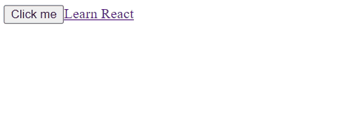
Steps to make Component
Output
Share your thoughts in the comments
Please Login to comment...