Storybook Using React
Last Updated :
03 Jan, 2024
Storybook is an open-source tool to build the UI components individually, allowing developers to concentrate on one component at a time, examine it more deeply, and record its behavior and changes. The objective of the project is to increase the effectiveness of the development of React components by giving them a dedicated space where they can be systematically and interactively created, imaged, or documented.
Prerequisites
Approach to use Storybook in React
- To develop react components in isolation to allow for targeted and efficient development.
- Create an interactive demo of React components that allows developers and designers to interact with them individually.
- Directly within Storybook, you can document component behavior, use cases, and changes.
- Early on in the product development process, Visual testing of components is carried out to determine if UI issues are present.
- Displays a variety of characteristics and differences in the components, e.g. various props or user interactions.
Steps to Create the React App:
Step 1: Initialized a react app using the following command.
npx create-react-app react-storybook
cd react-storybook
Step 2: Install the required dependencies.
npx sb init
You must create a Storybook directory in the Project root, configure Storybook settings.Develop stories about each component of React, including descriptions of various states and use cases.
Project Structure:
.png)
Note:
- we will have to make two files of each component and place the files in their respective folder (components and stories). As you can see the above project structure you will see Button.js in components folder and Button.stories.js in stories folder.
- In components folder, we have the proper structure of the components and their customizations
- In stories folder, we will have interactions of storybook with each of the component and customize it accordingly.
The updated dependencies in package.json file will look like:
"dependencies": {
    "@testing-library/jest-dom": "^5.17.0",
    "@testing-library/react": "^13.4.0",
    "@testing-library/user-event": "^13.5.0",
    "react": "^18.2.0",
    "react-dom": "^18.2.0",
    "react-scripts": "5.0.1",
    "web-vitals": "^2.1.4"
  },
  "devDependencies": {
    "@storybook/addon-essentials": "^7.6.7",
    "@storybook/addon-interactions": "^7.6.7",
    "@storybook/addon-links": "^7.6.7",
    "@storybook/addon-onboarding": "^1.0.10",
    "@storybook/blocks": "^7.6.7",
    "@storybook/preset-create-react-app": "^7.6.7",
    "@storybook/react": "^7.6.7",
    "@storybook/react-webpack5": "^7.6.7",
    "@storybook/test": "^7.6.7",
    "eslint-plugin-storybook": "^0.6.15",
    "prop-types": "^15.8.1",
    "storybook": "^7.6.7",
    "webpack": "^5.89.0"
  }
Example code (Button component):
Javascript
import PropTypes from "prop-types";
function Button({
label,
backgroundColor = "red",
size = "md",
handleClick,
color = "white",
}) {
let scale = 1;
if (size === "sm") scale = 0.75;
if (size === "lg") scale = 1.5;
const style = {
backgroundColor,
padding: `${scale * 0.5}rem ${scale * 1}rem`,
border: "none",
color,
};
return (
<button onClick={handleClick} style={style}>
{label}
</button>
);
}
Button.propTypes = {
label: PropTypes.string,
backgroundColor: PropTypes.string,
size: PropTypes.oneOf(["sm", "md", "lg"]),
handleClick: PropTypes.func,
};
|
Javascript
import React from "react";
import Button from "../components/Button";
export default {
title: "Button",
component: Button,
argTypes: { handleClick: { action: "handleClick" } },
};
export const Primary = () => (
<Button label="Primary Button" backgroundColor="blue" />
);
export const Secondary = () => <Button label="Secondary Button" />;
const Template = (args) => <Button {...args} />;
export const Red = Template.bind({});
Red.args = {
backgroundColor: "red",
label: "Click Me",
size: "md",
color: "white",
};
export const Green = Template.bind({});
Green.args = {
backgroundColor: "rebeccapurple",
label: "Click Me",
size: "md",
color: "white",
};
export const Small = Template.bind({});
Small.args = {
backgroundColor: "yellow",
label: "Click Me",
size: "sm",
};
export const Large = Template.bind({});
Large.args = {
backgroundColor: "green",
label: "Click Me",
size: "lg",
};
export const LongLabel = Template.bind({});
LongLabel.args = {
backgroundColor: "pink",
label: "Press Me adsf asd",
size: "md",
};
|
Steps to Run the Application:
Step 1: Use the following command to start your React application:
npm start
Step 2: Go to Storybook URL in your web browser:
http://localhost:6006
Output:
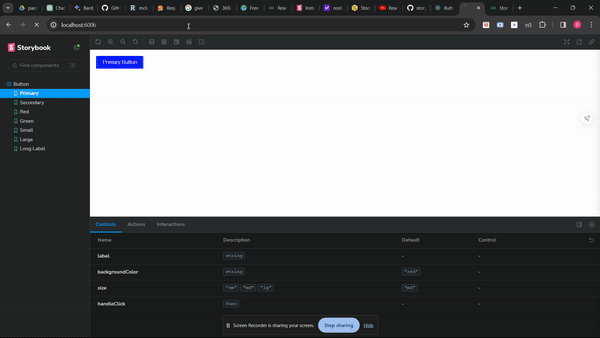
The output of the above code
Explanation: The “Button.stories.js” file configures Storybook for the “Button” component in react which is used to define the variations with different colors, sizes, and labels. You can create every variation using a template function, which allows you to build concise and reusable code. A functional React component that can dynamically style buttons according to their size and colour is defined in the “Button.js” file. Validation of the type is conducted using PropTypes in order to ensure proper use of prop. The efficient development, testing and documentation of the React ‘Button’ element in Storybook environment can be facilitated through this structure approach.
Share your thoughts in the comments
Please Login to comment...