Blog Page Template using React JS and Tailwind
Last Updated :
14 Dec, 2023
A Blog Page is a web page that is used to display multiple blog posts on a website. Using blogs people can share their views, ideas, and opinions. A Blog Page generally contains a NavBar and Introduction followed by multiple blogs displayed in the form of a card.
Prerequisites:
Basic features of a blog post:
- Blog Title
- Blog Content
- Author name and Publish Date
How Blog Page is different from a Home page?
A Blog Page contains a dedicated section to display posts in order and provides a platform where users can share their views and thoughts whereas a Home page is just an entry point to the website where users can get brief information about the website
Approach to Create Blog Page using React and Tailwind:
- Set up a basic react project and install the required dependencies.
- Create the basic layout consisting of a Navbar and Welcome slide.
- Style the components using Tailwind.
- Pass the data dynamically in the components and render it on the screen.
Step to create the project
Step 1: Set up the project using the command
npx create-react-app <<Project_Name>>
Step 2: Navigate to the folder using the command
cd <<Project_Name>>
Step 3: Install the required dependencies using the command
npm install -D tailwindcss
Step 4: Create the tailwind config file using the command
npx tailwindcss init
Step 5: Rewrite the tailwind.config.js file as folllows
/** @type {import('tailwindcss').Config} */
module.exports = {
  content: [
    "./src/**/*.{js,jsx,ts,tsx}",
  ],
  theme: {
    extend: {},
  },
  plugins: [],
}
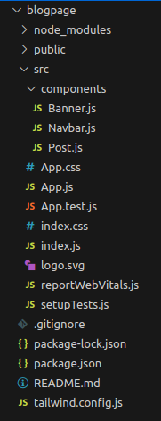
Step 6: Create a folder called components in src directory and add the file Banner.js, Navbar.js and Post.js
Project Structure:
The updated dependencies in package.json file will look like:
"dependencies": {
    "@testing-library/jest-dom": "^5.17.0",
    "@testing-library/react": "^13.4.0",
    "@testing-library/user-event": "^13.5.0",
    "react": "^18.2.0",
    "react-dom": "^18.2.0",
    "react-scripts": "5.0.1",
    "web-vitals": "^2.1.4"
  }
"devDependencies": {
    "tailwindcss": "^3.3.3"
  }
Example: Add the following code in respective files
- App.js: This file imports alll the components and passes necessary data
- Navbar.js: Topmost component of the page used for navigation
- Banner.js: Creates a welcome component
- Post.js: Displays the Blog post depending on the data passed in the component
- Index.css: Imports the necessary tailwind components
Javascript
import './App.css';
import Navbar from './components/Navbar';
import Banner from './components/Banner';
import Post from './components/Post';
export default function App() {
const postData = [
{
department: "Web Tech",
title: "Top 7 JavaScript One liners",
author: "Amit Singh",
designation: "TCE",
info: `This post tells you about best approaches
to write single line codes in JavaScript.
Use this post as a quick guide to
short but important JS codes`,
},
{
department: "DSA",
title: "Top Interview DSA Questions",
author: "Jatin Sharma",
designation: "TCE",
info: `No need to worry about technical round interviews
as this post will guide you step by step to
prepare for DSA round`,
},
{
department: "Cotent",
title: "Best Antiviruses of 2023",
author: "Shobhit Sharma",
designation: "TCE",
info: `Worried about your PC safety? No Problem,
this post tells you about the best antiviruses
to choose in 2023`,
}
]
return (
<div >
<Navbar />
<Banner />
<div className='grid grid-cols-3 gap-4 p-8'>
{postData.map((e) => {
return <Post content={e} />
})}
</div>
</div>
)
}
|
Javascript
export default function Navbar() {
return (
<div>
<nav classNameName="bg-white fixed w-full
z-20 top-0 left-0
border-b border-gray-200">
<div className="flex flex-wrap items-center
justify-between mx-auto p-4">
className="flex items-center">
<img src=
className="mr-2"
alt="GFG Logo" />
<span className="self-center text-2xl font-semibold ">
GeeksforGeeks
</span>
</a>
<div className="items-center justify-between hidden
w-full md:flex md:w-auto md:order-1"
id="navbar-sticky">
<ul className="flex flex-col p-4
md:p-0 mt-4 font-medium
border border-gray-100 rounded-lg
bg-gray-50 md:flex-row md:space-x-8
md:mt-0 md:border-0 md:bg-white">
<li>
<a href="#"
className="block py-2 pl-3
pr-4 text-white bg-blue-700
rounded md:bg-transparent
md:text-blue-700 md:p-0">
Home
</a>
</li>
<li>
<a href="#"
className="block py-2 pl-3
pr-4 text-gray-900 rounded
hover:bg-gray-100
md:hover:bg-transparent
md:hover:text-blue-700 md:p-0">
Posts
</a>
</li>
<li>
<a href="#"
className="block py-2 pl-3
pr-4 text-gray-900 rounded
hover:bg-gray-100
md:hover:bg-transparent
md:hover:text-blue-700 md:p-0">
About us
</a>
</li>
</ul>
</div>
</div>
</nav>
</div>
)
}
|
Javascript
export default function Banner() {
return (
<div className="h-32 w-full border-2
h-screen flex items-center
justify-center bg-emerald-500 text-white">
<p className="text-2xl"> Welcome to GeeksforGeeks Blog Page!!!</p>
</div>
)
}
|
Javascript
export default function Post(props) {
return (
<div>
<div className="bg-white shadow-2xl w-96">
<div className="mx-auto max-w-7xl ">
<div className="mx-5 grid max-w-2xl
grid-cols-1 gap-x-8
gap-y-16 p-10 lg:grid-cols-1">
<article className="flex max-w-xl flex-col
items-start justify-between">
<div className="flex items-center gap-x-4 text-xs">
<time datetime="2023-03-16"
className="text-gray-500">
Mar 16, 2023
</time>
<a
href="#"
className="relative z-10 rounded-full
bg-gray-50 px-3 py-1.5
font-medium text-gray-600
hover:bg-gray-100">
{props.content.department}
</a>
</div>
<div className="group relative">
<h3 className="mt-3 text-lg font-semibold
leading-6 text-gray-900
group-hover:text-gray-600">
<a href="#">
<span className="absolute inset-0">
</span>
{props.content.title}
</a>
</h3>
<p className="mt-5 line-clamp-3 text-sm
leading-6 text-gray-600">
{props.content.info}
</p>
</div>
<div className="relative mt-8 flex
items-center gap-x-4">
<svg fill="#000000"
viewBox="0 0 32 32"
className="h-10 w-10 rounded-full"
xmlns=
<g id="SVGRepo_tracerCarrier"
stroke-linecap="round" stroke-linejoin="round">
</g>
<g id="SVGRepo_iconCarrier">
<path d=
"M 16 4 C 9.382813 4 4 9.382813 4 16 C 4 22.617188 9.382813 28 16 28 C 22.617188 28 28 22.617188 28 16 C 28 9.382813 22.617188 4 16 4 Z M 16 6 C 21.535156 6 26 10.464844 26 16 C 26 21.535156 21.535156 26 16 26 C 10.464844 26 6 21.535156 6 16 C 6 10.464844 10.464844 6 16 6 Z M 11.5 12 C 10.671875 12 10 12.671875 10 13.5 C 10 14.328125 10.671875 15 11.5 15 C 12.328125 15 13 14.328125 13 13.5 C 13 12.671875 12.328125 12 11.5 12 Z M 18 13 L 18 15 L 23 15 L 23 13 Z M 20.96875 17.03125 C 20.96875 18.714844 20.292969 19.882813 19.3125 20.71875 C 18.332031 21.554688 17.035156 22 16 22 C 13.878906 22 12.4375 21.140625 11.3125 20.03125 L 9.90625 21.46875 C 11.300781 22.839844 13.320313 24 16 24 C 17.554688 24 19.261719 23.414063 20.625 22.25 C 21.988281 21.085938 22.96875 19.289063 22.96875 17.03125 Z">
</path></g></svg>
<div className="text-sm leading-6">
<p className="font-semibold text-gray-900">
<a href="#">
<span className="absolute inset-0"></span>
{props.content.author}
</a>
</p>
<p className="text-gray-600">{props.content.designation}</p>
</div>
</div>
</article>
</div>
</div>
</div>
</div>
);
}
|
CSS
@tailwind base;
@tailwind components;
@tailwind utilities;
body {
margin: 0;
font-family: -apple-system, BlinkMacSystemFont, 'Segoe UI',
'Roboto', 'Oxygen', 'Ubuntu', 'Cantarell', 'Fira Sans',
'Droid Sans', 'Helvetica Neue', sans-serif;
-webkit-font-smoothing: antialiased;
-moz-osx-font-smoothing: grayscale;
}
code {
font-family: source-code-pro, Menlo, Monaco, Consolas, 'Courier New',
monospace;
}
|
Steps to run the application:
Step 1: Type the following command in terminal
npm run start
Step 2: Open your web browser and type the following URL
http://localhost:3000/
Output:
.jpg)
Share your thoughts in the comments
Please Login to comment...