Annotating Text and Labels in Plots
Last Updated :
25 Sep, 2023
Data visualization is important for analyzing and communicating complex information. Raw data often needs context and clarification to tell a meaningful story. Annotating text and labels in plots helps guide understanding, emphasize key points, and provide a narrative. In this article, we’ll explore annotating text and labels in plots using the R programming language. By learning different annotation techniques, we can create visualizations that not only display data but also deliver a clear and insightful message. Annotations in data visualization enhance clarity and communication. They provide context, highlight data points, and explain trends in the plot. This article focuses on annotating text and labels in plots using R. In data visualization, annotating text and labels in plots is a crucial aspect that enhances the clarity and communicative power of our visualizations.
CONCEPT RELATED TO TOPIC
1. Annotations as Contextual Enhancers: Annotations play a crucial role in enhancing the context of visualizations. They provide valuable information to the audience, helping them understand the importance of specific data points, trends, or patterns.
2. Narrative Crafting: Annotations are a valuable tool for creating a narrative within your visualizations. By strategically placing labels, arrows, or explanatory notes, you can direct the viewer’s attention and tell a compelling story about your data.
3. Emphasis on Data Features: Annotations serve the purpose of highlighting significant aspects of data. These could include outliers, critical thresholds, or noteworthy events. By drawing attention to these elements, annotations ensure they are not missed or disregarded.
4. Incorporating Domain Knowledge: Annotating plots allows for the integration of domain expertise. By including labels that explain terms specific to the field, provide interpretations, or highlight anomalies that may not be evident from the data alone, one can effectively incorporate domain knowledge into data visualization. The incorporation of domain knowledge is crucial for creating visualizations that are both accurate and meaningful.
5. Comparisons and Contrasts: Annotations play a crucial role in facilitating the comparison and contrast of data points or groups. They serve to draw attention to differences or similarities, assisting viewers in deriving meaningful insights. Comparisons and contrasts are fundamental components of data visualization as they aid viewers in comprehending data by emphasizing the similarities and differences between data points, groups, or categories.
6. Interactive Annotations: Annotations in interactive visualizations can dynamically respond to user interactions, such as tooltips appearing when hovering or clicking. This enhances the interactivity and depth of engagement.
7. Combining Annotations with Visual Elements: Annotations can be integrated with visual elements such as lines, shapes, and arrows to construct intricate explanatory diagrams directly within the plot. The fusion of annotations and visual elements in data visualization is a formidable method that amplifies the lucidity, context, and effectiveness of your visualizations.
8. Annotations for Time Series: Annotations play a crucial role in time series plots by adding context and significance to the data. These annotations can be in the form of text or graphics, and they serve to highlight important events, milestones, or changes in trends.
9. Comparisons and Contrasts: Annotations help to facilitate the comparison and contrast between different data points or groups. By using annotations, you can effectively draw attention to the differences or similarities, thereby assisting viewers in deriving meaningful conclusions.
10. Interactive Annotations: Interactive visualizations utilize annotations that can adapt based on user actions. This includes tooltips that present information when hovering or clicking, enhancing the overall interactivity and depth of engagement.
STEPS TO ANNOTATE TEXT AND LABELS IN PLOTS
- 1. Load Required Libraries
- 2. Create a Plot
- 3. Identify Annotation Points
- 4. Select Appropriate Annotation Function
- 5. Specify Annotation Parameters
- label: The text to be displayed
- x and y: The coordinates where the annotation should be placed.
- hjust and vjust: Horizontal and vertical justification for text alignment.angle.
- color and size: Text color and size.
- line type, color, size: For lines or arrows.
- 6. Integrate Annotations into Plot
- 7. Fine-Tune Annotations
- 8. Combine Multiple Annotations
- 9. Label Dynamic Elements
- 10. Render and Export the Plot
- 11. Iterate and Refine
Example 1: Annotating a Histogram with Mean and Standard Deviation
R
data <- rnorm(1000, mean = 0, sd = 1)
hist(data, breaks = 30, col = 'blue', main = 'Histogram with Annotations',
xlab = 'Value', ylab = 'Frequency', xlim = c(min(data), max(data)))
mean_value <- mean(data)
std_deviation <- sd(data)
abline(v = mean_value, col = 'red', lty = 2, lwd = 2)
text(mean_value + 0.5, 70, paste("Mean = ", round(mean_value, 2)), col = 'red', pos = 3)
text(std_deviation + 0.5, 60, paste("Standard Deviation = ", round(std_deviation, 2)),
col = 'red', pos = 3)
|
Output:

Annotating Text and Labels in Plots
- In this R code, random data is generated and presented in the form of a histogram, while key statistical measures are annotated. Initially, 1000 random numbers are generated from the standard normal distribution, with a mean (0) and standard deviation (1).
- These numbers are then used to construct a hypothetical dataset, which is then broken down into 30 bins (breaks) or bars (bars). The bars are colored blue, and labels are provided for the x-axis and y-axis. The title “Histogram with annotations” describes the purpose of the plot. The code is then used to calculate two fundamental statistical values, namely the mean value and standard deviation.
- The mean value is used to represent the data’s central tendency, while the standard deviation is used to measure the spread or variability of the data. To enhance the informative nature of the plot, a red vertical dashed line is inserted to indicate the position of the mean value in the histogram, making it easier for viewers to locate the data distribution center. Text annotations are also added to prominently display the average and standard deviation value on the plot, with red highlights for emphasis.
- At the end of the code, the code tells R to show the finished plot, showing the generated dataset in a neat and easy-to-understand way, showing the central trend and variability of the dataset through the average and standard deviations annotations.
Example 2: Annotating a Pie Chart with Percentage Labels
R
library(ggplot2)
labels <- c('Category A', 'Category B', 'Category C', 'Category D')
sizes <- c(25, 40, 30, 5)
data <- data.frame(Category = labels, Size = sizes)
plot <- ggplot(data, aes(x = "", y = Size, fill = Category)) +
geom_bar(stat = "identity", width = 1) +
coord_polar(theta = "y") +
labs(title = "Pie Chart with Annotations", fill = "Category") +
theme_void()
exploded_slice <- data$Category == "Category C"
plot <- plot +
geom_text(data = data[exploded_slice, ], aes(x = 1, y = Size / 2, label = "Exploded"),
color = "black", size = 4, angle = 45, hjust = 0.5, vjust = 0.5)
print(plot)
|
Output:

Annotating Text and Labels in Plots
- The first step in this R code is to load the ggplot2 library, which is an important tool for creating data visualization. The library defines the sample data for the pie chart.
- The labels represent different categories and the sizes indicate their respective proportions. The dataset named data is used to store the category-size data.
- The code then builds the pie chart by using ggpl() to specify the data, aesthetic mapping, and original chart type. The geom-bar() function is used to make a bar chart. The bar heights are directly related to the size variable Size.
- The code then converts this bar chart to a pie chart by using coord_pole(theta= “y”), making sure that the proportions add up to 100. The chart title is set with labs(), the fill label is set with theme_void(), and any unnecessary chart elements are removed. The next step is to explode or separate the pie chart from the center by selecting a particular slice of pie chart, called “Category C”. The code then adds an annotation labeled “Exploded” to this slice, which controls the appearance and placement of the text.
Example 3: Create an attractive text label visualization with labels
R
library(ggplot2)
library(ggrepel)
set.seed(42)
data <- data.frame(Letter = letters,
Group = sample(1:3, 26, replace = TRUE))
plot <- ggplot(data, aes(x = 1, y = Letter, label = Letter, fill = factor(Group))) +
geom_label_repel(size = 6, color = 'white') +
labs(x = NULL, y = NULL) +
theme_void() +
theme(plot.background = element_rect(fill = "#f0f0f0"),
panel.background = element_rect(fill = "#f0f0f0"))
plot
|
Output:

Annotating Text and Labels in Plots
- We create a dataframe with alphabet letters and assign them to different groups using random sampling.
- We use geom_label_repel to add labels to the plot, ensuring that labels repel each other to prevent overlap.
- We change the color of the labels based on the Group variable.
- We set the background color of the plot and panel to a light gray.
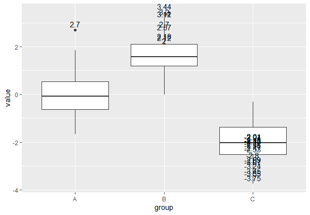
Example 4 : Box Plot with Outlier Annotations
In this example, we’ll create a box plot and annotate outliers with their corresponding data points.
R
library(ggplot2)
data <- data.frame(group = rep(c("A", "B", "C"), each = 30),
value = c(rnorm(30), rnorm(30, mean = 2), rnorm(30, mean = -2)))
plot <- ggplot(data, aes(group, value)) +
geom_boxplot()
outliers <- data[which(data$value > 2 | data$value < -2), ]
plot_with_annotations <- plot +
geom_text(data = outliers, aes(label = round(value, 2)), vjust = -0.5)
plot_with_annotations
|
Output:
Annotating Text and Labels in Plots
- The code starts by loading ggplot2, which is a powerful tool for data visualization in R.
- The sample data is generated and saved in a data frame called data. The data frame has two columns, group and value. In the group column, the values “A”, “B” and “C” are repeated 30 times each to form three groups. In the value column, 90 random numerical values are selected. The first 30 numbers are drawn from a normal distribution, the second 30 numbers have a mean value of 2 and the last 30 numbers have an average value of -2. For creating a box plot, use ggplot() on the data frame and specify the group on the x axis and the value on the y axis to create a box and whisker plots for each group.
- The code selects data points where the value is greater than or equal to -2, and appends annotations to these outliers using the geom_text() function. Approximate values are rounded to two decimal places using the vjust =0.5. The plot with annotations is saved in the plot_ with_annotations variable and the code shows the box plot with the outlier annotations. The data distribution is shown and the outliers are highlighted in each group.
- In conclusion, this code shows how to make a box plot with the outliers using the ggplot2 tool in R. It helps to visualize the distribution and spread of data while finding the extreme value.
CONCLUSION
Annotating Text and Labels in Plots Using R is an important skill for producing high-quality and eye-catching visualizations. Following the steps in this article, and experimenting with various annotation methods, we can convey insights and context within your plots to make them more interesting and understandable to your audience. Annotation and Labelling in Data Visualization are essential elements that significantly improve the clarity, effect, and communication of data visualizations.
Share your thoughts in the comments
Please Login to comment...