Add data Labels to Plotly Line Graph in Python
Last Updated :
24 Aug, 2023
Data labels are annotations attached to data points in a graph. They basically display the actual value of each data point, making it easier for readers to interpret and analyze the graph.
Data Labels on Plotly Line Graphs
The two main modules used for plotting line graphs in Python are as follows:
- Pandas is one of the famous libraries in Python used for data manipulation and analysis. It contains two primary data structures – Series and DataFrame. Pandas offers numerous functions and methods for data cleaning, filtering, merging, reshaping, and aggregating.
- plotly.express: The plotly.express module offers various functions and classes that are used for the creation of different types of visualizations, such as scatter plots, line plots, bar plots, histograms, etc.
Adding Data Labels on Plotly Line Graphs
The below steps demonstrate how to create and display a line chart with data labels using Plotly.
Step 1: Import the necessary libraries
First, import the plotly.express and pandas libraries.
import plotly.express as px
import pandas as pd
Step 2: Create a pandas DataFrame
Now, create a DataFrame named ‘df’ which consists of two columns: ‘x’ and ‘y’ with some data values.
df = pd.DataFrame({'x': [1, 2, 3], 'y': [10, 15, 25})
Step 3: Creating a line plot
Then create a line plot using plotly.express.line() function of plotly.express module. The DataFrame df is passed as the first argument. The x parameter is set to ‘x’ to use the ‘x’ column from the DataFrame for the x-axis, and the y parameter is set to ‘y’ to use the ‘y’ column for the y-axis. The test parameter is set to ‘y’ to display the ‘y’ values on the plot.
fig = px.line(df, x='x', y='y', text='y')
Step 4: Update the traces
Then, update the trace text template by using the update_trace() function which is used to update the trace properties of the plot. Here, the texttemplate property is set to “%{y}” to format the text displayed on the plot to match the ‘y’ values.
fig.update_traces(texttemplate="%{y}")
Step 5: Display the plot
At last, display the plot using the show() function which is called to display the created line plot with the specified data and formatting options.
fig.show()
By executing these steps a line plot will be generated visualizing the values from the ‘x’ and ‘y’ columns of the pandas DataFrame. The ‘y’ values will be displayed on the plot, and the text will be formatted according to the “%{y}” template.
Example 1:
In this example, we will create a simple line plot using the plotly.express module. Each data point on the line chart will have a data label displaying its ‘y’ value. The data labels will be formatted as plain text, showing the numerical value of ‘y’ for each data point.
Python3
import plotly.express as px
import pandas as pd
df = pd.DataFrame({'x': [1, 2, 3, 4, 5, 6, 7],
'y': [10, 15, 25, 18, 43, 30, 65]})
fig = px.line(df, x = 'x', y = 'y', text = 'y')
fig.update_traces(texttemplate="%{y}")
fig.show()
|
Output:
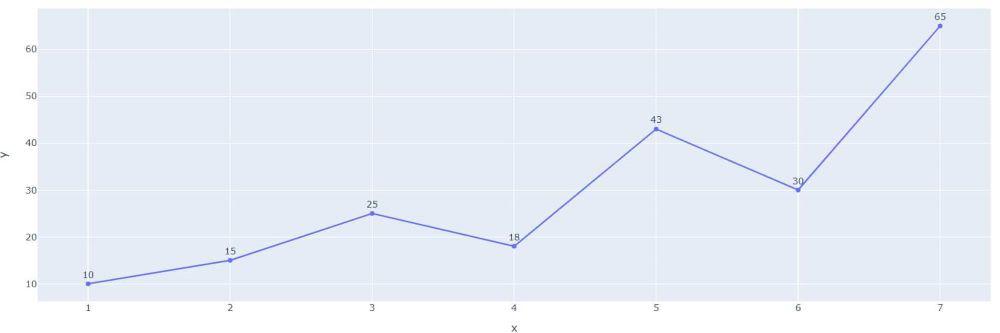
Adding data labels to plotly line graph
Example 2:
In this example, we are plotting a line chart with data labels displaying monthly sales data. The update_traces() function is used to update the trace properties of the plot. The texttemplate property is set to ‘%{text:.2s}’, which formats the data labels to display the Sales values with two significant figures and the textposition property is set to ‘top center’ to position the data labels at the top center of each data point.
Python3
import plotly.express as px
import pandas as pd
df = pd.DataFrame({
'Month': ['Jan', 'Feb', 'Mar', 'Apr', 'May', 'Jun'],
'Sales': [1000, 1500, 1200, 1800, 2000, 1600]
})
fig = px.line(df, x='Month', y='Sales', text='Sales')
fig.update_traces(texttemplate='%{text:.2s}', textposition='top center')
fig.show()
|
Output:
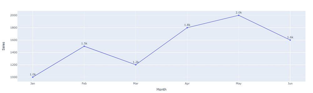
Adding data labels on top-center to plotly line graph
Share your thoughts in the comments
Please Login to comment...