Angular Material Table
Last Updated :
25 Oct, 2023
Angular Material is a UI component library for Angular to build customizable, responsive, and visually appealing web applications. It takes care of the UI so developers can focus only on core application functionalities. There are several main features, such as it provides numerous UI components out of the box like buttons, tables, tooltips, etc, along with facilitating multiple themes to customize colors, layout, and typography to match the brand. In Angular Material, its components implement ARIA standards to make them accessible, & it’s open-source, with an active community of developers maintaining it.
Material Table is a data table to display data in tabular format. It can be created using <table mat-table>. It displays complex data in a visually simple format.
Syntax
<table mat-table [dataSource]="data">

    <!-- Column Definitions -->
    <ng-container matColumnDef="column_name">
        <th mat-header-cell *matHeaderCellDef>
            Column Name
        </th>
        <td mat-cell *matCellDef="let element">
            {{element.property}}
        </td>
    </ng-container>

    <!-- Header and Rows -->
    <tr mat-header-row *matHeaderRowDef="displayedColumns"></tr>
    <tr mat-row *matRowDef="let row; columns: displayedColumns;"></tr>
</table>
Features
There are several features that are facilitated by Angular Material, in order to organize the content of the table in a specific order, along with dividing the large segments into pieces of small content with particular pages. The required features are described below:
Sorting
- Material Table provides a sorting feature on table headers. It can be implemented by adding matSort in the table.
<table mat-table matSort [dataSource]="data">
- Now, add mat-sort-header in the column header cell
<th mat-header-cell *matHeaderCellDef mat-sort-header> Column Name </th>
Please visit this article for more information about sorting.
Pagination
Angular Material provides pagination that can be added to tables for dividing large data into different pages. It can be implemented by adding <mat-paginator> at the bottom of the table.
<mat-paginator [pageSizeOptions]="[10, 50, 100]"
                       [showFirstLastButtons]="true"
                       [pageSize]="10">
</mat-paginator>
Filtering
Material Table also provides a way to filter the data in the table. It can be achieved by adding an input field and assigning the value of the input to the MatTableDataSource filter.
this.dataSource.filter = 'input text value';
We will see a detailed example below of how to filter using MatTableDataSource as a data source.
Installation Syntax
Before proceeding, we need to make sure that Angular CLI is installed on the system. To install Material UI, run the below command in the terminal and choose a prebuilt theme or custom.
ng add @angular/material
Please visit this article for detailed installation instructions.
Now, import the MatTableModule, MatPaginatorModule, and HttpClientModule in app.module.ts, and add them to the imports array.
import { MatTableModule } from '@angular/material/table';
import { MatPaginatorModule } from '@angular/material/paginator';
import { HttpClientModule } from '@angular/common/http';
@NgModule({
    declarations: [],
    imports: [
        HttpClientModule,
        MatPaginatorModule,
        MatTableModule,
    ],
    providers: [],
    bootstrap: []
})
Adding Table Component
A new component can be generated by running this command in the terminal:
ng g component components/material-table-overview
It will create a component named material-table-overview inside the components directory.
Project Structure
After successful installation, the project structure will look like the following image:
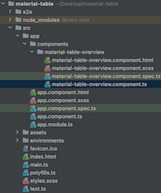
project structure
Example 1: The basic Angular Material table with pagination example.
HTML
<app-material-table-overview></app-material-table-overview>
|
Javascript
import { Component, OnInit } from '@angular/core';
@Component({
selector: 'app-root',
templateUrl: './app.component.html',
styleUrls: ['./app.component.scss']
})
export class AppComponent implements OnInit {
title = 'material-table';
ngOnInit(): void {
}
}
|
Javascript
import { BrowserModule }
from '@angular/platform-browser';
import { NgModule } from '@angular/core';
import { HttpClientModule }
from '@angular/common/http';
import { BrowserAnimationsModule }
from '@angular/platform-browser/animations';
import { AppComponent } from './app.component';
import { MatTableModule }
from '@angular/material/table';
import { MatPaginatorModule }
from '@angular/material/paginator';
import { MaterialTableOverviewComponent }
from './components/material-table-overview/material-table-overview.component';
@NgModule({
declarations: [
AppComponent,
MaterialTableOverviewComponent
],
imports: [
BrowserModule,
BrowserAnimationsModule,
HttpClientModule,
MatPaginatorModule,
MatTableModule,
],
providers: [],
bootstrap: [AppComponent]
})
export class AppModule { }
|
HTML
<h2>
Simple TODO Table
</h2>
<table mat-table [dataSource]="dataSource">
<ng-container matColumnDef="id">
<th mat-header-cell *matHeaderCellDef>
Id
</th>
<td mat-cell *matCellDef="let element">
{{element.id}}
</td>
</ng-container>
<ng-container matColumnDef="user_id">
<th mat-header-cell *matHeaderCellDef>
User Id
</th>
<td mat-cell *matCellDef="let element">
{{ element.userId }}
</td>
</ng-container>
<ng-container matColumnDef="title">
<th mat-header-cell *matHeaderCellDef>
Title
</th>
<td mat-cell *matCellDef="let element">
{{ element.title }}
</td>
</ng-container>
<ng-container matColumnDef="completed">
<th mat-header-cell *matHeaderCellDef>
Completed
</th>
<td mat-cell *matCellDef="let element">
{{ element.completed }}
</td>
</ng-container>
<tr mat-header-row *matHeaderRowDef="displayedColumns"></tr>
<tr mat-row *matRowDef="let row; columns: displayedColumns;"></tr>
</table>
<mat-paginator [pageSizeOptions]="pageSizeOptions"
[showFirstLastButtons]="true"
[pageSize]="pageSize">
</mat-paginator>
|
Javascript
import { Component, OnInit, ViewChild }
from '@angular/core';
import { MatPaginator }
from '@angular/material/paginator';
import { MatTableDataSource }
from '@angular/material/table';
import { HttpClient }
from '@angular/common/http';
@Component({
selector: 'app-material-table-overview',
templateUrl: './material-table-overview.component.html',
styleUrls: ['./material-table-overview.component.scss']
})
export class MaterialTableOverviewComponent implements OnInit {
@ViewChild(MatPaginator) paginator: MatPaginator;
dataSource: MatTableDataSource<any>;
pageSize = 10;
pageSizeOptions = [10, 50, 100];
displayedColumns = ['id', 'user_id', 'title', 'completed'];
constructor(private http: HttpClient) { }
ngOnInit(): void {
this.fetchData();
}
fetchData(): void {
(response: any) => {
this.dataSource = new MatTableDataSource(response);
this.dataSource.paginator = this.paginator;
}
);
}
}
|
CSS
.mat-table {
width: 100%;
.mat-header-cell {
color: rgb(33, 43, 53);
font-weight: 700;
font-size: 1em;
padding: 8px;
background-color: #EEEEEE;
&:first-of-type {
padding: 8px 24px;
}
}
.mat-column-flex-2 {
flex: 2;
}
.mat-cell {
padding: 8px;
line-height: 1.5em;
&:first-of-type {
padding: 8px 24px;
}
}
}
|
Output
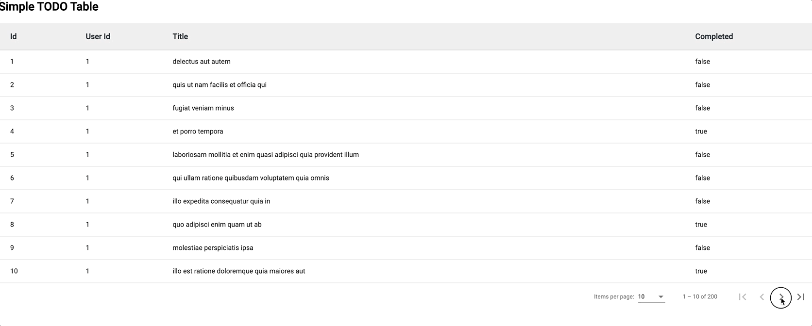
material table with pagination
Example 2: In this example, we have implemented the Material Table with a search example.
Javascript
import { BrowserModule }
from '@angular/platform-browser';
import { NgModule }
from '@angular/core';
import { HttpClientModule }
from '@angular/common/http';
import { BrowserAnimationsModule }
from '@angular/platform-browser/animations';
import { AppComponent } from './app.component';
import { MatTableModule }
from '@angular/material/table';
import { MatPaginatorModule }
from '@angular/material/paginator';
import { MatInputModule }
from '@angular/material/input';
import { MaterialTableOverviewComponent }
from './components/material-table-overview/material-table-overview.component';
@NgModule({
declarations: [
AppComponent,
MaterialTableOverviewComponent
],
imports: [
BrowserModule,
BrowserAnimationsModule,
HttpClientModule,
MatInputModule,
MatPaginatorModule,
MatTableModule,
],
providers: [],
bootstrap: [AppComponent]
})
export class AppModule { }
|
HTML
<h2>Simple TODO Table</h2>
<mat-form-field style="float: right;
margin-right: 5%">
<mat-label>Search</mat-label>
<input matInput (keyup)="filter($event)">
</mat-form-field>
<table mat-table [dataSource]="dataSource">
<ng-container matColumnDef="id">
<th mat-header-cell *matHeaderCellDef>
Id
</th>
<td mat-cell *matCellDef="let element">
{{element.id}}
</td>
</ng-container>
<ng-container matColumnDef="user_id">
<th mat-header-cell *matHeaderCellDef>
User Id
</th>
<td mat-cell *matCellDef="let element">
{{ element.userId }}
</td>
</ng-container>
<ng-container matColumnDef="title">
<th mat-header-cell *matHeaderCellDef>
Title
</th>
<td mat-cell *matCellDef="let element">
{{ element.title }}
</td>
</ng-container>
<ng-container matColumnDef="completed">
<th mat-header-cell *matHeaderCellDef>
Completed
</th>
<td mat-cell *matCellDef="let element">
{{ element.completed }}
</td>
</ng-container>
<tr mat-header-row *matHeaderRowDef="displayedColumns"></tr>
<tr mat-row *matRowDef="let row; columns: displayedColumns;"></tr>
</table>
<mat-paginator [pageSizeOptions]="pageSizeOptions"
[showFirstLastButtons]="true"
[pageSize]="pageSize">
</mat-paginator>
|
Javascript
import { Component, OnInit, ViewChild }
from '@angular/core';
import { MatPaginator }
from '@angular/material/paginator';
import { MatTableDataSource }
from '@angular/material/table';
import { HttpClient }
from '@angular/common/http';
@Component({
selector: 'app-material-table-overview',
templateUrl: './material-table-overview.component.html',
styleUrls: ['./material-table-overview.component.scss']
})
export class MaterialTableOverviewComponent implements OnInit {
@ViewChild(MatPaginator) paginator: MatPaginator;
dataSource: MatTableDataSource<any>;
pageSize = 10;
pageSizeOptions = [10, 50, 100];
displayedColumns = ['id', 'user_id', 'title', 'completed'];
constructor(private http: HttpClient) { }
ngOnInit(): void {
this.fetchData();
}
fetchData(): void {
(response: any) => {
this.dataSource = new MatTableDataSource(response);
this.dataSource.paginator = this.paginator;
}
);
}
filter($event): void {
this.dataSource.filter =
$event.target.value.trim().toLowerCase();
}
}
|
Output
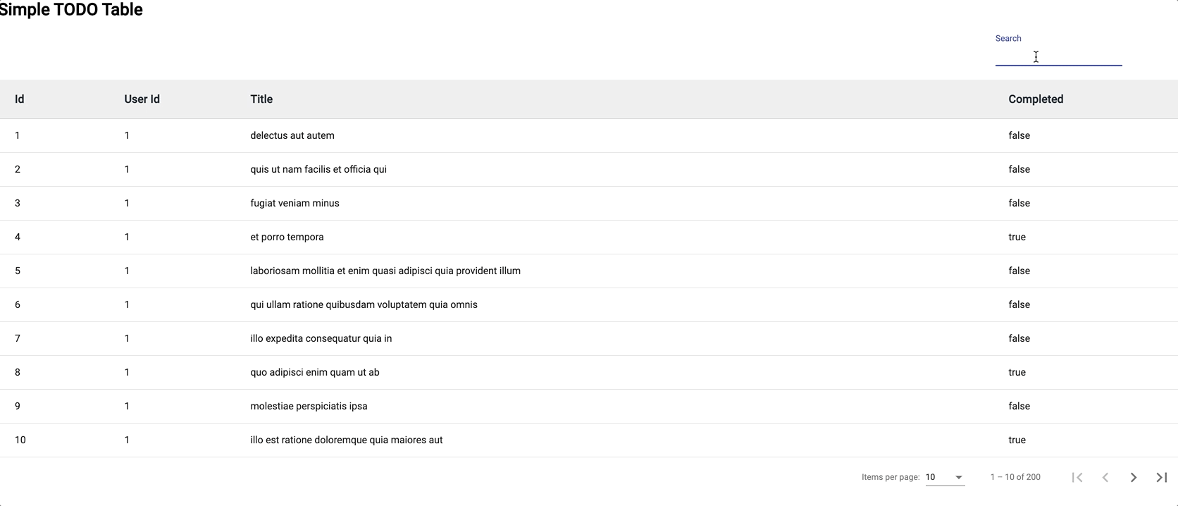
material table with search
Reference: https://material.angular.io/components/table/overview
Share your thoughts in the comments
Please Login to comment...