Angular Material Datepicker
Last Updated :
16 Nov, 2022
Angular Material is a UI component library that is developed by Google so that Angular developers can develop modern applications in a structured and responsive way. By making use of this library, we can greatly increase the user experience of an end-user thereby gaining popularity for our application. This library contains modern ready-to-use elements which can be directly used with minimum or no extra code.
The Datepicker Component in angular material is used for selecting the dates as input values. For creating a Datepicker we use <mat-datepicker #picker> directive. For selecting the range dates, instead of selecting a single date, we can use the mat-date-range-input and mat-date-range-picker components.
Syntax:
<mat-datepicker #picker>
    ...
</mat-datepicker>
Installation Syntax: The basic pre-requisite is that we must have Angular CLI installed on the system in order to add and configure the Angular material library. The following command is executed on the Angular CLI to install the angular material library:
ng add @angular/material
Make sure the path should be opened in the terminal before executing the above command.
Please refer to the Adding Angular Material Component to Angular Application article for the detailed installation procedure.
Adding Datepicker Component:
To use the Datepicker Component, we need to import the below modules into the app.module.ts file:
import { MatDatepickerModule } from ‘@angular/material/datepicker’;
import { MatInputModule } from ‘@angular/material/input’;
import { MatNativeDateModule } from ‘@angular/material/core’;
To use the Datepicker component in our code we have to import MatDatepickerModule, MatInputModule, and MatNativeDateModule into the imports array.
Project Structure: After successful installation, the project structure will look like the following image:
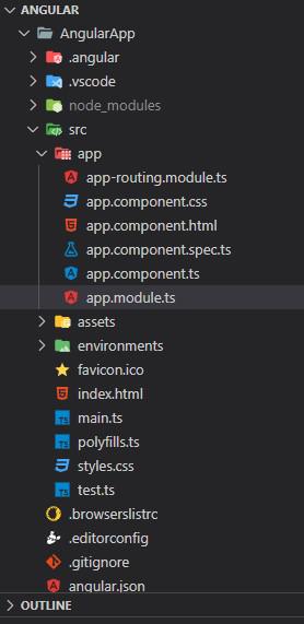
Project Structure
Example 1: The below example illustrates the basic implementation of the Angular Material Datepicker.
Javascript
import { NgModule } from '@angular/core';
import { BrowserModule }
from '@angular/platform-browser';
import { AppComponent } from './app.component';
import { MatDatepickerModule }
from '@angular/material/datepicker';
import { MatInputModule }
from '@angular/material/input';
import { MatNativeDateModule }
from '@angular/material/core';
import { MatFormFieldModule }
from '@angular/material/form-field';
import { BrowserAnimationsModule }
from '@angular/platform-browser/animations';
@NgModule({
declarations: [
AppComponent
],
imports: [
BrowserModule,
MatDatepickerModule,
MatNativeDateModule,
MatInputModule,
MatFormFieldModule,
BrowserAnimationsModule
],
providers: [],
bootstrap: [AppComponent]
})
export class AppModule { }
|
Javascript
import { Component } from '@angular/core';
@Component({
selector: 'app-root',
templateUrl: './app.component.html',
styleUrls: ['./app.component.css']
})
export class AppComponent {
title = 'AngularApp';
}
|
HTML
<div>
<h1>GeeksforGeeks</h1>
<h3>Angular Material Datepicker</h3>
<mat-form-field appearance="fill">
<mat-label>Choose a date</mat-label>
<input matInput [matDatepicker]="picker">
<mat-hint>MM/DD/YYYY</mat-hint>
<mat-datepicker-toggle matSuffix [for]="picker">
</mat-datepicker-toggle>
<mat-datepicker #picker></mat-datepicker>
</mat-form-field>
<br>
<h3>Angular Material Datepicker Range Selection</h3>
<mat-form-field appearance="fill">
<mat-label>Enter a date range</mat-label>
<mat-date-range-input [rangePicker]="picker1">
<input matStartDate placeholder="Start date">
<input matEndDate placeholder="End date">
</mat-date-range-input>
<mat-hint>MM/DD/YYYY – MM/DD/YYYY</mat-hint>
<mat-datepicker-toggle matSuffix [for]="picker1">
</mat-datepicker-toggle>
<mat-date-range-picker #picker1></mat-date-range-picker>
</mat-form-field>
</div>
|
Output:

Selecting a date using datepicker
Example 2: The below example illustrates the implementation of the Datepicker, by specifying the Date range picker with custom a selection strategy in Angular Material.
Javascript
import { NgModule } from '@angular/core';
import { BrowserModule }
from '@angular/platform-browser';
import { BrowserAnimationsModule }
from '@angular/platform-browser/animations';
import { AppComponent } from './app.component';
import { MatDatepickerModule }
from '@angular/material/datepicker';
import { MatInputModule }
from '@angular/material/input';
import { MatNativeDateModule }
from '@angular/material/core';
import { MatFormFieldModule }
from '@angular/material/form-field';
import { FormsModule, ReactiveFormsModule }
from '@angular/forms';
@NgModule({
declarations: [
AppComponent
],
imports: [
BrowserModule,
MatDatepickerModule,
MatNativeDateModule,
MatInputModule,
MatFormFieldModule,
BrowserAnimationsModule,
FormsModule,
ReactiveFormsModule
],
providers: [],
bootstrap: [AppComponent]
})
export class AppModule { }
|
Javascript
import { Component, Injectable } from '@angular/core';
import { DateAdapter } from '@angular/material/core';
import {
MatDateRangeSelectionStrategy,
DateRange,
MAT_DATE_RANGE_SELECTION_STRATEGY,
} from '@angular/material/datepicker';
@Injectable()
export class FiveDayRangeSelectionStrategy<D>
implements MatDateRangeSelectionStrategy<D> {
constructor(private _dateAdapter: DateAdapter<D>) { }
selectionFinished(date: D | null): DateRange<D> {
return this._createFiveDayRange(date);
}
createPreview(activeDate: D | null): DateRange<D> {
return this._createFiveDayRange(activeDate);
}
private _createFiveDayRange(date: D | null): DateRange<D> {
if (date) {
const start = this._dateAdapter.addCalendarDays(date, -2);
const end = this._dateAdapter.addCalendarDays(date, 2);
return new DateRange < D > (start, end);
}
return new DateRange < D > (null, null);
}
}
@Component({
selector: 'app-root',
templateUrl: './app.component.html',
styleUrls: ['./app.component.css'],
providers: [
{
provide: MAT_DATE_RANGE_SELECTION_STRATEGY,
useClass: FiveDayRangeSelectionStrategy,
},
],
})
export class AppComponent {
title = 'AngularApp';
}
|
HTML
<div>
<h1>GeeksforGeeks</h1>
<h3>
Angular Material Date range picker
with custom a selection strategy
</h3>
<mat-form-field appearance="fill">
<mat-label>Enter a date range</mat-label>
<mat-date-range-input [rangePicker]="picker">
<input matStartDate placeholder="Start date">
<input matEndDate placeholder="End date">
</mat-date-range-input>
<mat-hint>MM/DD/YYYY – MM/DD/YYYY</mat-hint>
<mat-datepicker-toggle matSuffix [for]="picker">
</mat-datepicker-toggle>
<mat-date-range-picker #picker>
</mat-date-range-picker>
</mat-form-field>
</div>
|
Output:

Datepicker custom range gif
Reference: https://material.angular.io/components/datepicker/overview
Like Article
Suggest improvement
Share your thoughts in the comments
Please Login to comment...