3D Line Plots using Plotly in Python
Last Updated :
10 Jul, 2020
Plotly is a Python library that is used to design graphs, especially interactive graphs. It can plot various graphs and charts like histogram, barplot, boxplot, spreadplot and many more. It is mainly used in data analysis as well as financial analysis. plotly is an interactive visualization library
Line Plot in Plotly
Line plot in plotly is much accessible and illustrious annexation to plotly which manage a variety of types of data and assemble easy-to-style statistic. With px.line_3d each data position is represented as a vertex (which location is given by the x, y and z columns) of a polyline mark in 3D space. Line chart Displays a series of numerical data as points which are connected by lines. It visualizes to show two data trends. The main productive feature is it can display thousands of data points without scrolling. It can be created using the line_3d() method of plotly.express class.
Syntax: plotly.express.line_3d(data_frame=None, x=None, y=None, z=None, color=None, line_dash=None, text=None, line_group=None, hover_name=None, hover_data=None, custom_data=None, error_x=None, error_x_minus=None, error_y=None, error_y_minus=None, error_z=None, error_z_minus=None, animation_frame=None, animation_group=None, category_orders={}, labels={}, color_discrete_sequence=None, color_discrete_map={}, line_dash_sequence=None, line_dash_map={}, log_x=False, log_y=False, log_z=False, range_x=None, range_y=None, range_z=None, title=None, template=None, width=None, height=None
Parameters:
data_frame: This argument needs to be passed for column names (and not keyword names) to be used.
x, y, z: Either a name of a column in data_frame, or a pandas Series or array_like object. Values from this column or array_like are used to position marks along the x, y and z axis respectively in cartesian coordinates.
color: Either a name of a column in data_frame, or a pandas Series or array_like object. Values from this column or array_like are used to assign color to marks.
Example 1: Using Iris dataset
Python3
import plotly.express as px
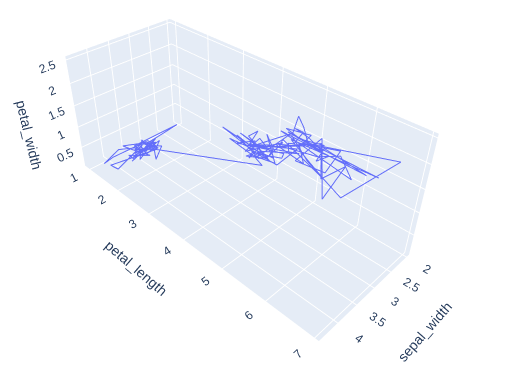
df = px.data.iris()
fig = px.line_3d(df, x="sepal_width",
y="petal_length",
z="petal_width")
fig.show()
|
Output:
Example 2: Iris dataset with color argument
Python3
import plotly.express as px
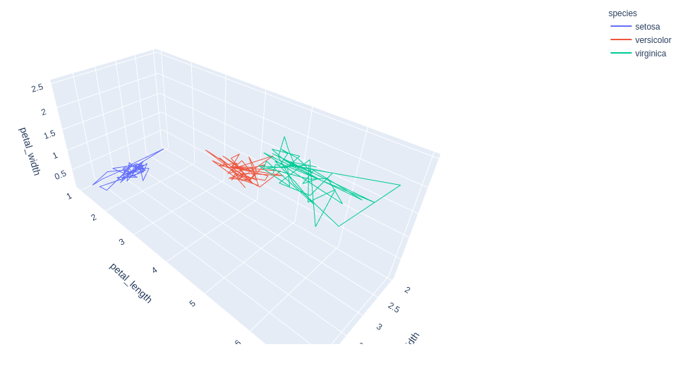
df = px.data.iris()
fig = px.line_3d(df, x="sepal_width",
y="petal_length",
z="petal_width",
color="species")
fig.show()
|
Output:
Example 3: Using tips dataset
Python3
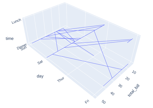
import plotly.express as px
df = px.data.tips()
fig = px.line_3d(df, x="total_bill",
y="day", z="time")
fig.show()
|
Output:
Example 4: Tips dataset with color argument.
Python3
import plotly.express as px
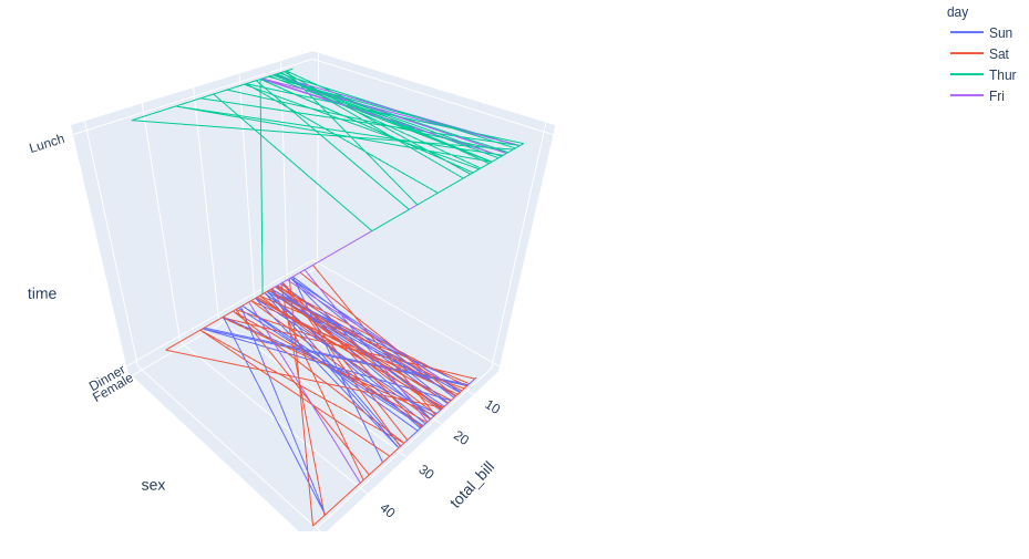
df = px.data.tips()
fig = px.line_3d(df, x="total_bill", y="day", z="time")
fig.show()
|
Output:
Share your thoughts in the comments
Please Login to comment...