Carpet Plots using Plotly in Python
Last Updated :
01 Oct, 2020
A Plotly is a Python library that is used to design graphs, especially interactive graphs. It can plot various graphs and charts like histogram, barplot, boxplot, spreadplot, and many more. It is mainly used in data analysis as well as financial analysis. Plotly is an interactive visualization library.
Carpet Plots
A carpet plot is any of a few different specific types of plot. A carpet plot is one that shows the interaction between two or more independent variables and one or more dependent variables in a two-dimensional plot. The carpet plot distinguishes itself from other plots as carpet plot can be used to more accurately interpolate data points. It can be created using the Carpet() method of graph_objects class.
Syntax: plotly.graph_objects.Carpet(a=None,b=None,carpet=None, x=None, y=None)
Parameters:
a: An array containing values of the first parameter value
b: An array containing values of the first parameter value
x: A two dimensional array of x coordinates at each carpet point. If ommitted, the plot is a cheater plot and the xaxis is hidden by default.
y: A two dimensional array of y coordinates at each carpet point.
carpet: An identifier for this carpet, so that scattercarpet and contourcarpet traces can specify a carpet plot on which they lie
Example:
Python3
import plotly.graph_objects as go
fig = go.Figure(go.Carpet(
y = [1, 2, 3, 4, 5, 6]
))
fig.show()
|
Output:
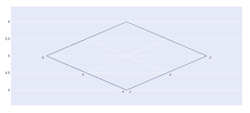
Adding a and b values
A and B attributes should be used to save the parameter values.
Example:
Python3
import plotly.graph_objects as go
fig = go.Figure(go.Carpet(
a = [1, 2, 3, 1, 2, 3],
b = [4, 5, 6, 4, 5, 6],
y = [1, 2, 3, 4, 5, 6]
))
fig.show()
|
Output:
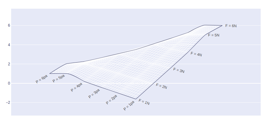
Set A and B Axis
aaxis and baxis lists are used to set A and B axis respectively.
Example 1:
Python3
import plotly.graph_objects as go
fig = go.Figure(go.Carpet(
a=[1, 2, 3, 4, 5, 6],
b=[6, 5, 4, 3, 2, 1],
y=[1, 2, 3, 4, 5, 6],
aaxis=dict(
tickprefix='F = ',
ticksuffix='N',
smoothing=0.2,
minorgridcount=10,
),
baxis=dict(
tickprefix='P = ',
ticksuffix='pa',
smoothing=0.4,
minorgridcount=9,
)
))
fig.show()
|
Output:
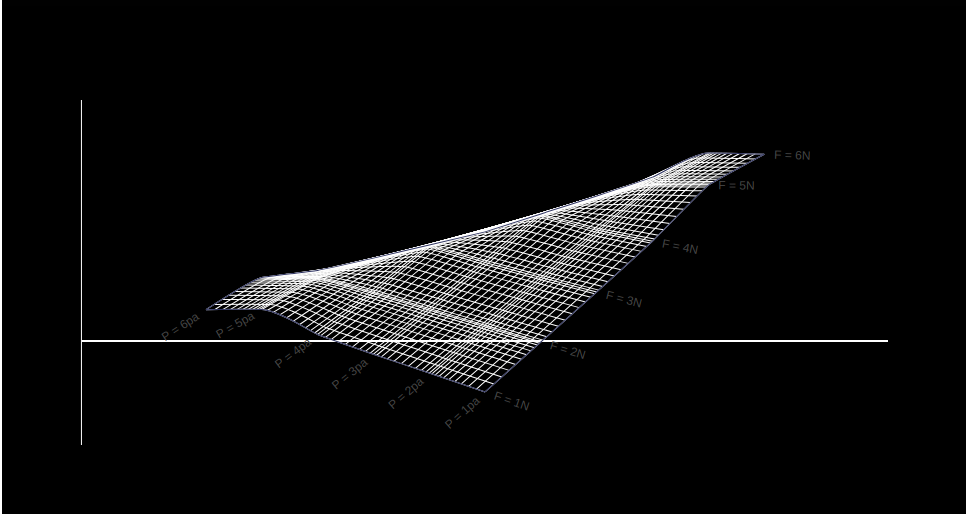
Example 2: Styling A and B axis
Python3
import plotly.graph_objects as go
fig = go.Figure(go.Carpet(
a=[1, 2, 3, 4, 5, 6],
b=[6, 5, 4, 3, 2, 1],
y=[1, 2, 3, 4, 5, 6],
aaxis=dict(
tickprefix='F = ',
ticksuffix='N',
smoothing=0.2,
minorgridcount=10,
),
baxis=dict(
tickprefix='P = ',
ticksuffix='pa',
smoothing=0.4,
minorgridcount=9,
)
))
fig.update_layout(
plot_bgcolor='black',
paper_bgcolor='black',
xaxis=dict(
showgrid=False,
showticklabels=False
),
yaxis=dict(
showgrid=False,
showticklabels=False
)
)
fig.show()
|
Output:
Share your thoughts in the comments
Please Login to comment...