Plotting multiple groups with facets in ggplot2
Last Updated :
10 Oct, 2023
Data visualization is an essential aspect of data analysis and interpretation. We can more easily examine and comprehend data thanks to it. You may make many kinds of graphs in R, a popular computer language for data research, to show your data. For a thorough understanding while working with complicated datasets or several variables, it becomes essential to display multiple graphs concurrently. Faceting, commonly referred to as tiny multiples or trellis plots, is useful in this situation.
A data visualization approach called faceting includes making a grid of smaller plots, each of which shows a portion of the data. A categorical variable or group of categorical variables determines these subsets. Faceting is a potent tool in your data analysis toolbox since it helps you visualize links and trends within various subsets of your data.
Concepts Related to Faceting:-
Let’s review some fundamental ideas about faceting before getting into the specifics of making faceted plots in R.
- Categorical Variables: Categorical variables, such as gender, area, or product category, are those that reflect defined categories or groupings. When you wish to illustrate the data distribution or correlations across these categories, faceting is especially helpful.
- Grid of Plots: Faceting is the process of segmenting your plotting area into a grid of smaller plots, each of which shows a distinct subset of the data depending on one or more categorical factors. These smaller plots frequently have the same axes and scales, making comparisons simple.
- Facet Variables: Facet variables are categorical variables that are used to divide your data into smaller groups. Your plots can be faceted by one or more factors, which affects how the data is divided into the grid’s many panels.
- Facet kinds: You may build many facet kinds, including:
- Grid Facets: Using one or more facet variables, the data is divided into a grid of graphs.
- Wrap Facets: The process of arranging plots in a linear fashion, frequently employed for a single facet variable with several levels.
- Free Facets: Allowing the grid’s row and column counts to change according to the data.
- Nested Facets: Constructing nested grids to see several facet variables at once.
Steps Required for Faceting in R
You normally take these steps to make faceted graphs in R:
- Load Required Libraries: Depending on your desire, you may need to load libraries in R called ‘ggplot2‘ or ‘lattice‘ that provide functions for making faceted plots.
- Prepare Your Data: Make sure your data is in the appropriate format, particularly if you’re using ggplot2, which frequently necessitates data in a “tidy” format.
- Generate the Plot: To generate your initial plot, use the appropriate functions (such as ggplot() for ‘ggplot2’), providing aesthetics and geoms as necessary.
- Add Facets: Using facet methods (such as facet_grid() or facet_wrap() in ‘ggplot2’), you may describe how to facet your plot based on your facet variables.
- Personalize and polish: Enhance your faceted plot by including labels and titles, changing scales, and making any other required adjustments to make it more aesthetically pleasing and easier to read.
- Examine and Save: At this point, you can either use R’s plotting capabilities to examine your faceted plot or save it to a file for further sharing or study.
Creating a Faceted Histogram in R with ggplot2
Scenario: You have a dataset of customer feedback for an e-commerce platform. You want to visualize the distribution of customer satisfaction scores across different product categories.
R
customer_data <- data.frame(
Satisfaction_Score = c(4, 5, 3, 2, 5, 4, 4, 3, 5, 2, 1, 5),
Product_Category = c("Electronics", "Clothing", "Electronics",
"Clothing", "Home Decor", "Electronics",
"Clothing", "Home Decor", "Clothing",
"Electronics", "Home Decor", "Clothing")
)
library(ggplot2)
plot <- ggplot(data = customer_data, aes(x = Satisfaction_Score)) +
geom_histogram(binwidth = 1, fill = "blue") +
labs(title = "Distribution of Customer Satisfaction Scores")
faceted_plot <- plot + facet_wrap(~Product_Category, scales = "free")
print(faceted_plot)
|
Output
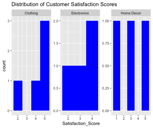
The code generates a faceted histogram that visualizes the distribution of customer satisfaction scores. The plot is divided into three facets, each corresponding to a different product category: “Electronics,” “Clothing,” and “Home Decor.” Within each facet, the histogram displays the distribution of satisfaction scores for the respective product category. This visualization allows for a quick comparison of satisfaction score distributions across different product categories.
Histograms and Scatterplots
We’ll utilize a dataset in this code that comprises customer satisfaction ratings and the related dollar amounts of purchases. To see the distribution of satisfaction ratings and the connection between contentment and expenditure, we’ll make faceted plots.
R
library(ggplot2)
customer_data <- data.frame(
Satisfaction_Score = c(4, 5, 3, 2, 5, 4, 4, 3, 5, 2, 1, 5),
Spending_Amount = c(100, 150, 80, 60, 200, 120, 130, 90, 180, 70, 50, 210),
Product_Category = c("Electronics", "Clothing", "Electronics",
"Clothing", "Home Decor", "Electronics",
"Clothing", "Home Decor", "Clothing", "Electronics",
"Home Decor", "Clothing")
)
scatterplot <- ggplot(data = customer_data, aes(x = Satisfaction_Score,
y = Spending_Amount)) +
geom_point(color = "green", size = 3) +
labs(title = "Scatterplot of Satisfaction vs. Spending")
histogram <- ggplot(data = customer_data, aes(x = Satisfaction_Score)) +
geom_histogram(binwidth = 1, fill = "blue") +
labs(title = "Distribution of Satisfaction Scores")
faceted_plots <- scatterplot + facet_wrap(~Product_Category, scales = "free") +
geom_smooth(method = "lm", color = "red")
histogram_facet <- histogram + facet_wrap(~Product_Category, scales = "free") +
theme_minimal()
print(faceted_plots)
print(histogram_facet)
|
Output
geom_smooth()` using formula = ‘y ~ x’
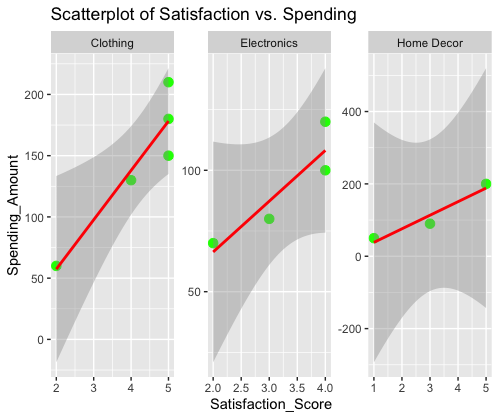
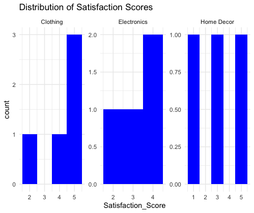
- Two ggplot objects are made: one for a histogram of satisfaction ratings and another for a scatterplot of satisfaction vs spending.
- We provide options for customization, such as altering the scatterplot’s point color and size and giving the histogram a minimalistic look.
- Both scatterplots and histograms are made with faceted plots that are organized by product categories.
- Regression lines are added to the scatterplot’s faceted plot to show how expenditure and satisfaction are related.
The code generates two faceted plots:
- The scatterplot visualizes the relationship between satisfaction scores and spending amounts, with separate facets for different product categories. Regression lines indicate the trend within each category.
- The histogram facets display the distribution of satisfaction scores across product categories, each with its own histogram. The minimal theme is applied to this facet.
These plots provide a comprehensive view of customer satisfaction, spending patterns, and their distributions across product categories, making it easier to analyze and draw insights from the data.
Customizing Colors and Aesthetics
In this, we’ll continue to use the same dataset but focus on customizing colors and aesthetics of the faceted plots.
R
library(ggplot2)
customer_data <- data.frame(
Satisfaction_Score = c(4, 5, 3, 2, 5, 4, 4, 3, 5, 2, 1, 5),
Spending_Amount = c(100, 150, 80, 60, 200, 120, 130, 90, 180, 70, 50, 210),
Product_Category = c("Electronics", "Clothing", "Electronics",
"Clothing", "Home Decor", "Electronics",
"Clothing", "Home Decor", "Clothing",
"Electronics", "Home Decor", "Clothing")
)
scatterplot <- ggplot(data = customer_data, aes(
x = Satisfaction_Score, y = Spending_Amount)) +
geom_point(aes(color = Product_Category), size = 3) +
labs(title = "Scatterplot of Satisfaction vs. Spending")
histogram <- ggplot(data = customer_data, aes(x = Satisfaction_Score)) +
geom_histogram(binwidth = 1, fill = "lightblue") +
labs(title = "Distribution of Satisfaction Scores")
faceted_plots <- scatterplot + facet_wrap(~Product_Category, scales = "free") +
theme_minimal() + scale_color_manual(values = c("Electronics" = "red",
"Clothing" = "blue",
"Home Decor" = "green"))
histogram_facet <- histogram + facet_wrap(~Product_Category, scales = "free") +
theme_minimal() + scale_fill_manual(values = c("Electronics" = "red",
"Clothing" = "blue",
"Home Decor" = "green"))
print(faceted_plots)
print(histogram_facet)
|
Output
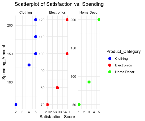
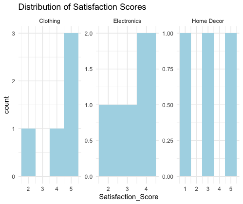
- We use the scale_color_manual and scale_fill_manual functions to alter the colors of the scatterplot points and histogram fills based on product categories.
- The faceted plots’ custom colors—”red” for electronics, “blue” for clothing, and “green” for home décor—make it simpler to tell apart the various categories.
The data points in the faceted scatterplot plot now have configurable colors. The caption at the top-right shows the color-coding for each category, and each facet relates to a certain product category.
Additionally, the histogram faceted plot uses unique colors for various product categories. When comparing the distribution of satisfaction levels, this makes it easier to visually distinguish the groups.
Share your thoughts in the comments
Please Login to comment...