Waiter’s Tip Prediction using Machine Learning
Last Updated :
26 Oct, 2022
If you have recently visited a restaurant for a family dinner or lunch and you have tipped the waiter for his generous behavior then this project might excite you. As in this article, we will try to predict what amount of tip a person will give based on his/her visit to the restaurant using some features related to the same.
Let’s start by importing some libraries which will be used for various purposes which will be explained later in this article.
Importing Libraries and Dataset
Python libraries make it very easy for us to handle the data and perform typical and complex tasks with a single line of code.
- Pandas – This library helps to load the data frame in a 2D array format and has multiple functions to perform analysis tasks in one go.
- Numpy – Numpy arrays are very fast and can perform large computations in a very short time.
- Matplotlib/Seaborn – This library is used to draw visualizations.
- Sklearn – This module contains multiple libraries having pre-implemented functions to perform tasks from data preprocessing to model development and evaluation.
- XGBoost – This contains the eXtreme Gradient Boosting machine learning algorithm which is one of the algorithms which helps us to achieve high accuracy on predictions.
Python3
import numpy as np
import pandas as pd
import seaborn as sb
import matplotlib.pyplot as plt
from sklearn.metrics import mean_absolute_error as mae
from sklearn.model_selection import train_test_split
from sklearn.preprocessing import StandardScaler, LabelEncoder
from sklearn.linear_model import LinearRegression
from xgboost import XGBRegressor
from sklearn.ensemble import RandomForestRegressor, AdaBoostRegressor
import warnings
warnings.filterwarnings('ignore')
|
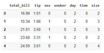
Now let’s use the panda’s data frame to load the dataset and look at the first five rows of it.
Python3
df = pd.read_csv('tips.csv')
df.head()
|
Output:
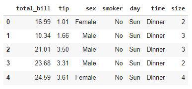
First five rows of the dataset
Output:
(244, 7)
This dataset contains very less rows but the procedure will be the same doesn’t matter if this dataset would have contained 20,000 rows of data.
Output:
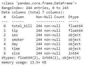
Details about the columns of the dataset
From the above, we can see that the dataset contains 2 columns with float values 4 with categorical values and the rest contains integer values.
Output:
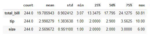
Descriptive Statistical measures of the data
We can look at the descriptive statistical measures of the continuous data available in the dataset.
Exploratory Data Analysis
EDA is an approach to analyzing the data using visual techniques. It is used to discover trends, and patterns, or to check assumptions with the help of statistical summaries and graphical representations. While performing the EDA of this dataset we will try to look at what is the relation between the independent features that is how one affects the other.
Output:
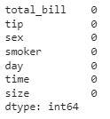
Count of the null values column wise
So, there are no null values in the given dataset. Hence we are good to go for the data analysis part.
Python3
plt.subplots(figsize=(15,8))
for i, col in enumerate(['total_bill', 'tip']):
plt.subplot(2,3, i + 1)
sb.distplot(df[col])
plt.tight_layout()
plt.show()
|
Output:
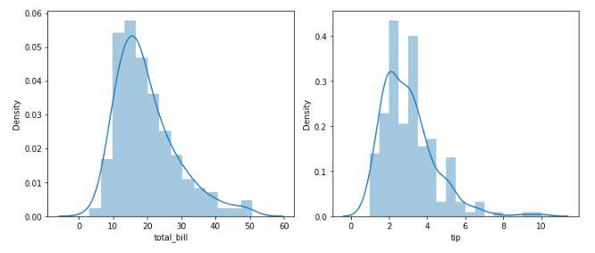
Distribution plots of the continuous data columns
From the above plots, we can conclude that the data distribution is a little bit positively skewed. This is observed generally because maximum people spend in a certain range but some do such heavy expenditure that the distribution becomes positively skewed.
Python3
plt.subplots(figsize=(15,8))
for i, col in enumerate(['total_bill', 'tip']):
plt.subplot(2,3, i + 1)
sb.boxplot(df[col])
plt.tight_layout()
plt.show()
|
Output:
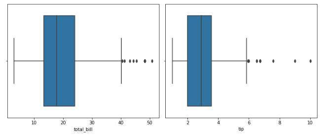
Box plot to identify the outliers
From the above boxplots, we can say that there are outliers in the dataset. But we have very less amount of data already if we will drop more rows it would not be a good idea. But let’s check how many rows we will have to remove in order to get rid of the outliers.
Python3
df.shape, df[(df['total_bill']<45) & (df['tip']<7)].shape
|
Output:
((244, 7), (238, 7))
We will have to just lose 6 data points in order to get rid of most of the outliers so, let’s do this.
Python3
df = df[(df['total_bill']<45) & (df['tip']<7)]
|
Let’s draw the count plot for the categorical columns.
Python3
feat = df.loc[:,'sex':'size'].columns
plt.subplots(figsize=(15,8))
for i, col in enumerate(feat):
plt.subplot(2,3, i + 1)
sb.countplot(df[col])
plt.tight_layout()
plt.show()
|
Output:
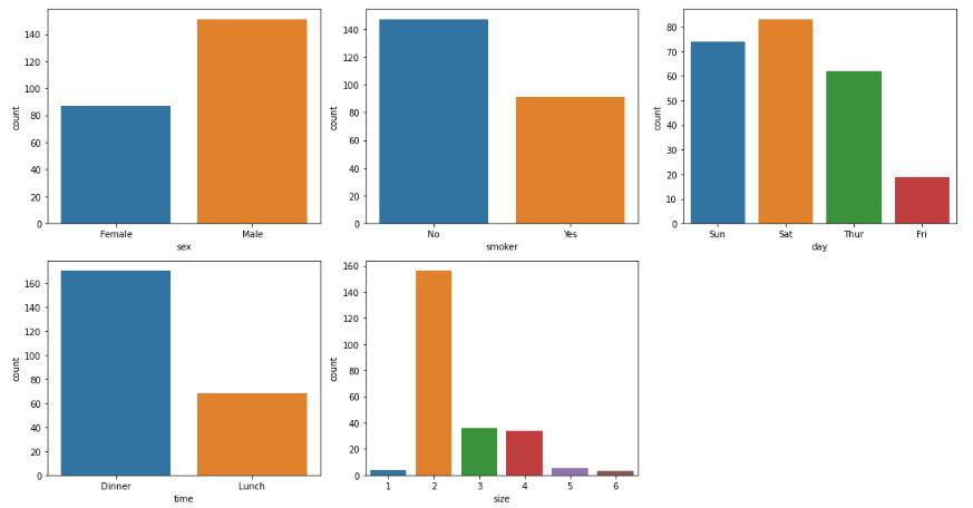
Count plot for the categorical columns
Here we can draw some observations which are stated below:
- Footfall on weekends is more than that on weekdays
- People usually prefer dinner outside as compared to lunch.
- People going alone to restaurants is as rare as people going with a family of 5 or 6 persons.
Python3
plt.scatter(df['total_bill'], df['tip'])
plt.title('Total Bill v/s Total Tip')
plt.xlabel('Total Bill')
plt.ylabel('Total Tip')
plt.show()
|
Output:
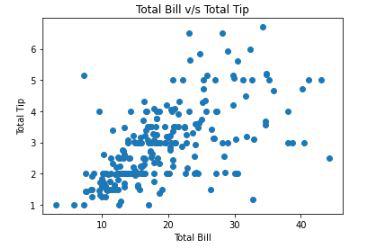
Scatter plot between total bill v/s tip
Let’s see what is the relation between the size of the family and the tip given.
Python3
df.groupby(['size']).mean()
|
Output:
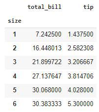
Grouping the data by a column using the GroupBy method
Here is an observation that we can derive from the above-grouped table that the tip given to the waiter is directly proportional to the number of people who have arrived to dine in.
Python3
df.groupby(['time']).mean()
|
Output:
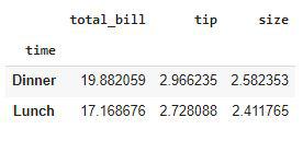
Grouping the data by a column using the GroupBy method
People who come at dinner time tend to pay more tips as compared to those who came for lunch.
Python3
df.groupby(['day']).mean()
|
Output:
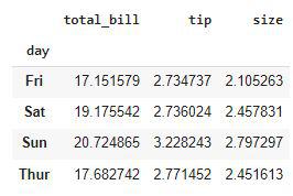
Grouping the data by a column using the GroupBy method
Here we can derive one observation that the tip given on weekends is generally higher than that compared that given on weekdays.
Python3
le = LabelEncoder()
for col in df.columns:
if df[col].dtype == object:
df[col] = le.fit_transform(df[col])
df.head()
|
Output:
Ordinally Encoded dataset
Now all the columns have been converted to numerical form. Let’s draw a heatmap to analyze the correlation between the variables of the dataset.
Python3
plt.figure(figsize=(7,7))
sb.heatmap(df.corr() > 0.7, annot = True, cbar = False)
plt.show()
|
Output:
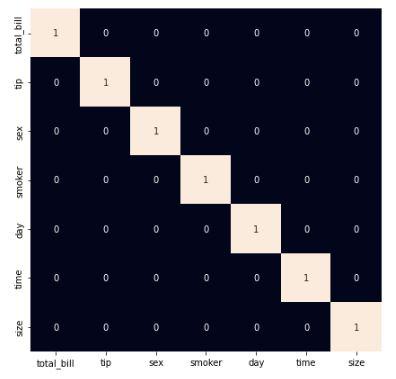
Heatmap to analyze the correlation
From the above heatmap, it is certain that there are no highly correlated features in it.
Model Development
There are so many state-of-the-art ML models available in academia but some model fits better to some problem while some fit better than other. So, to make this decision we split our data into training and validation data. Then we use the validation data to choose the model with the highest performance.
Python3
features = df.drop('tip', axis=1)
target = df['tip']
X_train, X_val, Y_train, Y_val = train_test_split(features, target, test_size=0.2, random_state=22)
X_train.shape, X_val.shape
|
Output:
((190, 6), (48, 6))
After dividing the data into training and validation data it is considered a better practice to achieve stable and fast training of the model.
Python3
scaler = StandardScaler()
X_train = scaler.fit_transform(X_train)
X_val = scaler.transform(X_val)
|
Now let’s train some state-of-the-art machine learning models on the training data and then use the validation data for choosing the best out of them for prediction.
Python3
models = [LinearRegression(), XGBRegressor(), RandomForestRegressor(), AdaBoostRegressor()]
for i in range(4):
models[i].fit(X_train, Y_train)
print(f'{models[i]} : ')
pred_train = models[i].predict(X_train)
print('Training Accuracy : ', mae(Y_train, pred_train))
pred_val = models[i].predict(X_val)
print('Validation Accuracy : ', mae(Y_val, pred_val))
print()
|
Output:
LinearRegression() :
Training Error :  0.6866406322422778
Validation Error :  0.7903774704017295

[10:19:57] WARNING: /workspace/src/objective/regression_obj.cu:152: reg:linear is now deprecated in favor of reg:squarederror.
XGBRegressor() :
Training Error :  0.4352481277867367
Validation Error :  0.7437935236096381

RandomForestRegressor() :
Training Error :  0.276898947368421
Validation Error :  0.7220791666666665

AdaBoostRegressor() :
Training Error :  0.6609079068130044
Validation Error :  0.8455811030375475
Out of all the models RandomForestModel is giving the least value for the mean absolute error this means predictions made by this model are close to the real values as compared to the other model.
Conclusion
The dataset we have used here was small still the conclusion we drew from them were quite similar to what is observed in the real-life scenario. If we would have a bigger dataset then we will be able to learn even deeper patterns in the relation between the independent features and the tip given to the waiters.
Share your thoughts in the comments
Please Login to comment...