Vue.js Custom Directives with Components
Last Updated :
08 Apr, 2022
Vue.js is a progressive javascript framework for developing web user interfaces. It is a performant, approachable, and versatile framework. We can create Single Page Applications as well as Full Stack applications. It is built on top of HTML, CSS, and Javascript which makes it easier for developers to integrate Vue.js in any application at any stage.
The Custom Directives allows the developers to create and use some custom functions easily on the elements. Like the in-built directives that are like v-model, v-for, v-if, etc., we can create our own directives which will according to what we set it. It allows reusing some logic by having access to the lower level of DOM. We can also pass data to the custom directives.
Custom Directives with Components: Custom Directives can be used with the components by modifying, removing, or adding any content to the element. The Custom Directives will always be applicable to the root node of the component. We can have an input element that should have some placeholder text by default or some default value.
Syntax: In the component, before the name of the directive add the “v-” as follows:
<script>
const customDirective = {
  ...
};
export default {
  directives: {
    customDirective,
  },
};
</script>
<template>
  ...
  <MyElement v-customDirective />
</template>
Example: In the following example, we have a custom directive called input for the input elements to easily place the color and the placeholder text in the input elements.
Step 1: Create a new Vue.js project with the npm node.js package manager using the following command.
npm init vue@latest
Enter the project name and preset the project as follows:
Project Structure: After successful installation, the following project structure will be formed.
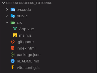
Project Structure
Step 3: In the script section of the App.vue file, create a custom directive and name it as input. In the mounted section, add the element and binding, through which we will receive value from the elements. Then modify the element’s value accordingly.
App.vue
<script>
const input = {
mounted: (el, binding) => {
console.log(binding.value);
el.placeholder = binding.value.placeholder;
el.style.color = binding.value.color;
},
};
export default {
directives: {
input,
},
};
</script>
|
Step 4: In the template section of the App.vue file, add two input elements and add the values for the placeholder and the color.
App.vue
<template>
<center>
<h1 style="text-align: center;
color: green">GeeksforGeeks</h1>
<strong>
Vue.js Custom Directives with Components
</strong>
<br />
</center>
<center>
<input type="text"
v-input="{ placeholder: 'Green Color Input',
color: 'green' }" />
<input type="text"
v-input="{ placeholder: 'Red Color Input',
color: 'red' }"/>
</center>
</template>
|
Step 5: Run the project using the following command and see the output.
npm run dev
Output: On successfully building the project, open http://localhost:3000, and the result will be as follows.
Reference: https://vuejs.org/guide/reusability/custom-directives.html#usage-on-components
Share your thoughts in the comments
Please Login to comment...