Tweet Sentiment Analysis Using Python Streamlit
Last Updated :
26 Mar, 2024
This article covers the sentiment analysis of by parsing the tweets fetched from Twitter using the streamlit Python framework.
What is Sentiment Analysis?
Sentiment Analysis is the process of ‘computationally’ determining whether a piece of writing is positive, negative or neutral. It’s also known as opinion mining, deriving the opinion or attitude of a speaker.
Tweet Sentiment Analysis Using Streamlit
Below, is the guide on how to create Tweet Sentiment Analysis using Streamlit in Python:
Create a Virtual Environment
First, create the virtual environment using the below commands
python -m venv env
.\env\Scripts\activate.ps1
Install Necessary Library
Before creating the Tweet Sentiment Analysis using Streamlit, it’s essential to install several libraries. Execute the following commands to install Streamlit, Pandas, Matplotlib, Plotly, and NumPy:
pip install streamlit
pip install pandas
pip install numpy
pip install matplotlib
pip install plotly
Writing Tweet Sentiment Analysis Code
Below, are the step-by-step explanation of the Tweet Sentiment Analysis code.
Step 1: Importing Libraries
Below, code imports the necessary libraries for building the Streamlit app. Streamlit for app creation, Pandas for data manipulation, Matplotlib for basic plotting, Plotly Express for interactive visualizations, and NumPy for numerical operations.
Python3
import streamlit as st
import pandas as pd
import matplotlib.pyplot as plt
import plotly.express as px
import numpy as np
Step 2: Title and Description
Below, code set up the title and a brief description of the Streamlit application, indicating its purpose of analyzing tweet sentiments of airlines.
Python3
st.title('Tweet Sentiment Analysis')

st.markdown('''This application is all about tweet sentiment analysis of airlines.
            We can analyse reviews of the passengers using this streamlit''')
Step 3: Data Loading and Sidebar Setup
Below, code Configures the sidebar title and description. Then, it loads the dataset from a provided URL into a Pandas DataFrame for further analysis.
Python3
st.sidebar.title("Sentiment Analysis Of Airlines")
st.sidebar.markdown("We can analyse passengers review from this application.")
data = pd.read_csv(
    'https://drive.google.com/file/d/1S9UUMorMPWWpM133H41yQPoZPdUcovK1/view?usp=drivesdk')
Step 4: Display Data and Tweet Selection
Below, code Allows users to choose the sentiment type (positive, negative, or neutral) from the sidebar. Displays a random tweet corresponding to the selected sentiment type.
Python3
if st.checkbox("Show Data"):
    st.write(data.head(50))

st.sidebar.subheader('Tweets Analyser')
tweets = st.sidebar.radio(
    'Sentiment Type', ('positive', 'negative', 'neutral'))
st.write(data.query('airline_sentiment==@tweets')
         [['text']].sample(1).iat[0, 0])
st.write(data.query('airline_sentiment==@tweets')
         [['text']].sample(1).iat[0, 0])
st.write(data.query('airline_sentiment==@tweets')
         [['text']].sample(1).iat[0, 0])
st.write(data.query('airline_sentiment==@tweets')
         [['text']].sample(1).iat[0, 0])
Step 5: Visualization Selection
Below, code Provides options to visualize tweet sentiment distribution either through a histogram or a pie chart. It prepares the data for visualization by counting the occurrences of each sentiment type.
Python3
select = st.sidebar.selectbox('Visualisation of Tweets', [
                              'Histogram', 'Pie Chart'], key=1)
sentiment = data['airline_sentiment'].value_counts()
sentiment = pd.DataFrame(
    {'Sentiment': sentiment.index, 'Tweets': sentiment.values})
Step 6: Visualizations and Tweet Location
Below, code Displays the selected visualization (either histogram or pie chart) of tweet sentiments. Additionally, it allows users to explore tweet location based on the selected hour of the day using an interactive map.
Python3
if select == "Histogram":
    fig = px.bar(sentiment, x='Sentiment', y='Tweets',
                 color='Tweets', height=500)
    st.plotly_chart(fig)
else:
    fig = px.pie(sentiment, values='Tweets', names='Sentiment')
    st.plotly_chart(fig)

st.sidebar.markdown('Time & Location of tweets')
hr = st.sidebar.slider("Hour of the day", 0, 23)
data['Date'] = pd.to_datetime(data['tweet_created'])
hr_data = data[data['Date'].dt.hour == hr]
if not st.sidebar.checkbox("Hide", True, key='2'):
    st.markdown("### Location of the tweets based on the hour of the day")
    st.markdown("%i tweets during %i:00 and %i:00" %
                (len(hr_data), hr, (hr+1) % 24))
    st.map(hr_data)
Complete Code
Below, are the complete code of Tweet Sentiment Analysis using streamlit which we write in main.py file
Download the Data.csv File by Click Here
main.py
Python3
# Main file--
import streamlit as st
import pandas as pd
import matplotlib.pyplot as plt
import plotly.express as px
import numpy as np


st.title('Tweet Sentiment Analysis')

st.markdown('''This application is all about tweet sentiment analysis of airlines.
            We can analyse reviews of the passengers using this streamlit''')

st.sidebar.title("Sentiment Analysis Of Airlines")
st.sidebar.markdown("We can analyse passengers review from this application.")
data = pd.read_csv(
    'https://drive.google.com/file/d/1S9UUMorMPWWpM133H41yQPoZPdUcovK1/view?usp=drivesdk')

if st.checkbox("Show Data"):
    st.write(data.head(50))

st.sidebar.subheader('Tweets Analyser')
tweets = st.sidebar.radio(
    'Sentiment Type', ('positive', 'negative', 'neutral'))
st.write(data.query('airline_sentiment==@tweets')
         [['text']].sample(1).iat[0, 0])
st.write(data.query('airline_sentiment==@tweets')
         [['text']].sample(1).iat[0, 0])
st.write(data.query('airline_sentiment==@tweets')
         [['text']].sample(1).iat[0, 0])
st.write(data.query('airline_sentiment==@tweets')
         [['text']].sample(1).iat[0, 0])

select = st.sidebar.selectbox('Visualisation of Tweets', [
                              'Histogram', 'Pie Chart'], key=1)
sentiment = data['airline_sentiment'].value_counts()
sentiment = pd.DataFrame(
    {'Sentiment': sentiment.index, 'Tweets': sentiment.values})
st.markdown("###  Sentiment count")
if select == "Histogram":
    fig = px.bar(sentiment, x='Sentiment', y='Tweets',
                 color='Tweets', height=500)
    st.plotly_chart(fig)
else:
    fig = px.pie(sentiment, values='Tweets', names='Sentiment')
    st.plotly_chart(fig)

st.sidebar.markdown('Time & Location of tweets')
hr = st.sidebar.slider("Hour of the day", 0, 23)
data['Date'] = pd.to_datetime(data['tweet_created'])
hr_data = data[data['Date'].dt.hour == hr]
if not st.sidebar.checkbox("Hide", True, key='2'):
    st.markdown("### Location of the tweets based on the hour of the day")
    st.markdown("%i tweets during %i:00 and %i:00" %
                (len(hr_data), hr, (hr+1) % 24))
    st.map(hr_data)


st.sidebar.markdown("Airline tweets by sentiment")
choice = st.sidebar.multiselect(
    "Airlines", ('US Airways', 'United', 'American', 'Southwest', 'Delta', 'Virgin America'), key='0')
if len(choice) > 0:
    air_data = data[data.airline.isin(choice)]
    fig1 = px.histogram(air_data, x='airline', y='airline_sentiment',
                        histfunc='count', color='airline_sentiment', labels={'airline_sentiment'})
    st.plotly_chart(fig1)
Run the Server
python main.py
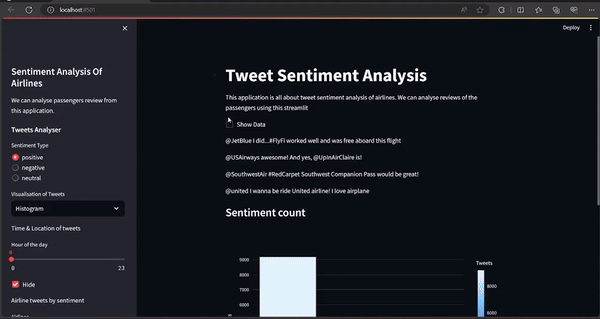
Output
Share your thoughts in the comments
Please Login to comment...