Treemap using Plotly in Python
Last Updated :
28 Jun, 2021
Plotly is a Python library that is used to design graphs, especially interactive graphs. It can plot various graphs and charts like histogram, barplot, boxplot, spreadplot, and many more. It is mainly used in data analysis as well as financial analysis. plotly is an interactive visualization library.
Treemap in Plotly
Treemap in plotly.express is convenient to use, high_ranking terminal to plotly, which accomplishes a variety of types of data and produces easy-to-style figures. A treemap provides a stratified view of data and makes it easy to blot the patterns. The tree branches are characterized by rectangles and each of the sub_branches is shown in a smaller rectangle.
Syntax: plotly.express.treemap(data_frame=None, names=None, values=None, parents=None, ids=None, path=None, color=None, color_continuous_scale=None, range_color=None, color_continuous_midpoint=None, color_discrete_sequence=None, color_discrete_map={}, hover_name=None, hover_data=None, custom_data=None, labels={}, title=None, template=None, width=None, height=None, branchvalues=None, maxdepth=None)
Parameters:
data_frame: This argument needs to be passed for column names (and not keyword names) to be used. Array-like and dict are transformed internally to a pandas DataFrame.
names: Either a name of a column in data_frame, or a pandas Series or array_like object. Values from this column or array_like are used as labels for sectors.
values: Either a name of a column in data_frame, or a pandas Series or array_like object. Values from this column or array_like are used to set values associated to sectors.
path: Either names of columns in data_frame, or pandas Series, or array_like objects List of columns names or columns of a rectangular dataframe defining the hierarchy of sectors, from root to leaves.
color: Either a name of a column in data_frame, or a pandas Series or array_like object. Values from this column or array_like are used to assign color to marks.
Example:
Python3
import plotly.express as px
fig = px.treemap(
names = ["A","B", "C", "D", "E"],
parents = ["", "A", "B", "C", "A"]
)
fig.show()
|
Output:

Plotting Treemap of a Hierarchical DataFrame
Rectangular data frames are often stored in Hierarchical form, in which the columns are different corresponding to different levels of the hierarchy. px.treemap can use path parameter which corresponding to a list of columns, but id and parent should be provided if the path is used already.
Example:
Python3
Python3
import plotly.express as px
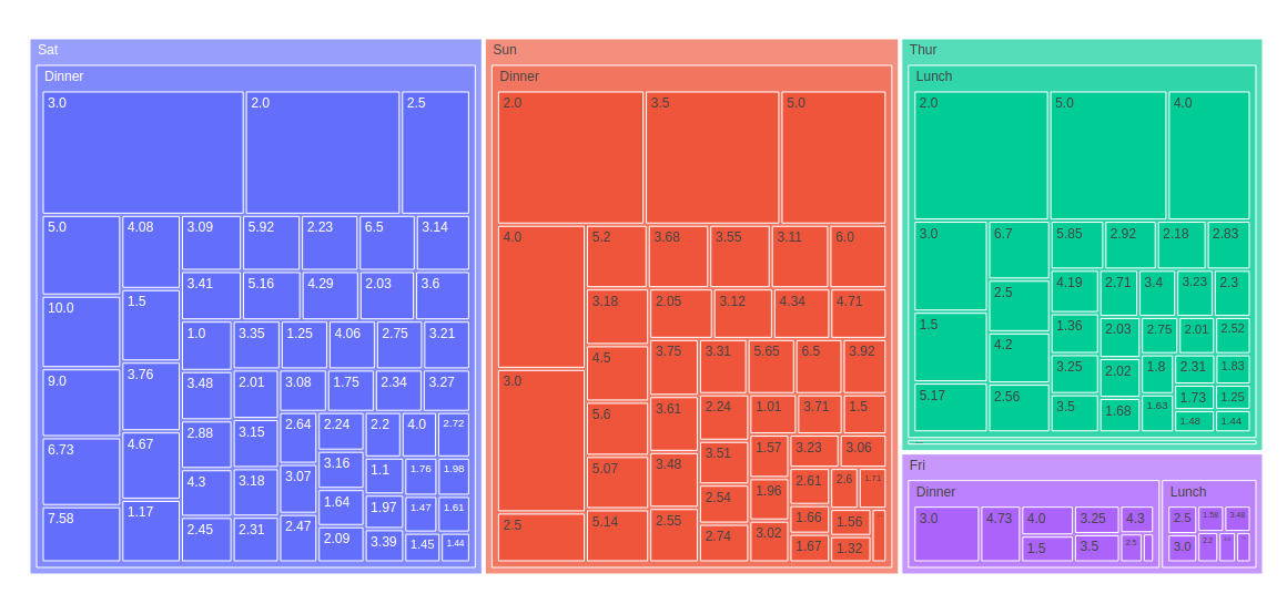
df = px.data.tips()
fig = px.treemap(df, path=['day', 'time', 'tip'],
values='total_bill')
fig.show()
|
Output:
Plotting Hierarchical dataframe with the continuous color argument
If the color argument are passed, the average of the color values of its children, weighted by their values should be computed by color of node.
Example:
Python3
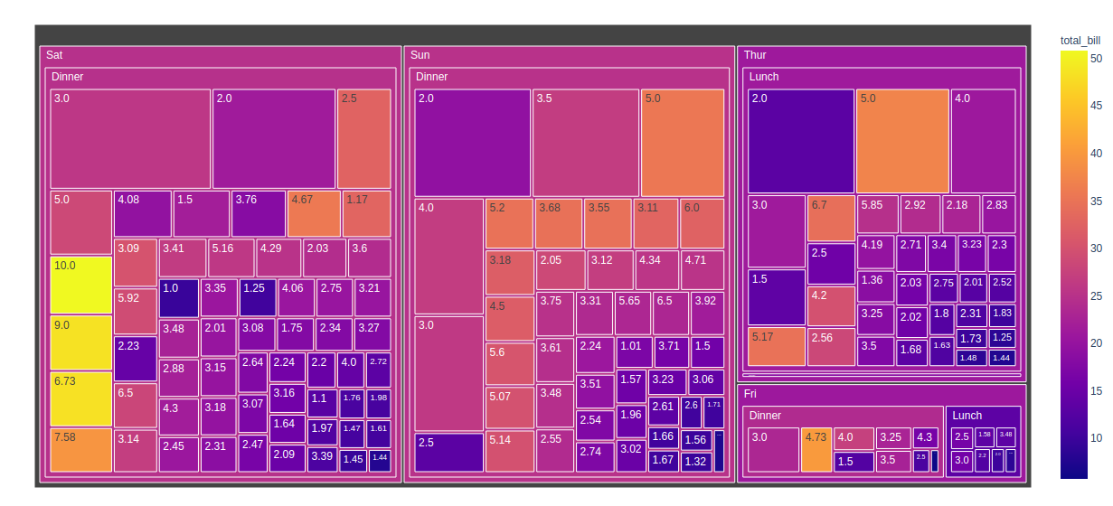
import plotly.express as px
df = px.data.tips()
fig = px.treemap(df, path=['day', 'time', 'tip'],
values='total_bill',
color='total_bill')
fig.show()
|
Output:
Plotting Hierarchical dataframe with the discrete color argument
When the non-numeric data corresponds with the color argument, then discrete color are used. If the value of the color column for all the sector is same, then the corresponding color are used, otherwise, the first color of discrete color in the sequence is used.
Example:
Python3
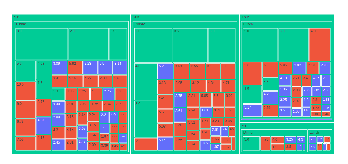
import plotly.express as px
df = px.data.tips()
fig = px.treemap(df, path=['day', 'time', 'tip'],
values='total_bill',
color='sex')
fig.show()
|
Output:
Share your thoughts in the comments
Please Login to comment...