Bubble chart using Plotly in Python
Last Updated :
03 Jul, 2020
Plotly is a Python library which is used to design graphs, especially interactive graphs. It can plot various graphs and charts like histogram, barplot, boxplot, spreadplot, and many more. It is mainly used in data analysis as well as financial analysis. Plotly is an interactive visualization library.
Bubble Chart
The bubble chart in Plotly is created using the scatter plot. It can be created using the scatter() method of plotly.express. A bubble chart is a data visualization which helps to displays multiple circles (bubbles) in a two-dimensional plot as same in scatter plot. A bubble chart is primarily used to depict and show relationships between numeric variables.
Example:
Python3
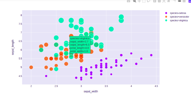
import plotly.express as px
df = px.data.iris()
fig = px.scatter(df, x="sepal_width", y="sepal_length",
color="species",
size='petal_length',
hover_data=['petal_width'])
fig.show()
|
Output:
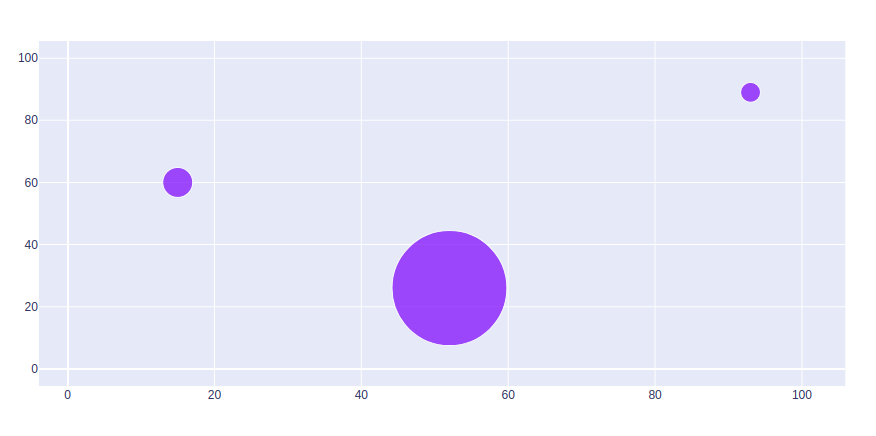
Set Marker Size
Marker size and color are used to control the overall size of the marker. Marker size helps to maintain the color inside the bubble in the graph. Scatter is used to actually scale the marker sizes and color based on data.
Example:
Python3
import plotly.graph_objects as px
import numpy as np
np.random.seed(42)
random_x= np.random.randint(1,101,100)
random_y= np.random.randint(1,101,100)
plot = px.Figure(data=[px.Scatter(
x = random_x,
y = random_y,
mode = 'markers',
marker_size = [115, 20, 30])
])
plot.show()
|
Output:
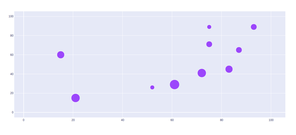
Scaling the Size of Bubble Charts
To scale the bubble size,use the parameter sizeref. To calculate the values of sizeref use:
sizeref = 2. * max(array of size values) / (desired maximum marker size ** 2)
Example:
Python3
import plotly.graph_objects as px
import numpy as np
np.random.seed(42)
random_x= np.random.randint(1,101,100)
random_y= np.random.randint(1,101,100)
size = [20, 40, 60, 80, 100, 80, 60, 40, 20, 40]
plot = px.Figure(data=[px.Scatter(
x = random_x,
y = random_y,
mode = 'markers',
marker=dict(
size=size,
sizemode='area',
sizeref=2.*max(size)/(40.**2),
sizemin=4
)
)])
plot.show()
|
Output:
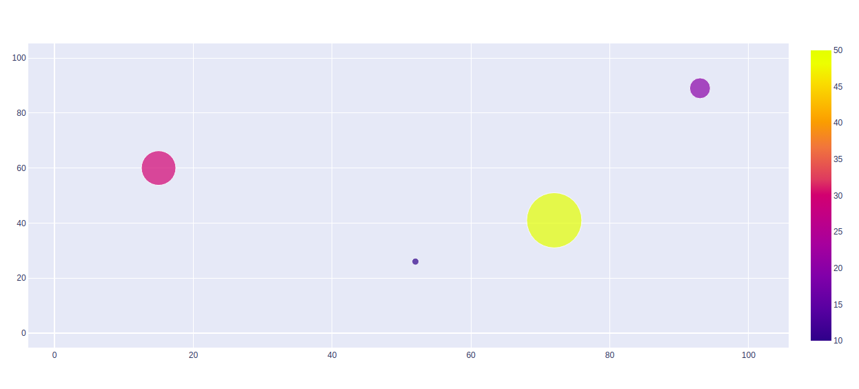
Showing Color scale
The color scale is a specialized label which helps to displays a color map with its scale, the color scale is used to display a color palette and its numerical scale for color mapped.
Example:
Python3
import plotly.graph_objects as px
import numpy as np
np.random.seed(42)
random_x= np.random.randint(1,101,100)
random_y= np.random.randint(1,101,100)
plot = px.Figure(data=[px.Scatter(
x = random_x,
y = random_y,
mode = 'markers',
marker=dict(
color = [10, 20, 30, 50],
size = [10, 30, 50, 80],
showscale=True
)
)])
plot.show()
|
Output:
Share your thoughts in the comments
Please Login to comment...