Tools to Automate EDA
Last Updated :
29 Jan, 2024
Exploratory Data Analysis (EDA) is a critical phase in the data analysis process, where analysts and data scientists examine and explore the characteristics and patterns within a dataset. In this article, We’ll learn how to automate this process with Python libraries.
Exploratory Data Analysis
EDA stands for Exploratory Data Analysis. With the help of various visualization methods and statistical tools, we analyze and visualize our data sets to discover any patterns, relationships, anomalies, and key insights that can help us in analysis or decision-making. It’s a comprehensive approach to understanding and summarizing the main characteristics of a dataset. We have three types of analysis. Let’s understand them one by one in-depth.
Univariate analysis
It involves the examination of a single variable in isolation like:
- Descriptive Statistics: We examine the mean, median, mode, and standard deviation of all the numerical columns of our data
- Data visualization: We Create visual representations of the individual data columns like histograms, box plots, bar charts, PDF or PMF (depending on the type of data), and summary data.
- Data Distribution Analysis: We Investigate the distribution of variables to understand their shape, skewness, and potential impact on analysis.
- Identify gaps in data: We identify issues with the data, such as missing values, outliers, or inconsistencies,
Bivariate analysis
It involves the examination of the relationship between two variables:
- Scatter Plots: Creating scatter plots to visualize the relationship between two numerical variables i.e how one affects the other
- Correlation Analysis: Calculating correlation coefficients (e.g., Pearson correlation) to quantify the strength and direction of the linear relationship between two numerical variables.
- Categorical Plots: Using visualizations like stacked bar charts or grouped bar charts to compare the distribution of a categorical variable across different levels of another variable.
- Contingency Tables: Constructing contingency tables to show the frequency distribution of two categorical variables.
- Heatmaps: Creating heatmaps to visualize the intensity of the relationship between two numerical variables.
Multivariate Analysis
Beyond univariate and bivariate analysis, EDA may also incorporate multivariate techniques when exploring relationships involving more than two variables like:
- Dimensionality reduction techniques like Principal Component Analysis (PCA)
- Clustering methods to group observations based on patterns in multiple variables.
If we perform EDA manually we generally need to write lot of code for each type of analysis. Automatic Exploratory Data Analysis (Auto EDA) refers to the use of pre built libraries in python to perform the initial stages of eda. This greatly reduces manual effort. With only few lines of code we can generate the detailed analysis and concise summary of the main characteristics of a dataset .
Advantages of Automating EDA
- By automating repetitive tasks, Automated EDA tools can save a significant amount of time compared to manually creating visualizations and summary statistics so that analyst/data scientist can devote more of their time on gaining insights from data.
- Automated EDA produces well-formatted reports that can be easily shared with team members, stakeholders, or collaborators. This enhances communication and collaboration.
- Some automated EDA tools offer interactive interfaces that allow users to explore data dynamically. This can be particularly useful for gaining a deeper understanding of the data.
- Automated eda can help analysts discover patterns, trends, and outliers in the data more effectively.
Python Libraries for Exploratory Data Analysis
There are many such libraries available. We will explore the most popular of them namely
- Ydata profiling (previously known as pandas profiling)
- AutoViz
- SweetViz
- Dataprep
- D-tale
Before exploring this libraries let us look at the dataset that we will use as an example to use this libraries.
Throughout this article, we will be using the Titanic dataset. The Titanic dataset is a well-known dataset in the field of data science and machine learning. It contains information about passengers on the Titanic, including whether they survived or not.
Python3
import pandas as pd
df = pd.read_csv("/content/train.csv")
|
1. Ydata-Profiling
The capabilities of ydata-profiling package are :
- Type Inference: Automatically detects the data types of columns in a dataset, classifying them as Categorical, Numerical, Date, etc. This is crucial for understanding the nature of the variables in the dataset.
- Warnings: Provides a summary of potential problems or challenges in the data. This can include issues such as missing data, inaccuracies, skewness, and other anomalies that might need attention during data cleaning or preprocessing.
- Univariate Analysis: Performs analysis on individual variables, including descriptive statistics such as mean, median, mode, etc. Visualizations like distribution histograms are generated to help understand the distribution of values within each variable.
- Multivariate Analysis: Analyzes relationships and interactions between multiple variables. This includes correlations, detailed analysis of missing data, identification of duplicate rows, and visualizations supporting pairwise interactions between variables.
- Time–Series Analysis: Provides statistical information specific to time-dependent data. This may include auto-correlation, seasonality analysis, and plots like ACF (AutoCorrelation Function) and PACF (Partial AutoCorrelation Function).
- Text Analysis: Analyzes text data, including common categories like uppercase, lowercase, separator usage, and script detection (e.g., Latin, Cyrillic). It may also identify text blocks (e.g., ASCII, Cyrillic).
- File and Image Analysis: Analyzes file and image data, providing information such as file sizes, creation dates, dimensions of images, indications of truncated images, and existence of EXIF metadata in images.
- Compare Datasets: Offers a one-line solution to enable a fast and comprehensive report on the comparison of two datasets. This can be useful for identifying differences between datasets.
- Flexible Output Formats: Allows exporting the analysis in different formats, including an HTML report for easy sharing, JSON for integration into automated systems, and a widget for embedding in Jupyter Notebooks.
The report generated by the tool typically contains three additional sections:
- Overview: Global details about the dataset, such as the number of records, variables, overall missingness, duplicates, and memory footprint.
- Alerts: A comprehensive and automatic list of potential data quality issues, ranging from high correlation and skewness to uniformity, zeros, missing values, constant values, and more.
- Reproduction: Technical details about the analysis, including the time of analysis, version information, and configuration settings.
Install the library
!pip install ydata-profiling
Implementation
- The ‘ProfileReport’ class from ydata_profiling is used to create an EDA report for the provided DataFrame (df). This report includes various statistical information, visualizations, and insights about the dataset.
- The ‘to_file’ method is called on the profile object, and it saves the generated EDA report as an HTML file named ‘eda_report.html’. This file will contain a comprehensive analysis of the dataset, including information on data types, missing values, descriptive statistics, and visualizations
- After executing this code, you can open the ‘eda_report.html’ file in a web browser to explore the EDA report interactively.
Python3
import ydata_profiling as yp
profile = yp.ProfileReport(df)
profile.to_notebook_iframe()
profile.to_file('eda_report.html')
|
Output:
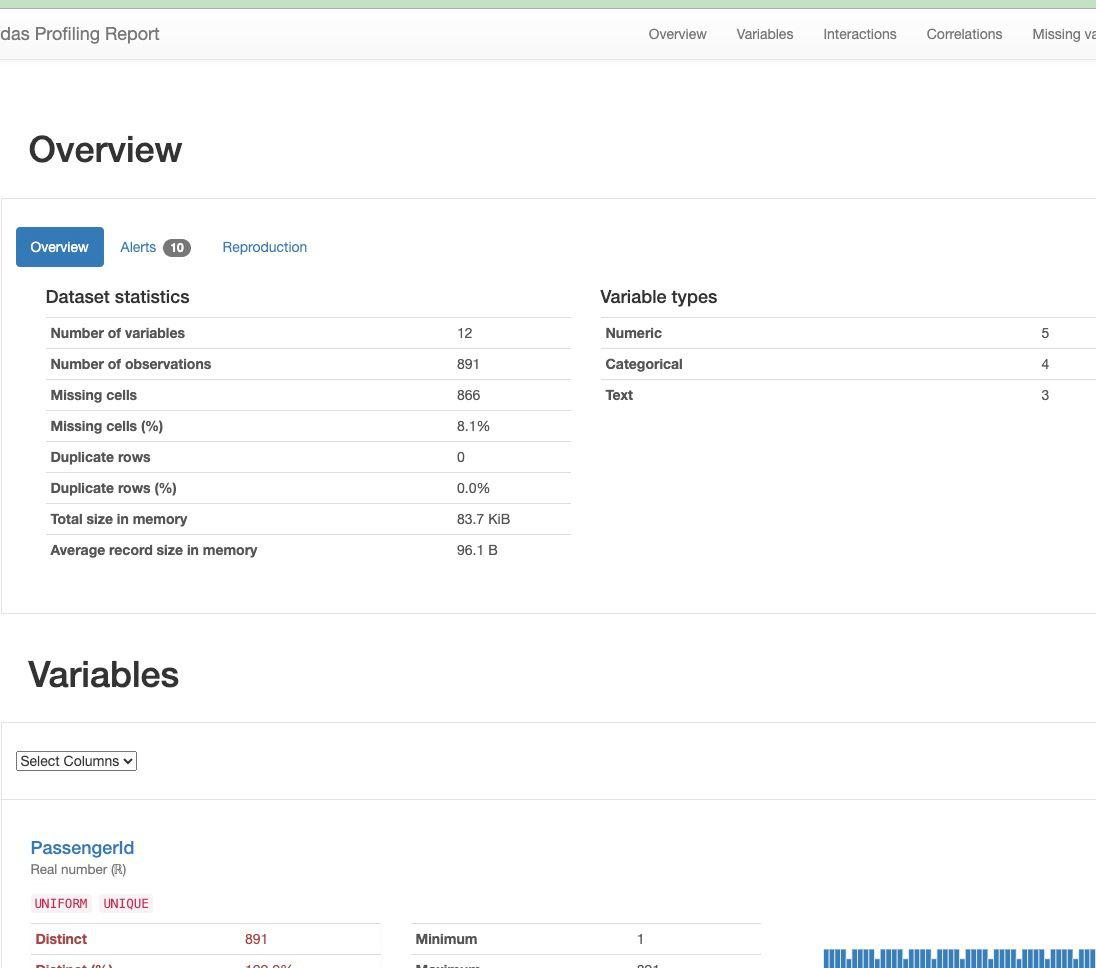
Output of data profiling
2. AutoViz
AutoViz provides a rapid visual snapshot of the data. It’s built on top of Matplotlib and Seaborn, and it can quickly generate various charts and graphs. It provides below visuzlation
- Pairwise scatter plot of all continuous variables
- Histograms and Box plots of continous varaibles
- Bar graphs of countinous variable by each categorical variable
- Heatmap of continuous variables
- Word count for categorical variables
Install the library
!pip install autoviz
Implementation
We use the auto viz library to generate graphs as below.
The ‘AV.AutoViz()’ method in AutoViz offers several customizable arguments for streamlined data visualization:
- filename: Specifies the file name (CSV, txt, or JSON) associated with the dataset. Use an empty string (“”) if no filename is present and you intend to use a dataframe. Use either this argument or the dfte argument, not both.
- sep: Defines the file separator (e.g., comma, semi-colon, tab) if a filename is provided.
- verbose: Controls the level of information and chart display. Use 0 for minimal info and charts, 1 for more info and charts, or 2 for saving charts locally without display.
- dfte: Refers to the name of the pandas dataframe for plotting charts. Keep it as an empty string if using a filename.
- chart_format: Determines the format for displaying or saving charts. Options include ‘svg’, ‘png’, ‘jpg’, ‘bokeh’, ‘server’, or ‘html’ based on the verbose option.
- For ‘png’, ‘svg’, or ‘jpg’, Matplotlib charts are generated inline and can be saved locally or displayed in Jupyter Notebooks (default behavior).
- For ‘bokeh’, interactive Bokeh charts are produced within Jupyter Notebooks.
- With ‘server’, dashboards appear in the browser for each chart type.
- Choosing ‘html’ results in the creation of interactive Bokeh charts saved as HTML files in the AutoViz_Plots directory (default) or a specified directory using the save_plot_dir setting
- max_rows_analyzed: Limits the maximum number of rows used for visualization, especially useful for very large datasets (millions of rows). AutoViz will use a statistically valid sample. The default is 150,000 rows.
- max_cols_analyzed: Restricts the number of continuous variables to be analyzed. The default is 30 columns.
- save_plot_dir: Specifies the directory for saving plots. The default is None, saving plots under the current directory in a subfolder named AutoViz_Plots. If the specified directory doesn’t exist, it will be created.
Python3
from autoviz import AutoViz_Class
%matplotlib inline
AV = AutoViz_Class()
filename = "/content/train.csv"
target_variable = "Survived"
dft = AV.AutoViz(
filename,
sep=",",
depVar=target_variable,
dfte=None,
header=0,
verbose=1,
lowess=False,
chart_format="svg",
max_rows_analyzed=150000,
max_cols_analyzed=30,
save_plot_dir="/content/"
)
|
Output:
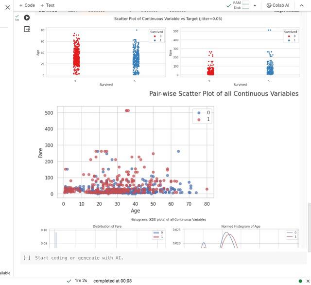
Output of Autoviz library
3. Sweetivz
The library is mainly known for visualizing target values and comparing datasets. It is good tool for comparing different dataset like the train and test or different parts of the same dataset like (dataset divided into two categories based on a categorical feature like gender)
Key features of this library are :
- Investigates the relationship between a target value (e.g., “Survived” in the Titanic dataset) and other features.
- Visualization and Comparison: Visualizes and compares the target variable with various features to uncover patterns, trends, and associations.
- Distinct Datasets:Allows comparison between distinct datasets, such as training and test data, to assess consistency or differences in target-related characteristics.
- Intra-set Characteristics: Analyzes intra-set characteristics, like comparing the target variable across different groups (e.g., male versus female) within the dataset.
- Summary Information: Provides summary information for each feature, including its type, unique values, missing values, duplicate rows, and most frequent values.
Install the library
!pip install sweetviz
Implementation
Let us use this library to compare two subsets of our data frame(male vs female).
- Here, a FeatureConfig object is created to configure how Sweetviz analyzes features. In this specific configuration:
- The feature with the name “PassengerId” will be skipped during the analysis.
- The feature “Age” will be treated as a text feature (force_text), which means Sweetviz will consider it as a categorical feature rather than a numerical one.
- The compare_intra function is used to generate a comparative analysis report. Here’s a breakdown of the parameters:
- df: The pandas DataFrame that you want to analyze.
- df[“Sex”] == “male”: This is a condition that splits the dataset into two groups based on the “Sex” column, where the value is “male.”
- [“Male”, “Female”]: The names assigned to the two groups created by the condition.
- “Survived”: The target variable for the analysis.
- feature_config: The configuration object created earlier.
Python3
import sweetviz as sv
feature_config = sv.FeatureConfig(skip="PassengerId", force_text=["Age"])
my_report = sv.compare_intra(df, df["Sex"] == "male", ["Male", "Female"], "Survived", feature_config)
my_report.show_notebook()
my_report.show_html()
|
Output:
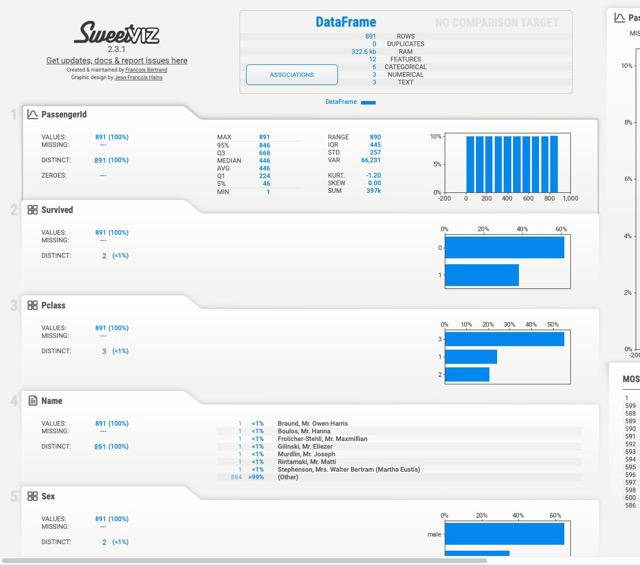
Sweetiviz Output
4. Data Prep
Notable feature of DataPrep that makes this library standout is its visualizations has insight notes and are interactive unlike static visualization of data profiling. Other key features
- Data Collection:The library facilitates the collection of data from multiple sources using the dataprep.connector module, streamlining the process of obtaining data from various locations.
- Exploratory Data Analysis (EDA): Through the dataprep.eda module, DataPrep supports in-depth exploratory data analysis, allowing users to uncover insights, identify missing data, and generate statistical summaries quickly.
- Data Cleaning and Standardization: The dataprep.clean module helps clean and standardize datasets efficiently. It provides functions for handling missing values, duplicates, and other data quality issues.
- Automatic Insight Detection: DataPrep automatically detects and highlights insights within the data, including missing data, distinct count, and various statistical measures.
- Quick Profile Reports: The library enables the creation of detailed profile reports with a single line of code. This streamlined process makes DataPrep up to ten times faster compared to other libraries for data preparation and exploratory data analysis.
- Efficient Data Profiling: Users can generate comprehensive profile reports that include information on data types, unique values, missing values, duplicates, and statistical metrics, providing a holistic view of the dataset.
NOTE: restart runtime session before executing the code
Install the library
!pip install dataprep
Implementation
- Generating EDA Report: The create_report function is called with the DataFrame df as its argument. This DataFrame is the dataset for which the EDA report will be generated.
- Report Generation:The function processes the provided DataFrame and automatically creates a detailed exploratory data analysis report. This report typically includes visualizations, statistical summaries, and insights into various aspects of the dataset, such as data types, distributions, missing values, and correlations.
- Displaying the Report:Depending on the environment in which the code is executed (e.g., Jupyter Notebook or a Python script), the report may be displayed interactively or saved as an HTML file for later review.
Python3
from dataprep.eda import create_report
create_report(df)
|
Output:
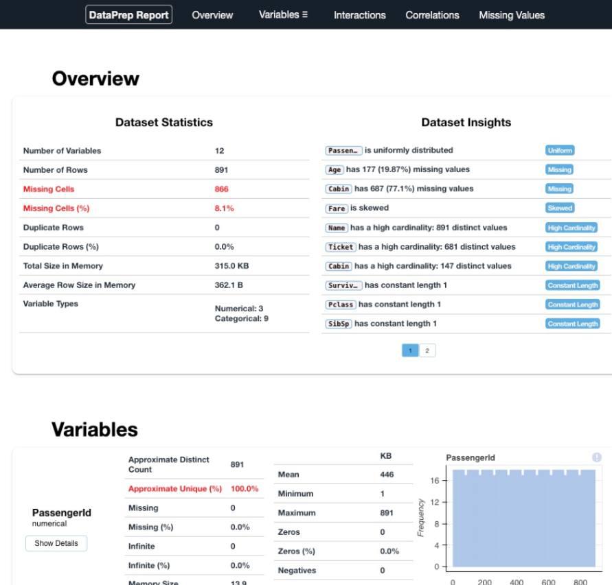
DataPrep Output
5. D-Tale
The key feature of D_tale is that users can interact with the dtale interface to explore the dataset dynamically. The interface typically includes features like filtering, sorting, and visualizations, providing a user-friendly environment for data exploration.
NOTE: dtale link does not work in colab
run below code in local machine , ensure that df is loaded with train.csv before running code
Install the library
!pip install dtale
Implementation
- Generating Interactive EDA Interface: The show function from the dtale library is called with the DataFrame df as its argument. This function initiates the process of creating an interactive web-based interface for exploratory data analysis.
- Interactive EDA Interface:When executed, the code launches a web browser window displaying an interactive dashboard provided by dtale. This dashboard allows users to explore and analyze various aspects of the dataset, including visualizations, statistical summaries, and other EDA features.
Python3
import dtale
dtale.show(df)
|
Output :
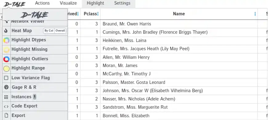
D-Tale
Comparing Data Exploration Libraries
Each of the library discussed above brings something unique. Lets discuss them.
- YData Profiling (previously known as Pandas Profiling):
- Comprehensive HTML reports with type inference, warnings, univariate analysis, bivariate analysis, time-series analysis, text analysis, file, and image analysis.
- Overview, alerts, and reproduction sections in the report.
- Offers flexible output formats.
- AutoViz
- Automatic visualization of data with minimal code.
- Generates a variety of charts and graphs
- AutoViz is designed for quick inline visualization in Jupyter Notebooks
- Sweetviz
- If you specifically need to compare two datasets or focus on the relationship with a target variable, Sweetviz’s target analysis offers a holistic exploration of how the chosen target variable interacts with the rest of the dataset
- Dataprep:
- DaraPrep has interactive visualizations, which provide users with more insights about the dataset they are analyzing.
- dataprep.eda module, can be up to 10 times faster than Pandas-based profiling tools. This speed boost is attributed to the library’s highly optimized Dask-based computing module, improving efficiency in data analysis tasks.
- DataPrep’s design supports an integrated pipeline approach, allowing users to seamlessly transition between different stages of the data analysis process. From data connection to exploratory analysis and data cleaning, the library provides a cohesive and efficient workflow.
- Dtale
- Dtale provides an interactive web-based interface for exploring and visualizing data.
- This interface simplifies and enhances the process of data analysis, offering users an intuitive platform to interactively investigate and visualize various aspects of their datasets.
Conclusion
We saw some of the libraries that can automate the task of EDA in few lines of code. They are many more available . One must choose the library that best fits the needs and preferences. Keep in mind that while automation tools can provide a quick overview, manual inspection and domain knowledge are still essential for a thorough understanding of the data.
Share your thoughts in the comments
Please Login to comment...