Tips for styling React apps in JavaScript
Last Updated :
01 Jan, 2024
Although many developers continue to employ CSS for styling their React applications, there is a growing trend in using JavaScript to write styles. This approach has gained popularity as it provides the conveniences of CSS preprocessors without requiring mastery of a new language.
Within CSS-in-JS libraries, a prevalent technique entails creating a JavaScript object for specifying styles. For instance, in the case of my preferred library, Aphrodite, the construction of a style object adheres to this particular methodology.
const styles = StyleSheet.create({
    container: {
        position: 'absolute',
        width: 60,
        height: 40,
    },
)}
The following tips will be discussed to style React app using JavaScript
Using Variables:
Many of the best practices established in SASS/LESS workflows remain applicable when working with JavaScript styles. Utilizing variables to store constants like colors and fonts is a beneficial practice, ensuring their uniform application across the codebase. For example:
// colors
const BLUE = '#3498db';
// fonts
const ITALIC = 'italic';
const ARIAL = 'Arial, sans-serif';
// shared constants
const boxShadow = `2px 2px 2px ${BLUE}`;
const styles = StyleSheet.create({
  textBox: {
    color: BLUE,
    fontStyle: ITALIC,
    fontFamily: ARIAL,
    boxShadow,
  },
)}
The use of the object literal shorthand notation in the provided example leverages the convenience of new ES6 language features for cleanly sharing styles, particularly evident in the reference to the `boxShadow` property.
Use of JS objects in place of mixins:
The utilization of the spread operator (…) proves highly beneficial when establishing a frequently employed set of styles, as demonstrated in this example where it is employed to encapsulate the rules necessary for appending an ellipsis to overflowing text.
const textShadow = {
  textShadow: '2px 2px 2px rgba(0, 0, 0, 0.5)',
  lineHeight: '1.5',
  letterSpacing: '1px',
  color: 'white',
};
const styles = StyleSheet.create({
  textBox: {
    ...textShadow,
    backgroundColor: 'darkblue',
  },
)};
Making functions that help with complicated designs.
Complex sets of styling rules can be encapsulated within helper functions for improved abstraction. As an illustration, when dealing with the styling of placeholder text, a function is employed to yield an object containing the relevant styles.
// colors
const BLUE = '#3498db';
const getPlaceholderStyles = obj => ({
  '::-webkit-input-placeholder': obj,
  '::-moz-placeholder': obj,
  ':-ms-input-placeholder': obj,
  ':-moz-placeholder': obj,
  ':placeholder': obj,
});
const styles = StyleSheet.create({
  input: getPlaceholderStyles({ color: BLUE }),
});
Implementing the Styling of React Apps in JavaScript
Steps to Create React Application:
Step 1: Create a react application by using this command
npx create-react-app myapp
Step 2: After creating your project folder, i.e. myapp, use the following command to navigate to it:
cd myapp
Step 3: Installing the Required the packages:
npm install styled-components
Project Structure:
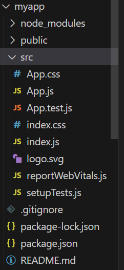
Project Structure
The updated dependencies in package.json file will look like:
"dependencies": {
    "react": "^18.2.0",
    "react-dom": "^18.2.0",
    "react-scripts": "5.0.1",
    "styled-components": "^6.1.1",
    "web-vitals": "^2.1.4",
}
Example: Below is the code example of styling react app using react styled-components.
Javascript
import React from "react";
import styled from "styled-components";
const StyledDiv = styled.div`
color: #333;
font-size: 16px;
margin: auto;
padding: 20px;
background-color: #f2d1f0;
margin-top: 10px;
text-align: center;
width: 50vw;
height: 15vh;
border: 2px solid #bf9b9b;
border-radius: 5px;
`;
const StyledComponentExample = () => {
return <StyledDiv>This is a styled component in a React app.</StyledDiv>;
};
export default StyledComponentExample;
|
Output:
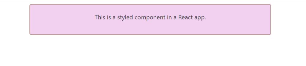
Output
Share your thoughts in the comments
Please Login to comment...