Stacked area chart with R
Last Updated :
26 Mar, 2024
Area Charts are the filled regions between two series that share common areas. A stacked area chart is easily understandable if you know the area chart. In R Programming Language this Stacked area chart displays the evolution of the cost/value of several groups on the same plot. The values of each group are displayed on top of every other. Using a Stacked area chart we can analyze the total numerical value of variables present in each group section-wise and the importance of each group.
R uses the function geom_area() to create Stacked area charts.
Syntax: ggplot(Data, aes(x=x_variable, y=y_variable, fill=group_variable)) + geom_area()
Parameters:
- Data: This parameter contains whole dataset which are used in stacked-area chart.
- x: This parameter contains numerical value of variable for x axis in stacked-area chart.
- y: This parameter contains numerical value of variables for y axis in stacked-area chart.
- fill: This parameter contains group column of Data which is mainly used for analyse in stacked-area chart.
Creating a basic Stacked area chart
Step 1: Import Packages
R
library(ggplot2)
library(dplyr)
library(tidyverse)
Step 2: Create Dataset
In the Group column, Four Direction is replicated 4 times. Year column, the sequence is generated from 2017 to 2020, each 4 times. Price column, generated by runif(n, min, max) function.
R
group <- rep(c("NORTH","SOUTH","EAST","WEST"),times=4)
year <- as.numeric(rep(seq(2017,2020),each=4))
price <- runif(16, 50, 100)

data <- data.frame(year, price, group)
data
Output:
   year    price group
1  2017 56.76171 NORTH
2  2017 71.79472 SOUTH
3  2017 61.76387  EAST
4  2017 85.14322  WEST
5  2018 86.03499 NORTH
6  2018 70.49531 SOUTH
7  2018 77.26497  EAST
8  2018 57.61432  WEST
9  2019 86.39476 NORTH
10 2019 77.41802 SOUTH
11 2019 99.03071  EAST
12 2019 62.08326  WEST
13 2020 57.90093 NORTH
14 2020 65.38019 SOUTH
15 2020 86.11634  EAST
16 2020 88.98761  WEST
Step 3: Plot the Data
R
ggplot(data, aes(x=year, y=price, fill=group)) + geom_area()
Output:
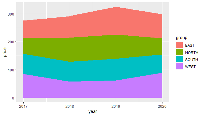
Stacked area chart with R
Percentage stacked area chart
In the basic stacked-area chart, if we interested in the relative interest of each group, then we can draw a percentage stacked-area chart. This plot will normalize our data then plot. This can be done using dplyr library.
Step 1: Calculate the percentage
R
library(dplyr)

data <- data %>%
  group_by(year, group) %>%
  summarise(n = sum(price)) %>%
  mutate(percentage = n / sum(n))
Output:
A tibble: 16 × 4
Groups:   year [4]
    year group     n percentage
   <dbl> <chr> <dbl>      <dbl>
 1  2017 EAST   61.8      0.224
 2  2017 NORTH  56.8      0.206
 3  2017 SOUTH  71.8      0.261
 4  2017 WEST   85.1      0.309
 5  2018 EAST   77.3      0.265
 6  2018 NORTH  86.0      0.295
 7  2018 SOUTH  70.5      0.242
 8  2018 WEST   57.6      0.198
 9  2019 EAST   99.0      0.305
10  2019 NORTH  86.4      0.266
11  2019 SOUTH  77.4      0.238
12  2019 WEST   62.1      0.191
13  2020 EAST   86.1      0.289
14  2020 NORTH  57.9      0.194
15  2020 SOUTH  65.4      0.219
16  2020 WEST   89.0      0.298
Step 2: Plot data
We can add color in a plot by Viridis library, Title by ggtitle, and theme_ipsum of the hrbrthemes package
R
library(viridis)
library(hrbrthemes)

ggplot(data, aes(x=year, y=percentage, fill=group)) + geom_area(alpha=0.8 , size=.5,
                          colour="white") +scale_fill_viridis(discrete = T) +theme_ipsum()+
ggtitle("Percentage Stacked-Area Plot")
Output:
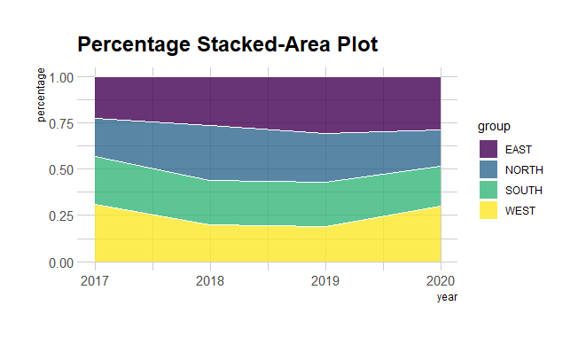
Stacked area chart with R
Stacked Area Chart with Smooth Lines
Adds smooth lines for each group. The aes(group = group) ensures that separate lines are drawn for each group, and size = 1 sets the line thickness.
R
library(ggplot2)

ggplot(data, aes(x = year, y = percentage, fill = group)) +
  geom_area(alpha = 0.7) +
  geom_line(aes(group = group), size = 1) +
  labs(title = "Stacked Area Chart with Smooth Lines",
       x = "Year",
       y = "Percentage") +
  theme_minimal()
Output:

Stacked area chart with R
Stacked Area Chart with Percentage Labels
R
library(ggplot2)

ggplot(data, aes(x = year, y = percentage, fill = group)) +
  geom_area(alpha = 0.7) +
  geom_text(aes(label = scales::percent(percentage, scale = 1)),
            position = "stack", vjust = 1) +
  labs(title = "Stacked Area Chart with Percentage Labels",
       x = "Year",
       y = "Percentage") +
  theme_minimal()
Output:

Stacked area chart with R
geom_text: Adds text labels on the stacked areas, displaying the percentage values. scales::percent is used to format the percentages, and position = "stack" ensures proper placement of labels.
Conclusion
The stacked area chart created using the provided dataset serves as a powerful visual tool for understanding the distribution of contributions from different groups over the years. This type of chart excels in conveying both the overall trends and the individual contributions of each group to the total.
Share your thoughts in the comments
Please Login to comment...