How to Create a Stacked Dot Plot in R ?
Last Updated :
29 Nov, 2022
A stacked dotplot is a type of plot that displays frequencies using dots, piled one over the other. Mainly 2 methods are there, to make a stacked dot plot and both of them are discussed in this article.
Method 1: Using stripchart()
So, using the first method, stripchart method, to create our stacked dot plot. For instance, if we don’t have a set of values, we can even make them, serve our purpose. We would create a set of values that would contain numbers ranging from 0 to 30, including both the ranges too, i.e., the set of values would also include 0 and 30. After creating the set of values, we would plot our stacked dotplot based on those values. We would use the function set.seed(), to reproduce a particular sequence of ‘random’ numbers. stripchart produces one-dimensional scatter plots (or dot plots) of the given data.
Syntax: stripchart(x, …)
Example:
R
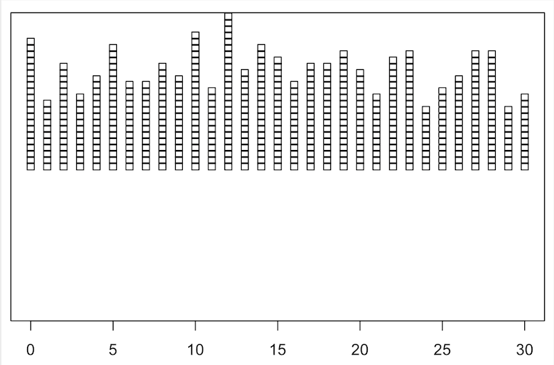
set.seed(0)
data <- sample(0:30, 500, replace = TRUE)
stripchart(data, method = "stack")
|
Output:
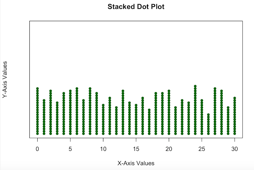
But, the dot plot which we made, is not so pleasing, like the whole stacked dotplot is somewhat above the X-axis, so now we are going to edit it a bit, to make it look more interesting.
Example:
R
set.seed(0)
data <- sample(0:30, 500, replace = TRUE)
stripchart(data, method = "stack", at = 0,
pch = 16, col = "darkgreen",
main = "Stacked Dot Plot",
xlab = "X-Axis Values",
ylab = "Y-Axis Values")
|
Output:
Method 2: Using geom_dotplot()
In a dot plot, the width of a dot corresponds to the bin width (or maximum width, depending on the binning algorithm), and dots are stacked, with each dot representing one observation.
Syntax: geom_dotplot()
Parameter:
- dotsize: The diameter of the dots relative to binwidth, default 1.
- stackratio: how close to stack the dots. Default is 1, where dots just touch. Use smaller values for closer, overlapping dots.
- fill: interior colour of the dots in the stack.
- color: exterior outline colour of the dots in the stack
Example:
R
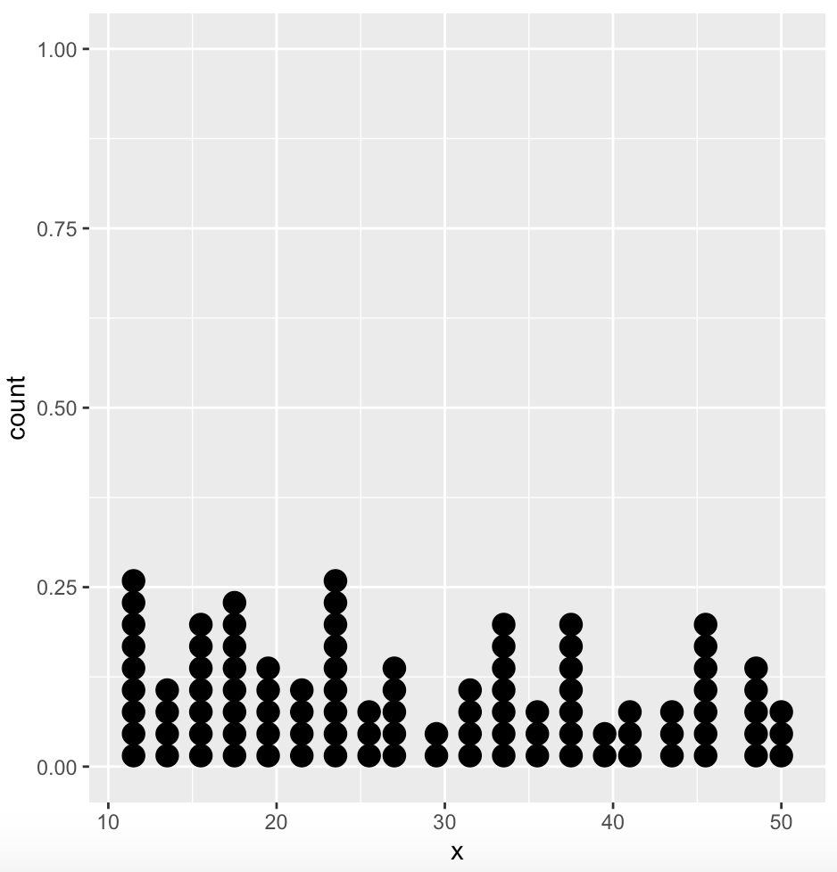
require(ggplot2)
set.seed(0)
data <- data.frame(x = sample(10:50, 100, replace = TRUE))
ggplot(data, aes(x = x)) + geom_dotplot()
|
Output:
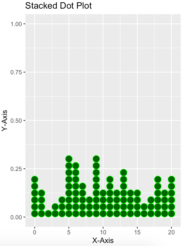
Again, for this one too, we can make it a bit more interesting, adding some more parameters.
Example:
R
library(ggplot2)
set.seed(0)
data <- data.frame(x = sample(0:20, 100, replace = TRUE))
ggplot(data, aes(x = x)) +
geom_dotplot(dotsize = 1.5, stackratio = 1,
fill = "darkgreen", color = "green") +
labs(title = "Stacked Dot Plot", x = "X-Axis", y = "Y-Axis")
|
Output:
Share your thoughts in the comments
Please Login to comment...