Stacked Bar Chart in R
Last Updated :
17 Feb, 2021
A stacked bar chart extends the standard bar chart from looking at numeric values across one categorical variable to two. Each bar in a standard bar chart is divided into a number of sub-bars stacked end to end, each one corresponding to a level of the second categorical variable. This article discusses how one can be created using R.
The function used here to create a stacked bar chart is barplot().
Syntax: barplot(H,xlab,ylab,main, names.arg,col)
Parameters:
- H: is a vector or matrix containing numeric values used in a bar chart.
- xlab: is the label for the x-axis.
- ylab: is the label for the y-axis.
- main: is the title of the bar chart.
- names.arg: is a vector of names appearing under each bar.
- col: is used to give colors to the bars in the graph.
Returns: a barplot.
Approach
- Create data
- Pass the data to the barplot() function
- Pass appropriate arguments to the function
- Display plot
Example:
R
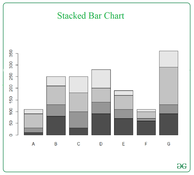
dat <- read.table(text = "A B C D E F G
1 10 80 30 90 70 60 90
2 20 50 70 50 40 10 40
3 60 80 80 60 60 30 160
4 20 40 70 80 20 10 70", header = TRUE)
barplot(as.matrix(dat))
|
Output:
Example 2:
R
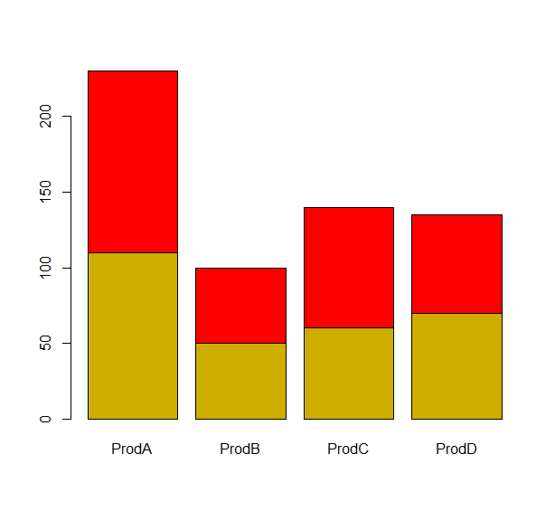
dat <- read.table(text ="ProdA ProdB ProdC ProdD
1 110 50 60 70
2 120 50 80 65", header= TRUE)
barplot(as.matrix(dat),col=c("gold3","red"))
|
Output:
Like Article
Suggest improvement
Share your thoughts in the comments
Please Login to comment...