ReactJS UI Ant Design Tree Component
Last Updated :
01 Jun, 2021
Ant Design Library has this component pre-built, and it is very easy to integrate as well. Tree Component is used for a hierarchical list structure component. We can use the following approach in ReactJS to use the Ant Design Tree Component.
Tree Props:
- allowDrop: It is used to indicate whether to allow dropping on the node or not.
- autoExpandParent: It is used to indicate whether to automatically expand a parent treeNode or not.
- blockNode: It is used to indicate whether treeNode fills the remaining horizontal space or not.
- checkable: It is used to add a Checkbox before the treeNodes.
- checkedKeys: It is used to specify the keys of the checked treeNodes.
- checkStrictly: It is used to check the treeNode precisely.
- defaultCheckedKeys: It is used to specify the keys of the default checked treeNodes.
- defaultExpandAll: It is used to indicate whether to expand all treeNodes by default or not.
- defaultExpandedKeys: It is used to specify the keys of the default expanded treeNodes.
- defaultExpandParent: It is used to denote whether to auto-expand the parent treeNodes or not.
- defaultSelectedKeys: It is used to specify the keys of the default selected treeNodes.
- disabled: It is used to indicate whether disabled the tree or not.
- draggable: It is used to specify whether this Tree or the node is draggable or not.
- expandedKeys: It is used to specify the keys of the expanded treeNodes.
- filterTreeNode: It is used to define a function to filter treeNodes.
- height: It is used to define the Config virtual scroll height.
- icon: It is used to customize the treeNode icon.
- loadData: It is used to load data asynchronously.
- loadedKeys: It is used to set loaded tree nodes.
- multiple: It is used to enable selecting multiple treeNodes.
- selectable: It is used to indicate whether it can be selected or not.
- selectedKeys: It is used to specify the keys of the selected treeNodes.
- showIcon: It is used to show the icon before a treeNode’s title.
- showLine: It is used to show a connecting line.
- switcherIcon: It is used to customize the collapse/expand icon of the tree node.
- titleRender: It is used to customize the tree node title render.
- treeData: It is used to denote the treeNodes data Array.
- virtual: It is used to disable virtual scroll when this is set to false.
- onCheck: It is a callback function that is triggered when the onCheck event occurs.
- onDragEnd: It is a callback function that is triggered when the onDragEnd event occurs.
- onDragEnter: It is a callback function that is triggered when the onDragEnter event occurs.
- onDragLeave: It is a callback function that is triggered when the onDragLeave event occurs.
- onDragOver: It is a callback function that is triggered when the onDragOver event occurs.
- onDragStart: It is a callback function that is triggered when the onDragStart event occurs.
- onDrop: It is a callback function that is triggered when the onDrop event occurs.
- onExpand: It is a callback function that is triggered a treeNode is expanded or collapsed.
- onLoad: It is a callback function that is triggered when a treeNode is loaded.
- onRightClick: It is a callback function that is triggered when the user right-clicks a treeNode.
- onSelect: It is a callback function that is triggered when the user clicks a treeNode.
TreeNode Props:
- checkable: It is used to denote whether Tree is checkable or not.
- disableCheckbox: It is used to disable the checkbox of the treeNode.
- disabled: It is used to disable the treeNode.
- icon: It is used for the customize icon.
- isLeaf: It is used to determine if this is a leaf node or not.
- key: It is used for the unique identifier for the treeNode.
- selectable: It is used to set whether the treeNode can be selected or not.
- title: It is used to denote the Title for the treeNode.
DirectoryTree Props:
- expandAction: It is used to denote the directory open logic.
Tree Methods:
- scrollTo(): This method is used to scroll to key items in the virtual scroll.
Creating React Application And Installing Module:
-
Step 1: Create a React application using the following command:
npx create-react-app foldername
-
Step 2: After creating your project folder i.e. foldername, move to it using the following command:
cd foldername
-
Step 3: After creating the ReactJS application, Install the required module using the following command:
npm install antd
Project Structure: It will look like the following.

Project Structure
Example: Now write down the following code in the App.js file. Here, App is our default component where we have written our code.
App.js
import React from 'react'
import "antd/dist/antd.css";
import { Tree } from 'antd';
const treeData = [
{
title: 'TreeMain',
key: 'TreeMain',
children: [
{
title: 'ParentLeaf',
key: 'ParentLeaf',
children: [
{
title: 'ChildLeaf1',
key: 'ChildLeaf1',
},
{
title: 'ChildLeaf2',
key: 'ChildLeaf2',
},
],
},
],
},
];
export default function App() {
return (
<div style={{
display: 'block', width: 700, padding: 30
}}>
<h4>ReactJS Ant-Design Tree Component</h4>
<Tree
treeData={treeData}
/>
</div>
);
}
|
Step to Run Application: Run the application using the following command from the root directory of the project:
npm start
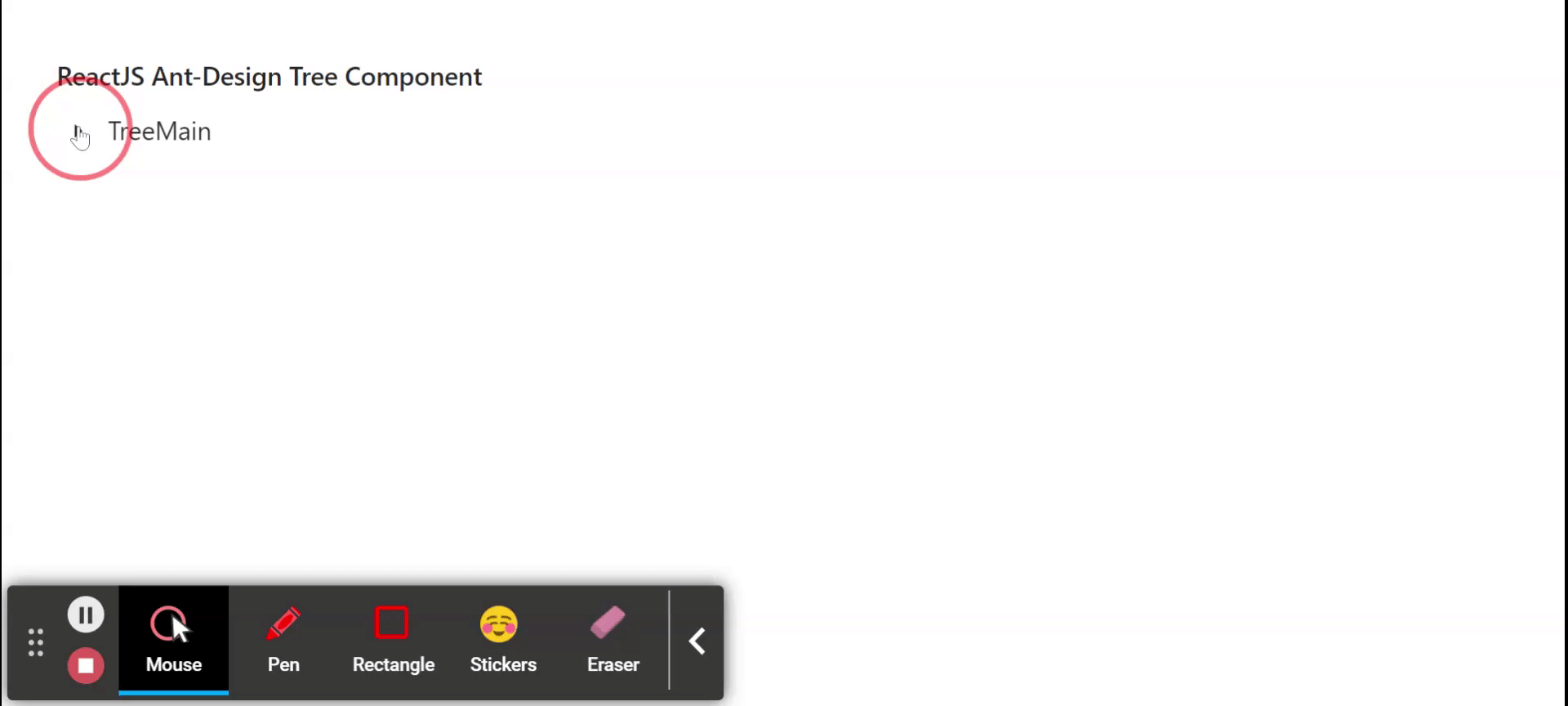
Output: Now open your browser and go to http://localhost:3000/, you will see the following output:
Reference: https://ant.design/components/tree/
Share your thoughts in the comments
Please Login to comment...