ReactJS UI Ant Design Layout Component
Last Updated :
01 Jun, 2021
Ant Design Library has this component pre-built, and it is very easy to integrate as well. The Layout component is used for handling the overall layout of a page. We can use the following approach in ReactJS to use the Ant Design Layout Component.
Layout Props:
- className: It is used to pass the container className.
- hasSider: It is used to indicate whether contain Sider in children or not.
- style: It is used to customize the styles.
Layout.Sider Props:
- breakpoint: It is used to denote the Breakpoints of the responsive layout.
- className: It is used to pass the container className.
- collapsed: It is used to set the current status.
- collapsedWidth: It is used to denote the width of the collapsed sidebar.
- collapsible: It is used to indicate whether it can be collapsed or not.
- defaultCollapsed: It is used to set the initial status.
- reverseArrow: It is used to reverse the direction of the arrow, for a sider that expands from the right.
- style: It is used to customize the styles.
- theme: It is used to denote the Color theme of the sidebar.
- trigger: It is used to specify the customized trigger.
- width: It is used to denote the width of the sidebar.
- zeroWidthTriggerStyle: When collapsedWidth is 0, it is used to customize the styles of the special trigger.
- onBreakpoint: It is a callback function that is triggered when breakpoints changed.
- onCollapse: It is a callback function that is triggered when clicking the trigger or activating the responsive layout.
Creating React Application And Installing Module:
-
Step 1: Create a React application using the following command:
npx create-react-app foldername
-
Step 2: After creating your project folder i.e. foldername, move to it using the following command:
cd foldername
-
Step 3: After creating the ReactJS application, Install the required module using the following command:
npm install antd
Project Structure: It will look like the following.

Project Structure
Example: Now write down the following code in the App.js file. Here, App is our default component where we have written our code.
App.js
import React from 'react'
import "antd/dist/antd.css";
import { Layout } from 'antd';
const { Header, Footer, Sider, Content } = Layout;
export default function App() {
return (
<div style={{
display: 'block', width: 700, padding: 30
}}>
<h4>ReactJS Ant-Design Layout Component</h4>
<>
<Layout>
<Sider style={{ backgroundColor: 'grey' }}>
Sample Sider
</Sider>
<Layout style={{ backgroundColor: 'lightblue' }}>
<Header style={{ backgroundColor: 'green' }}>
Sample Header
</Header>
<Content style={{ backgroundColor: 'yellow' }}>
Sample Content
</Content>
<Footer style={{ backgroundColor: 'green' }}>
Sample Footer
</Footer>
</Layout>
</Layout>
</>
</div>
);
}
|
Step to Run Application: Run the application using the following command from the root directory of the project:
npm start
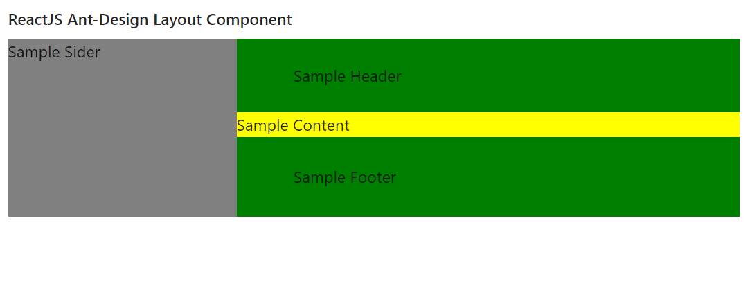
Output: Now open your browser and go to http://localhost:3000/, you will see the following output:
Reference: https://ant.design/components/layout/
Share your thoughts in the comments
Please Login to comment...