React Suite DatePicker ts:Range Props
Last Updated :
23 Aug, 2022
React suite is a library of React components, sensible UI design, and a friendly development experience. It is supported in all major browsers. It provides pre-built components of React which can be used easily in any web application. In this article, we’ll learn about React suite DatePicker ts:Range Props.
The DatePicker Component is used to choose a time or date from the picker. To add a specific DatePicker label, value, or closeOverlay, we can add that by creating an interface using ts:Range prop.
React Suite DatePicker ts:Range Prop Properties:
- label: It is used to add the range label of datepicker component.
- value: It defines the range value that is defined by the user.
- closeOverlay: It closes the picker component after selecting the date range.
Syntax:
<DatePicker
    ranges={[
        {
          label: 'Content',
          value: addDays(new Date(), -1),
          closeOverlay: boolean
        }
    ]}
/>
Creating React Application And Installing Module:
Step 1: Create a React application using the given command:
npm create-react-app projectname
Step 2: After creating your project, move to it using the given command:
cd projectname
Step 3: Now Install the rsuite node package using the given command:
npm install rsuite
Project Structure: Now your project structure should look like the following:
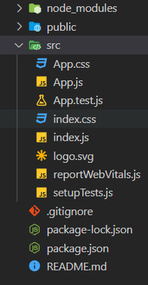
Project Structure
Example 1: Below example demonstrates the use of ts:Range interface for adding shortcuts to the DatePicker component.
App.js
import "rsuite/dist/rsuite.min.css";
import { DatePicker } from "rsuite";
import addDays from "date-fns/addDays";
export default function App() {
return (
<div>
<div style={{ textAlign: "center" }}>
<h2>GeeksforGeeks</h2>
<h4 style={{ color: "green" }}>
React Suite DatePicker ts:Range Prop
</h4>
</div>
<div
style={{
padding: 20,
textAlign: "center"
}}>
<div>
<DatePicker
ranges={[
{
label: "yesterday",
value: addDays(new Date(), -1),
},
{
label: "today",
value: new Date(),
}
]}
/>
</div>
</div>
</div>
);
}
|
Steps to run the application: Execute the below-mentioned command from the root of your project folder to run the app.
npm start
Output:
Example 2: Another example demonstrating the use of ts:Range interface to define the shortcuts for the of DatePicker component.
App.js
import "rsuite/dist/rsuite.min.css";
import { DatePicker } from "rsuite";
import addDays from "date-fns/addDays";
import subDays from "date-fns/subDays";
export default function App() {
return (
<div>
<div style={{ textAlign: "center" }}>
<h2>GeeksforGeeks</h2>
<h4 style={{ color: "green" }}>
React Suite DatePicker ts:Range Prop
</h4>
</div>
<div style={{ padding: 20, textAlign: "center" }}>
<div>
<DatePicker
ranges={[
{
label: "yesterday",
value: addDays(new Date(), -1),
},
{
label: "today",
value: new Date(),
},
{
label: "Prev Day",
closeOverlay: true,
value: (date) => {
return subDays(date, 1);
},
},
]}
/>
</div>
</div>
</div>
);
}
|
Output:
Reference: https://rsuitejs.com/components/date-picker/#code-ts-range-code
Share your thoughts in the comments
Please Login to comment...