React MUI Properties
Last Updated :
11 Jan, 2023
React MUI Properties refers to the properties that we use in our React component to style the component. Properties refers to the height, width, margin, padding, etc. that we provide to the component. One can find all the available properties of MUI in the Properties reference table.
We will now look at each of the type of properties that can be used:
1. System Keys: It contains a list of the key(s) that can be used to access this property using the ‘sx’ prop (or as a system function).
Syntax:
<Component sx={{ property': 'value' }} />
2. System style function: If you only require a subset of the sx prop’s style functions, you can import these instead of the complete package. This is useful if you need to optimism for the shortest possible bundle size.
Syntax:
import styled from '@emotion/styled';
import { spacing } from '@mui/system';

const Container1 = styled.div`
 ${spacing}
`;
3. CSS properties: When this system property is utilized, it specifies which CSS property will be created.
Syntax:
.myDiv1 {
    margin-top: 10px;
}
4. Theme mapping: Finally, this describes how this property is linked to the theme – in this case, whatever value you supply will be utilized as input to the ‘theme. spacing’ assist.
Syntax:
<Component sx={{ marginTop: theme => theme.spacing(3)}} />
First of all, we will start with creating a React app in VS Code.
Step 1: Create React app by writing the below code in any command line.
npx create-react-app app_name
Step 2: Then, we have to move into the folder we will be working on.
cd project_name
Step 3: We will be installing the @mui/material library for working on our project.
npm install @mui/material @emotion/react @emotion/styled
Project Structure: After creating React App and installing all the dependencies, the folder structure will look similar to the figure given below.
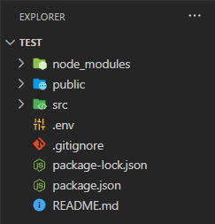
Folder Structure
Steps to run the application: Write the below code in the terminal to run the server:
npm start
Example 1: Below is the code for using System keys and System style function in React.
Javascript
import { Button } from '@mui/material';
import { spacing, palette } from '@mui/system';
import styled from '@emotion/styled';
const Container1 = styled.div`
${spacing}
${palette}
`;
const SystemProperty = () => {
return (
<Container1 bgcolor="yellow" p={2}>
<Button sx={{ width: '200px', m: '10px' }}
variant='contained' color="primary">
Button1
</Button>
<Button sx={{ width: '200px', m: '10px' }}
variant='contained' color="secondary">
Button2
</Button>
</Container1>
);
}
export default SystemProperty;
|
Output:
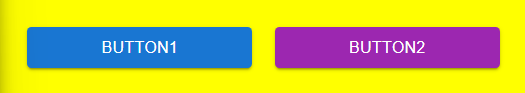
Buttons with System keys and style function
Example 2: Below is the code for using the CSS properties and Theme mapping in React.
Javascript
import { Checkbox } from '@mui/material';
import '../index.css';
const CSSTheme = () => {
return (
<div className='container'>
<div className='checkbox'>
Apple
<Checkbox sx={{ marginLeft: theme => theme.spacing(5) }}
defaultChecked variant='contained' color="error">
Checkbox1
</Checkbox>
</div>
<div className='checkbox'>
Orange
<Checkbox sx={{ marginLeft: theme => theme.spacing(4) }}
defaultChecked variant='contained' color="warning">
Checkbox1
</Checkbox>
</div>
<div className='checkbox'>
Guava
<Checkbox sx={{ marginLeft: theme => theme.spacing(5) }}
defaultChecked variant='contained' color="success">
Checkbox1
</Checkbox>
</div>
<div className='checkbox'>
Blueberry
<Checkbox sx={{ marginLeft: theme => theme.spacing(2) }}
defaultChecked variant='contained' color="primary">
Checkbox1
</Checkbox>
</div>
</div>
);
}
export default CSSTheme;
|
Filename: index.css file:
CSS
.container {
display: flex;
flex-direction: column;
}
.checkbox {
margin: 10px;
}
|
Output:
Reference: https://mui.com/system/properties/
Share your thoughts in the comments
Please Login to comment...