React MUI Palette
Last Updated :
11 Jan, 2023
React MUI Palette is used to adjust the colors for your component or specify default values. The Material UI theme module is utilized in the Palette. It can be used to change the component colors to match your brand.
Default Palette colors:
- primary: It is used to indicate a user’s primary interface elements. It’s the color that appears the most frequently on your app’s displays and components. React MUI uses the primary palette color for its components by default.
- secondary: It is a supplemental interface element for a user. It gives you more options for accentuating and distinguishing your product. It is not required.
- error: It is used to represent interface aspects that should be made clear to the user.
- warning: It is used to signify potentially risky behavioral or crucial messages.
- info: It is used to give information to the user that is neutral and not necessarily important.
- success: It is used to signify the successful completion of a user-triggered operation.
Syntax for default palette colors:
<Component color='colorName' />
Customized Palette colors:
By providing a palette object as part of your theme, you can alter the default palette settings. If any of the default color is provided, it will override it. Palette used the React MUI Theme module for customizing colors.
Syntax for customized palette colors:
const theme = createTheme({
    palette: {
        primary: {
            main: color,
        },
    },
});
First of all, we will start with creating a React app in VS Code.
Step 1: Create React app by writing the below code in any command line.
npx create-react-app app_name
Step 2: Then, we have to move into the folder we will be working on.
cd project_name
Step 3: We will be installing the @mui/material library for working on our project.
npm install @mui/material @emotion/react @emotion/styled
Project Structure: After creating React App and installing all the dependencies, the folder structure will look similar to the figure given below.
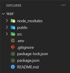
Folder Structure
Steps to run the application: Write the below code in the terminal to run the server:
npm start
Example 1: Below is the code for using the Default Palette colors in Button Component.
Javascript
import { Button } from '@mui/material';
const DefaultPalette = () => {
return (
<div>
<Button
sx={{ width: '200px', margin: '10px' }}
variant='contained' color="primary">Primary</Button>
<Button
sx={{ width: '200px', margin: '10px' }}
variant='contained' color="secondary">Secondary</Button>
<Button
sx={{ width: '200px', margin: '10px' }}
variant='contained' color="error">Error</Button>
<br />
<Button
sx={{ width: '200px', margin: '10px' }}
variant='contained' color="warning">Warning</Button>
<Button
sx={{ width: '200px', margin: '10px' }}
variant='contained' color="info">Info</Button>
<Button
sx={{ width: '200px', margin: '10px' }}
variant='contained' color="success">Success</Button>
</div>
);
}
export default DefaultPalette;
|
Output:
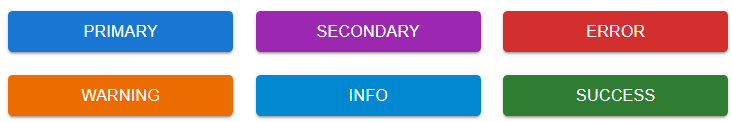
Default Palette Colors
Example 2: Below is the code by using Customized Palette colors in Checkbox component.
Javascript
import { Checkbox } from '@mui/material';
import { createTheme, ThemeProvider } from '@mui/material/styles';
import { pink, yellow } from '@mui/material/colors';
const theme = createTheme({
palette: {
primary: {
main: pink[500],
},
secondary: {
main: '#2bbccc',
},
success: {
main: '#000000',
},
warning: {
main: yellow[700],
},
info: {
main: '#6b2bcc',
},
error: {
main: '#69cc2b',
},
},
});
const Customized = () => {
return (
<ThemeProvider theme={theme}>
<Checkbox defaultChecked color='primary' />
<Checkbox defaultChecked color="secondary" />
<Checkbox defaultChecked color="success" />
<Checkbox defaultChecked color="error" />
<Checkbox defaultChecked color="info" />
<Checkbox defaultChecked color="warning" />
</ThemeProvider>
);
}
export default Customized;
|
Output:

Customized Palette Colors
Reference: https://mui.com/material-ui/customization/palette/
Share your thoughts in the comments
Please Login to comment...