Photography Website using React
Last Updated :
23 Jan, 2024
In this project, we’re going to design an impressive photography website using React. The website will include a beautiful navbar, an introductory section with both an image and text, a photo gallery with a dynamic grid layout, and a modal to showcase selected photos in detail. Additionally, we’ll integrate a “Buy Plans and Subscriptions” section to add more features to the website.
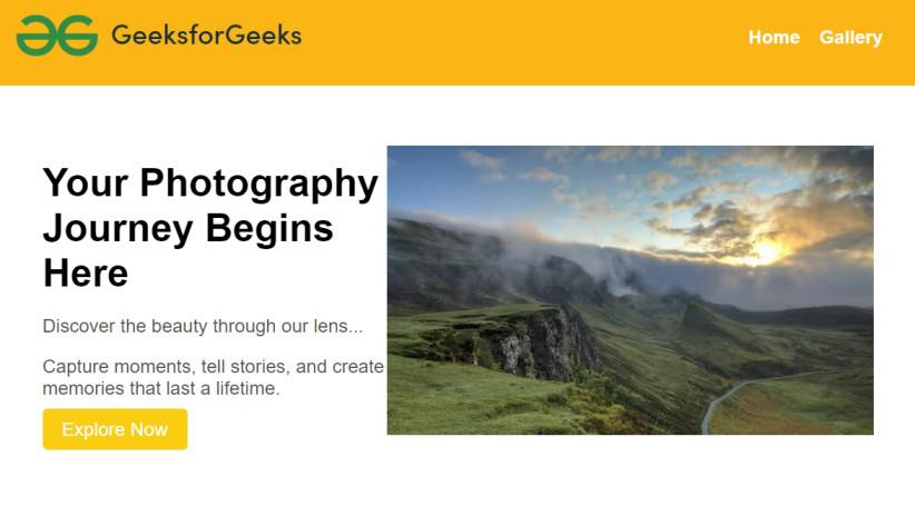
Preview of final output: Let us have a look at how the final output will look like.
Approach to create Photography Website:
- Create a responsive Navbar component showing a distinctive logo and navigation links to ensure seamless navigation across different pages.
- Create a starting section with a big, interesting picture, a title, and some paragraphs that tell people what the website is all about.
- Use React to make a grid where we can show off lots of photography images. It should look good and be easy for people to play around with.
- Make a part of the website that tells about different plans people can buy. Give details about each plan and add a button to sign up for a plan.
- Add the CSS for all the components like Navbar, Introduction, Gallery page etc. for better styling.
Steps to create the project:
Step 1: Create a new React app using Create React App.
npx create-react-app my-photography-website
cd my-photography-website
Step 2: Install Dependencies:
npm install react-router-dom
npm install react-images
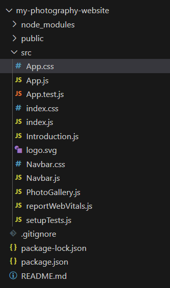
Step 3: Create the following components in the src folder:
- Navbar.js
- Introduction.js
- PhotoGallery.js
Project Structure:
The updated dependencies in package.json file will look like:
"dependencies": {
    "@testing-library/jest-dom": "^5.17.0",
    "@testing-library/react": "^13.4.0",
    "@testing-library/user-event": "^13.5.0",
    "react": "^18.2.0",
    "react-dom": "^18.2.0",
    "react-images": "^1.2.0-beta.7",
    "react-router-dom": "^6.21.3",
    "react-scripts": "5.0.1",
    "web-vitals": "^2.1.4"
},
Example: This example shows the implementation to design a photography website using React.
Javascript
import React from 'react';
import { BrowserRouter as Router, Route, Routes } from 'react-router-dom';
import Navbar from '../src/Components/Navbar';
import Introduction from "../src/Components/Introduction"
import PhotoGallery from "../src/Components/PhotoGallery"
import '../src/App.css';
function App() {
return (
<Router>
<div>
<Navbar />
<Routes>
<Route path="/" element={<Introduction />} />
<Route path="/gallery" element={<PhotoGallery />} />
</Routes>
</div>
</Router>
);
}
export default App;
|
Javascript
import React from "react";
const Introduction = () => {
return (
<>
<div className="introduction">
<div className="text">
<h1>
Your Photography
Journey Begins Here
</h1>
<p>
Discover the beauty
through our lens...
</p>
<p>
Capture moments, tell stories,
and create memories that last a
lifetime.
</p>
<button className="explore-button">
Explore Now
</button>
</div>
<div className="image">
<img
src=
alt="Introduction"
/>
</div>
</div>
<div className="buy-plans">
<h2>Buy Plans and Subscriptions</h2>
<p>
Unlock premium features and exclusive
content with our subscription
plans.
</p>
<div className="subscription-options">
{}
<div className="subscription-option">
<h3>Basic Plan</h3>
<p>Access to a limited set of features</p>
<p>$9.99/month</p>
<button className="subscribe-button">
Subscribe
</button>
</div>
<div className="subscription-option">
<h3>Pro Plan</h3>
<p>
Full access to all features
and exclusive content
</p>
<p>$19.99/month</p>
<button className="subscribe-button">
Subscribe
</button>
</div>
</div>
</div>
</>
);
};
export default Introduction;
|
Javascript
import React from 'react';
import { Link }
from 'react-router-dom';
import './Navbar.css';
const Navbar = () => {
return (
<nav className="navbar-container">
<div className="logo">
<img src=
alt="Logo" />
</div>
<ul className="nav-links">
<li><Link to="/">
Home
</Link></li>
<li>
<Link to="/gallery">
Gallery
</Link>
</li>
{}
</ul>
</nav>
);
};
export default Navbar;
|
Javascript
import React, { useState } from 'react';
import { Link } from 'react-router-dom';
const PhotoGallery = () => {
const photos = [
];
return (
<div className="photo-gallery">
{photos.map(
(photo, index) => (
<Link to={`/photo/${index}`}
key={index}>
<img src={photo}
alt={`Photo ${index + 1}`} />
</Link>
))}
</div>
);
};
export default PhotoGallery;
|
CSS
.navbar-container {
background-color: #fbb615;
color: #fff;
padding: 10px 20px;
display: flex;
justify-content: space-between;
align-items: center;
}
.logo img {
width: 75%;
height: auto;
}
.nav-links {
list-style: none;
display: flex;
}
.nav-links li {
margin-right: 20px;
}
.nav-links a {
text-decoration: none;
color: #fff;
font-weight: bold;
font-size: 1.2em;
transition: color 0.3s ease-in-out;
}
.nav-links a:hover {
color: #ffd700;
}
|
CSS
body {
margin: 0;
padding: 0;
font-family: 'Arial', sans-serif;
}
.introduction {
display: flex;
justify-content: space-between;
align-items: center;
padding: 50px;
}
.text {
max-width: 500px;
}
h1 {
font-size: 2.5em;
margin-bottom: 20px;
}
p {
font-size: 1.2em;
color: #555;
margin-bottom: 10px;
}
.explore-button {
background-color: #facc12;
color: #fff;
padding: 10px 20px;
font-size: 1.2em;
border: none;
border-radius: 5px;
cursor: pointer;
transition: background-color 0.3s ease-in-out;
}
.explore-button:hover {
background-color: #ffa600;
}
.buy-plans {
margin: 30px;
display: flex;
flex-wrap: wrap;
flex-direction: column;
justify-content: space-between;
}
.buy-plans h2 {
font-size: 2em;
margin-bottom: 10px;
}
.buy-plans p {
font-size: 1.2em;
color: #555;
margin-bottom: 10px;
}
.subscription-options {
display: flex;
justify-content: space-between;
margin-top: 20px;
}
.subscription-option {
flex: 0 1 calc(48% - 10px);
border: 1px solid #ddd;
padding: 15px;
border-radius: 5px;
}
.subscription-option h3 {
font-size: 1.5em;
margin-bottom: 10px;
}
.subscribe-button {
background-color: #fcd61a;
color: #fff;
padding: 8px 15px;
font-size: 1em;
border: none;
border-radius: 5px;
cursor: pointer;
transition: background-color 0.3s ease-in-out;
}
.photo-gallery {
display: flex;
flex-wrap: wrap;
gap: 20px;
padding: 20px;
}
.photo-gallery a {
flex: 0 1 calc(33.33% - 20px);
border-radius: 10px;
overflow: hidden;
}
.photo-gallery img {
display: block;
width: 100%;
border-radius: 10px;
transition: transform 0.3s ease-in-out;
}
.photo-gallery img:hover {
transform: scale(1.1);
}
|
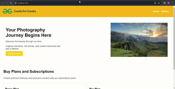
Steps to run the application:
npm start
Output:
Share your thoughts in the comments
Please Login to comment...