How to use Tailwind Forms Plugin with React Select ?
Last Updated :
14 Dec, 2023
Tailwind CSS, a utility-first styling library for web design, offers Tailwind forms as plugins that provide a foundational reset for form styles. This simplifies the styling process for form elements, allowing easy customization with utilities. React Select, a select component library, is employed for crafting Select Input controls in React with built-in multiselect and async support.
Prerequisites:
Steps to create React Project and install required modules:
Step 1: Create a React application using the following command:
npx create-react-app <<Project Name>>
Step 2: After creating your project folder i.e. folder_name, move to it using the following command:
cd <<Project Name>>
Step 3: Install react-select and clsx writing the following command.
npm install react-select clsx
Step 4: Install TailwindCSS by writing the following command.
npm install -D tailwindcss @tailwindcss/forms
npx tailwindcss init
Step 5: Add the paths of your template file and import @tailwindcss/forms in tailwind.config.js
module.exports = {
    content: ["./src/**/*.{html,js,jsx}"],
    theme: {
        extend: {},
    },
    plugins: [require('@tailwindcss/forms')],
}
Step 6: Add the tailwind directives to your index.css file
@tailwind base;
@tailwind components;
@tailwind utilities;
Step 7: Compile your index.css file to scan the template
npx tailwindcss -i ./src/index.css -o ./public/output.css
Step 8: Add your compiled CSS file to the <head> and start using Tailwind’s utility classes to style your content.
<link href="/public/output.css" rel="stylesheet">
Now TailwindCSS and react-select and tailwind-form plugin is now installed and ready to be used in the project
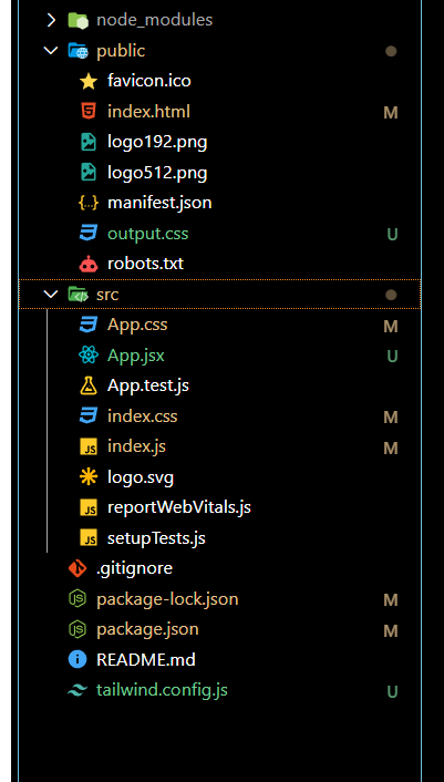
Project Structure:
The updated dependencies in package.json file will look like:
"dependencies": {
    "clsx": "^2.0.0",
    "react": "^18.2.0",
    "react-dom": "^18.2.0",
    "react-scripts": "5.0.1",
    "react-select": "^5.8.0",
    "web-vitals": "^2.1.4",
}
Example 1: In this, we will use basic styling to display react-select components using tailwind and tailwindcss forms. In react-select, there are 20 internal components that we can style. Few are given below:
- Control: It is used to style the base of the select component.
- Input: It is used to style the input search of the component.
- Menu: To style the dropdown list.
- Option: To style the list when they are selected or focused.
Javascript
import clsx from "clsx";
import React from "react";
import Select from "react-select";
const SelectTailwind = () => {
const options = [
{ value: "chocolate", label: "Chocolate" },
{ value: "strawberry", label: "Strawberry" },
{ value: "vanilla", label: "Vanilla" },
];
return (
<div className=" bg-white text-black
flex flex-col
justify-center
items-center
h-screen w-full">
<h1 className=" flex flex-row
text-green-500
font-semibold
text-2xl">
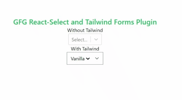
GFG React-Select and Tailwind Forms Plugin
</h1>
<label htmlFor="wotailwind">Without Tailwind</label>
<Select id="wotailwind" options={options} />
<label htmlFor="wtailwind">With Tailwind</label>
<Select
id="wtailwind"
unstyled
options={options}
classNames={{
input: () => "[&_input:focus]:ring-0",
control: () => "form-multiselect p-6 ",
menu: () => "bg-slate-200 ",
option: ({ isFocused, isSelected }) =>
clsx(
isFocused && `hover:cursor-pointer
hover:bg-slate-500
px-3 py-2 rounded`,
isSelected && "bg-slate-300"
),
}}
/>
</div>
);
};
export default SelectTailwind;
|
Steps to run: To run the project enter the following command in Terminal.
npm start
Output:
Example 2: In this example, we will use tailwind css styling to style the components and use variables instead of writing directly in classNames.
Javascript
import clsx from "clsx";
import React from "react";
import Select from "react-select";
const MultipleTailwind = () => {
const options = [
{ value: "chocolate", label: "Chocolate" },
{ value: "strawberry", label: "Strawberry" },
{ value: "vanilla", label: "Vanilla" },
];
const baseStyle =
`form-multiselect text-blue-800
border p-5 rounded-lg bg-red-400
hover:cursor-pointer`;
const menuStyle =
`text-blue-900 border
rounded-lg bg-red-400
hover:cursor-pointer`;
const optionStyles = {
focus: `hover:cursor-pointer
hover:bg-white
hover:text-black`,
Selected: "bg-slate-300",
};
return (
<div className=" bg-white text-black
flex flex-col
justify-center
items-center
h-screen w-full">
<h1 className="text-green-500
font-semibold
text-2xl">
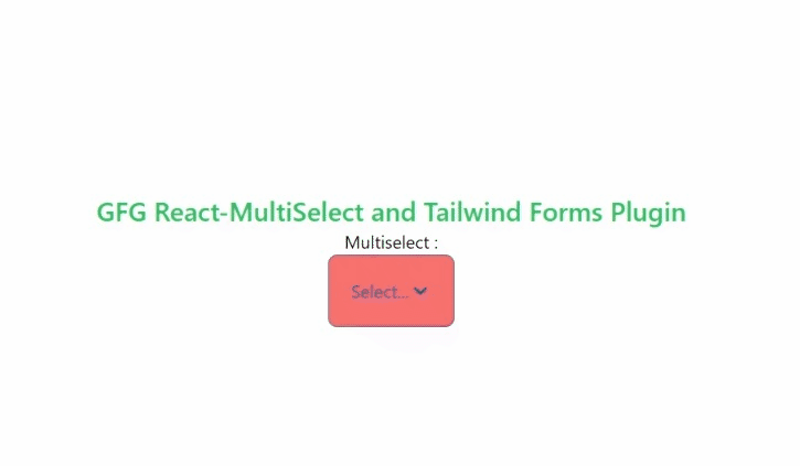
GFG React-MultiSelect and Tailwind Forms Plugin
</h1>
<label className="flavour">Multiselect :</label>
<Select
classNames={{
input: () => "[&_input:focus]:ring-0",
control: () => baseStyle,
menu: () => menuStyle,
option: ({ isFocused, isSelected }) =>
clsx(
isFocused && optionStyles.focus,
isSelected && optionStyles.Selected
),
}}
unstyled
id="flavour"
isMulti
styles={{
input: (base) => ({
...base,
"input:focus": {
boxShadow: "none",
},
}),
}}
options={options}
/>
</div>
);
};
export default MultipleTailwind;
|
Steps to Run: To run the project enter the following command in Terminal.
npm start
Output:
React Select Multi using Tailwind CSS
Share your thoughts in the comments
Please Login to comment...