Bootstrap Vertical Forms, Horizontal Forms, Inline Forms
Last Updated :
04 Apr, 2023
- Introduction and Installation
- Grid System
- Buttons, Glyphicons, Tables
- DropDowns and Responsive Tabs
- Progress Bar and Jumbotron
In this article, we’ll learn about creating forms. Forms are used almost in every website and they are used to collect user input.
Forms:
Bootstrap provides 3 types of form layout, namely:
- Vertical Forms (Default)
- Horizontal Forms
- Inline Forms
We’ll look into each of them separately:
Vertical Forms:
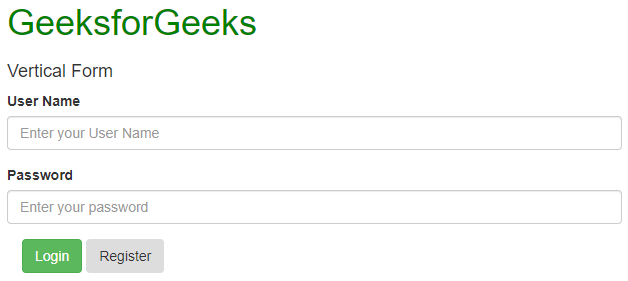
First of all, we’ll initialize the form using the <form> tag. We’ll wrap all the labels and form controls inside the tag <div class=”form-group”>. This is needed for optimum spacing between the form components.
Now, we can design the form within these tags as per our needs. We can use a label to define a label for an input element. Remember that the <for> attribute of the <label> tag should be equal to the id attribute of the related element to bind them together. After the label tag, one can enter the <input> tag that specifies an input field where the user can enter data. The class to be used inside the input tag must be class=”form-control”. One can also use the placeholder attribute which specifies a short hint that describes the expected value of an input field.
Example:
HTML
<!DOCTYPE html>
<html lang="en">
<head>
<title>Bootstrap Example</title>
<meta charset="utf-8">
<meta name="viewport"
content="width=device-width, initial-scale=1">
<link rel="stylesheet" href=
<script src=
</script>
<script src=
</script>
</head>
<body>
<div class="container" style="color:green">
<h1>GeeksforGeeks</h1>
</div>
<div class="container">
<h4>Vertical Form</h4>
<form action="">
<div class="form-group">
<label for="id1">User Name</label>
<input class="form-control" type="text"
id="id1" placeholder="Enter your User Name">
</div>
<div class="form-group">
<label for="id2">Password</label>
<input class="form-control" type="password"
id="id2" placeholder="Enter your password">
</div>
<div class="container">
<button type="button" class="btn btn-success">
Login
</button>
<button type="button" class="btn btn-secondary">
Register
</button>
</div>
</form>
</div>
</body>
</html>
|
Output:
Horizontal Forms:
Horizontal forms are different from Vertical forms not only in the amount of markup but also in the presentation of the form. To make a form horizontal, add class=”form-horizontal” in the <form> element. If you’re using the <label> element then you must use class=”control-label”. Also, remember that you can use Bootstrap’s predefined grid classes to align labels and groups of form controls in a horizontal layout.
You can also add particular styles to the labels and input fields. Add any of the classes has-warning, has-success, has-error, etc. in the <div> tag which contains a class that has a form-group to give it different effects when selected.
Example:
HTML
<!DOCTYPE html>
<html lang="en">
<head>
<title>Bootstrap Example</title>
<meta charset="utf-8">
<meta name="viewport"
content="width=device-width, initial-scale=1">
<link rel="stylesheet" href=
<script src=
</script>
<script src=
</script>
</head>
<body>
<div class="container" style="color:green">
<h1>GeeksforGeeks</h1>
</div>
<div class="container">
<h4>Horizontal Form</h4>
<form action="" class="form-horizontal">
<div class="form-group has-success">
<label class="control-label col-sm-2"
for="id1">Username</label>
<div class="col-sm-6">
<input class="form-control" type="text"
id="id1" placeholder="Enter your User Name">
</div>
</div>
<div class="form-group has-success">
<label class="control-label col-sm-2"
for="id2">Password</label>
<div class="col-sm-6">
<input class="form-control" type="password"
id="id2" placeholder="Enter your password">
</div>
</div>
<div class="container">
<button type="button" class="btn btn-success">
Login
</button>
<button type="button" class="btn btn-secondary">
Register
</button>
<label>
<input type="checkbox">
Remember me
</label>
</div>
</form>
</div>
</body>
</html>
|
Output:

Inline Forms:
As the name suggests, in an inline form, all of the elements are inline, left-aligned, and the labels are alongside. You just need to add the class=”form-inline” in the form element.
Using the class=”sr-only” you can hide the labels of the inline forms which might cause problems sometimes.
You can also add glyphicons inside the forms. For that, you have to add class=”has-feedback” and add the span tag in which the glyphicon is present after the <input> tag. Remember adding form-control-feed as the class of the span tag.
Example:
HTML
<!DOCTYPE html>
<html lang="en">
<head>
<title>Bootstrap Example</title>
<meta charset="utf-8">
<meta name="viewport"
content="width=device-width, initial-scale=1">
<link rel="stylesheet" href=
<script src=
</script>
<script src=
</script>
</head>
<body>
<div class="container" style="color:green">
<h1>GeeksforGeeks</h1>
</div>
<div class="container">
<h4>Inline Form</h4>
<br>
<form class="form-inline" action="/action_page.php">
<label for="email">Username:</label>
<input type="email" class="form-control"
id="email" placeholder="Enter Username"
name="email">
<label for="pwd">Password:</label>
<input type="password" class="form-control"
id="pwd" placeholder="Enter password"
name="pswd">
<button type="button" class="btn btn-danger">
Login
</button>
<button type="button" class="btn btn-secondary">
Register
</button>
</form>
</div>
</body>
</html>
|
Output:

Supported Browsers:
- Google Chrome
- Internet Explorer
- Firefox
- Opera
- Safari
Like Article
Suggest improvement
Share your thoughts in the comments
Please Login to comment...