How to Plot Timeseries using highcharter library in R
Last Updated :
12 Jun, 2023
Time series data is a sequence of data points that are measured at regular intervals over time. Plotting time series data is a useful way to visualize trends and patterns over time. Highcharter is an R package that provides an interface to the Highcharts JavaScript charting library. Highcharts is a popular web application library for creating interactive charts and graphs. In this article, we will explore how to use Highcharter to plot time series data in R.
Before we can use Highcharter, we need to install it. We can do this using the install.packages() function in R Programming Language:
# Installing the required R packages
install.packages("highcharter")
We will use the AirPassengers dataset, which contains monthly totals of international airline passengers from January 1949 to December 1960. This dataset is included with the base R installation and can be loaded using the data() function:
R
data(AirPassengers)
force(AirPassengers)
|
Output:
     Jan Feb Mar Apr May Jun Jul Aug Sep Oct Nov Dec
1949 112 118 132 129 121 135 148 148 136 119 104 118
1950 115 126 141 135 125 149 170 170 158 133 114 140
1951 145 150 178 163 172 178 199 199 184 162 146 166
1952 171 180 193 181 183 218 230 242 209 191 172 194
1953 196 196 236 235 229 243 264 272 237 211 180 201
1954 204 188 235 227 234 264 302 293 259 229 203 229
1955 242 233 267 269 270 315 364 347 312 274 237 278
1956 284 277 317 313 318 374 413 405 355 306 271 306
1957 315 301 356 348 355 422 465 467 404 347 305 336
1958 340 318 362 348 363 435 491 505 404 359 310 337
1959 360 342 406 396 420 472 548 559 463 407 362 405
1960 417 391 419 461 472 535 622 606 508 461 390 432
Creating a basic time series plot:
To create a basic time series plot using Highcharter, we need to first convert our data into a format that Highcharter can understand. We will use the xts package to convert our data into a time series object, and then use the hchart() function in Highcharter to create the plot:
R
library(highcharter)
library(datasets)
ts_data <- ts(nottem, start = c(1920, 1), frequency = 12)
df <- data.frame(date = time(ts_data),
value = as.numeric(ts_data))
hchart(df, "line", hcaes(x = date,
y = value)) %>%
hc_title(text = "Monthly Average Temperatures at Nottingham Castle") %>%
hc_yAxis(title = list(text = "Temperature (Fahrenheit)")) %>%
hc_xAxis(type = "datetime",
labels = list(format = "%b %Y"))
|
Output:
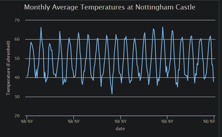
Basic time series plot using highcharter library
Adding plot options
Highcharter provides many options for customizing the appearance of the plot. Here are a few examples:
R
library(highcharter)
data(nottem)
ts_nottem <- ts(coredata(nottem), start = c(1920, 1),
frequency = 12)
hchart(ts_nottem, type = "line", name = "Monthly Temperatures") %>%
hc_title(text = "Monthly Average Temperatures in Nottingham") %>%
hc_yAxis(title = list(text = "Temperature (°F)")) %>%
hc_tooltip(pointFormat = "Temperature: <b>{point.y:.1f} °F</b>")
|
Output:
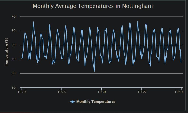
Added plot options in the time series plot
Customizing Time Series Plot using highcharter
highcharter provides many options for customizing time series plots. Here, we will demonstrate some of the commonly used customizations.
Adding Title and Subtitle
We can add a title and subtitle to our plot using the hc_titel( ) and hc_subtitle( ) functions. These functions take similar arguments and have similar functionality. Here are the main arguments that both functions take:
| Parameter |
Description |
| `text` |
The text is to display in the title/subtitle. |
| `align` |
The alignment of the title/subtitle. Can be one of “left”, “center”, or “right”. |
| `floating` |
A logical value indicating whether the title/subtitle should be floating above the plot. |
| `verticalAlign` |
The vertical alignment of the title/subtitle. Can be one of the “top”, “middle”, or “bottom”. |
| `x` |
The x position of the title/subtitle, relative to the plot area. |
| `y` |
The y position of the title/subtitle, relative to the plot area. |
| `useHTML` |
A logical value indicates whether to use HTML to format the text. |
| `style` |
A list of CSS styles to apply to the title/subtitle. For example, list(fontSize = “16px”, fontWeight = “bold”). |
| `margin` |
The margin around the title/subtitle. Can be a single value for all sides, or a list with values for each side (top, right, bottom, left). |
R
library(highcharter)
library(xts)
data("nottem")
nottem <- na.omit(nottem)
chart <- hchart(ts_data, type = "line") %>%
hc_title(text = "Average Monthly Temperatures in Nottingham, England",
align = "center",
style = list(fontSize = "20px")) %>%
hc_subtitle(text = "1920-1939",
align = "center",
style = list(fontSize = "16px")) %>%
print(chart)
|
Output:
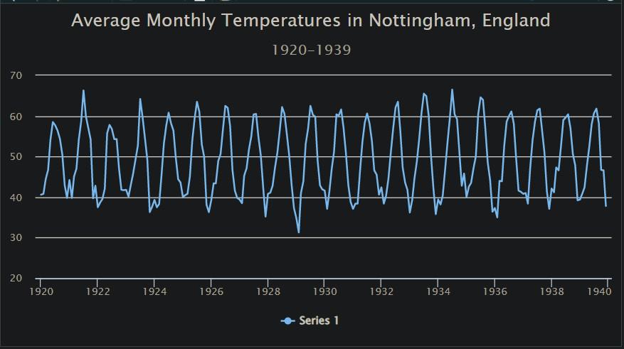
Adding Title and Subtitle Label to the high charter plots
Observe in the above graph, Title “Average Monthly Temperatures in Nottingham, England” and the subtitle “1920-1939” have been added to the basic timeseries plot.
Changing axis labels
We can change the x-axis and y-axis labels using the hc_xAxis( ) and hc_yAxis( ) functions respectively. hc_xAxis() is used to modify the properties of the X-axis. It takes several arguments, including:
|
Parameter
|
Description
|
|
`title`
|
The text of the X-axis title |
|
`type`
|
The type of the axis, which can be “linear”, “logarithmic”, “DateTime”, or “category” |
|
`categories`
|
A vector of categories for a “category” type axis |
|
`labels`
|
A list of label properties, including style, formatter, and step |
hc_yAxis() is used to modify the properties of the Y axis. It takes similar arguments to hc_xAxis(), including:
|
Parameter
|
Description
|
|
`title`
|
The text of the Y-axis title |
|
`type`
|
The type of the axis, which can be “linear”, “logarithmic”, or “datetime” |
|
`max`
|
The maximum value of the axis |
|
`min`
|
The minimum value of the axis |
|
`opposite`
|
A logical value indicating whether the axis should be on the opposite side of the chart |
R
library(highcharter)
library(xts)
data("nottem")
nottem <- na.omit(nottem)
chart <- hchart(ts_data, type = "line") %>%
hc_title(text = "Average Monthly Temperatures in Nottingham, England",
align = "center",
style = list(fontSize = "20px")) %>%
hc_subtitle(text = "1920-1939",
align = "center",
style = list(fontSize = "16px")) %>%
hc_yAxis(title = list(text = "Temperature (°F)"),
labels = list(style = list(fontSize = "14px"))) %>%
print(chart)
|
Output:
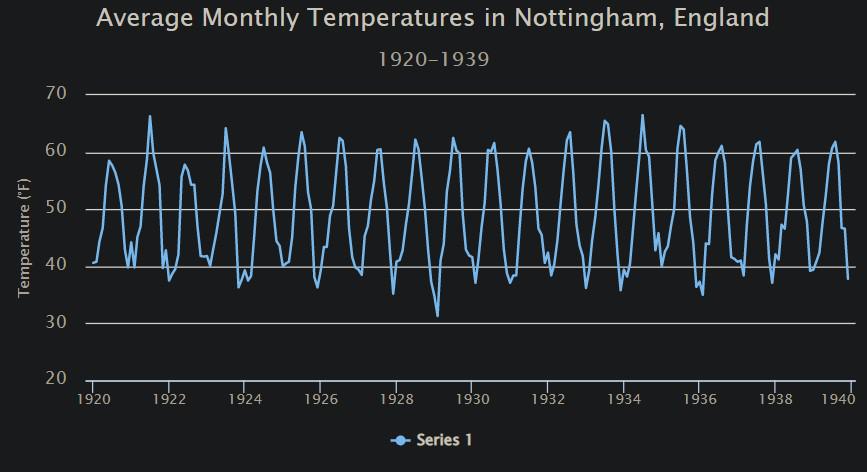
Adding Axis Label to the high charter plots
Observe we have changed the Y-axis label (“Temperature (F)) as compared to our previous time-series plot.
Adding Data Labels on the ToolTip
The hc_tooltip() function is used to customize the tooltip of the Highcharts object. The tooltip is a floating box that appears when the user hovers over a point on the chart. The hc_tooltip() function takes several arguments that can be used to customize the tooltip, including:
|
Parameter
|
Description
|
|
`formatter`
|
A JavaScript function is used to format the tooltip text. It takes the point object as a parameter and returns the formatted text. |
|
`enabled`
|
A logical value that determines whether or not the tooltip is enabled. |
|
`useHTML`
|
A logical value that determines whether the tooltip text should be rendered as HTML. |
|
`headerFormat`
|
A string is used to format the tooltip header. |
|
`pointFormat`
|
A string is used to format the tooltip for each point. |
|
`footerFormat`
|
A string is used to format the tooltip footer. |
|
`valueDecimals`
|
The number of decimals to show for numeric values in the tooltip. |
The other arguments taken by this function are “valuePrefix”, “valueSuffix”, “backgroundColor”, “borderColor”, “borderRadius”, “borderWidth” and “style”.
R
library(highcharter)
library(xts)
data("nottem")
nottem <- na.omit(nottem)
chart <- hchart(nottem, type = "line") %>%
hc_title(text = "Average Monthly Temperatures in Nottingham, England",
align = "center",
style = list(fontSize = "20px")) %>%
hc_subtitle(text = "1920-1939",
align = "center",
style = list(fontSize = "16px")) %>%
hc_yAxis(title = list(text = "Temperature (°F)"),
labels = list(style = list(fontSize = "14px"))) %>%
hc_tooltip(
formatter = JS("function() {
return '<b>' + Highcharts.dateFormat('%b %Y', new Date(this.x)) + '</b><br/>' +
'<span style=\"color:' + this.series.color + ';font-weight:bold;\">' +
this.series.name + ': </span>' + Highcharts.numberFormat(this.y, 2) + ' °F';
}")
)
print(chart)
|
Output:
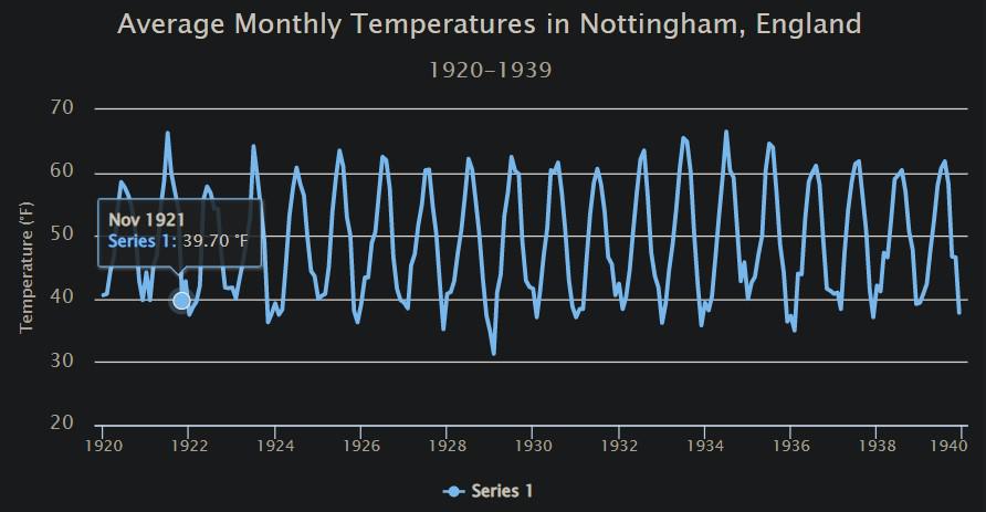
Adding Data Label to the high charter plots
Observe the data label displayed as we hover the cursor on the plot. We can customize the data label elements as per the requirement.
Adding Annotations:
We can add annotations to our plot using the hc_annotations( ) function. Annotations are graphical elements that can be added to a chart to provide additional information or highlight specific data points. The main arguments of the hc_annotations() function are:
| Parameter |
Description |
| `chart` |
The ID of the chart to which the annotation should be added (e.g., “plot”). |
| `labels` |
A logical value indicating whether or not to display the annotation labels (default is TRUE). |
| `list` |
A list of annotation objects, where each object represents an individual annotation. |
R
library(highcharter)
library(xts)
data("nottem")
nottem <- na.omit(nottem)
chart <- hchart(nottem, type = "line") %>%
hc_title(text = "Average Monthly Temperatures in Nottingham, England",
align = "center",
style = list(fontSize = "20px")) %>%
hc_subtitle(text = "1920-1939",
align = "center",
style = list(fontSize = "16px")) %>%
hc_yAxis(title = list(text = "Temperature (°F)"),
labels = list(style = list(fontSize = "14px"))) %>%
hc_tooltip(
formatter = JS("function() {
return '<b>' + Highcharts.dateFormat('%b %Y', new Date(this.x)) + '</b><br/>' +
'<span style=\"color:' + this.series.color + ';font-weight:bold;\">' +
this.series.name + ': </span>' + Highcharts.numberFormat(this.y, 2) + ' °F';
}")
) %>%
hc_annotations(
list(
labels = list(
list(point = list(x = as.numeric(as.Date("1934-07-01")),
y = 50),
text = "Summer month with highest temp")
)
)
) %>%
print(chart)
|
Output:
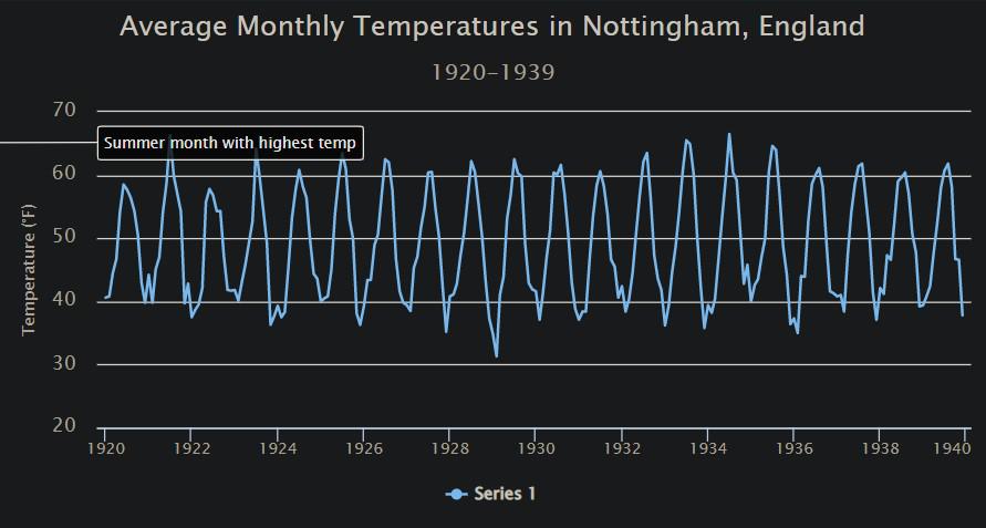
Adding annotation to the high charter plots
Observe the annotation added on the y-axis for the temperature of the month of July 1934 which is the month with the highest temperature.
Conclusion:
In conclusion, Highcharter is a powerful R library for creating interactive and dynamic time series visualizations. With its intuitive syntax and easy-to-use functions, Highcharter makes it easy to create professional-looking charts and graphs with minimal effort. In this article, we covered the basics of creating time series plots using Highcharter, including how to set up data, create charts, and customize the appearance of the plot. We also showed some advanced features such as adding annotations, changing the plot type, and adding multiple series. Overall, Highcharter is a great tool for anyone looking to create high-quality time series visualizations quickly and easily.
Share your thoughts in the comments
Please Login to comment...