How to Overlay Plots in R?
Last Updated :
19 Dec, 2021
In this article, we will discuss how to overlay plots in the R Programming Language.
Overlaying is a technique that is used to draw multiple plots on a single frame. To draw multiple plots in the R Language, we draw a basic plot and add an overlay line plot or scatter plot by using the lines() and the points() function. This line and scatter plot overlay can be drawn on top of any layer in the R Language.
Method 1: Overlay Line Plots in R
To overlay a line plot in the R language, we use the lines() function. The lines() function is a generic function that overlays a line plot by taking coordinates from a data frame and joining the corresponding points with line segments. We can further customize that line plot by using the lty, lwd, and col parameters to customize line type, line width, and line color respectively.
Syntax:
points( x, y, ltype, lwd, col )
Parameter:
- x and y: determines the x-axis and y-axis variables respectively.
- lty: determines the line type.
- lwd: determines the line width.
- col: determines the color of line.
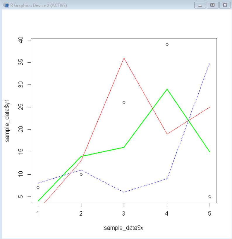
Example: Overlay line plots
R
sample_data <- data.frame(x=c(1, 2, 3, 4, 5),
y1 = c(7, 10, 26, 39, 5),
y2 = c(4, 14, 16, 29, 15),
y3 = c(2, 13, 36, 19, 25),
y4 = c(8, 11, 6, 9, 35))
plot(sample_data$x, sample_data$y1)
lines(sample_data$x, sample_data$y2, col='green', lwd=2)
lines(sample_data$x, sample_data$y3, col='red', lwd=1)
lines(sample_data$x, sample_data$y4, col='blue', lty="dashed")
|
Output:
Method 2: Overlay Scatter Plots in R
To overlay a scatter plot in the R language, we use the points() function. The points() function is a generic function that overlays a scatter plot by taking coordinates from a data frame and plotting the corresponding points. We can further customize that scatter plot by using the pch, and col parameters to customize point shape, and point color respectively.
Syntax:
points( x, y, pch, col )
Parameter:
- x and y: determine the x-axis and y-axis variables respectively.
- pch: determines the point shape.
- col: determines the color of points.
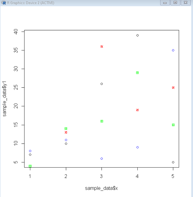
Example: Overlay scatter plot
R
sample_data <- data.frame(x=c(1, 2, 3, 4, 5),
y1 = c(7, 10, 26, 39, 5),
y2 = c(4, 14, 16, 29, 15),
y3 = c(2, 13, 36, 19, 25),
y4 = c(8, 11, 6, 9, 35))
plot(sample_data$x, sample_data$y1)
points(sample_data$x, sample_data$y2, col='green', pch=12)
points(sample_data$x, sample_data$y3, col='red', pch=13)
points(sample_data$x, sample_data$y4, col='blue')
|
Output:
Share your thoughts in the comments
Please Login to comment...