How to make Flexbox items the same size using CSS ?
Last Updated :
01 Feb, 2024
Flexbox items of equal size in CSS ensure a uniform and visually unified layout. By using Flexbox properties, we can distribute available space evenly among items, allowing different content sizes to flow seamlessly. We can achieve the same size of the flexbox items by using different ways including, Flex Property, width property, and calc() Property.
Using Flex Property
The container div, named “flex-container” inside it, creates three divs for three items. Style the “flex-container” by using border, display: flex, and sets width and height. Use the flex: 1 and height: 90% properties on Flexbox items within a container and ensure each item takes up an equal share of available space.
Example: Illustration of Flexbox items the same size using the flex property.
HTML
<!DOCTYPE html>
<html lang="en">
<head>
<meta charset="UTF-8">
<meta name="viewport" content=
"width=device-width, initial-scale=1.0">
<style>
body {
margin: 0;
padding: 0;
height: 100vh;
background-color: #f0f0f0;
display: flex;
align-items: center;
justify-content: center;
}
.main {
width: 80%;
height: 50%;
margin: 0 auto;
}
h1 {
text-align: center;
font-size: 40px;
color: green;
}
h2 {
text-align: center;
color: rgb(55, 0, 255);
}
.flex-container {
border: 5px solid rgb(55, 139, 22);
width: 100%;
height: 75%;
align-items: center;
display: flex;
}
.flex-item {
flex: 1;
height: 90%;
text-align: center;
background-color: rgb(184, 233, 181);
border: 1px solid #ccc;
margin: 5px 10px;
}
</style>
</head>
<body>
<div class="main">
<h1>GeeksForGeeks</h1>
<h2> Using Flex Property for
same size of Flexbox items
</h2>
<div class="flex-container">
<div class="flex-item">
Item 1
</div>
<div class="flex-item">
Item 2
</div>
<div class="flex-item align-right">
Item 3
</div>
</div>
</div>
</body>
</html>
|
Output:

Using Width Property
The container div, named “flex-container” inside it, creates, three div for three items. Style the “flex-container” by using border, display: flex and sets width and height. Use the width:30% and height: 90% properties on Flexbox items within a container and ensure each item has equal same.
Example: Illustration of Flexbox items the same size using the width property.
HTML
<!DOCTYPE html>
<html lang="en">
<head>
<meta charset="UTF-8">
<meta name="viewport" content=
"width=device-width, initial-scale=1.0">
<style>
body
{
margin: 0;
padding: 0;
height: 100vh;
background-color: #f0f0f0;
display: flex;
align-items: center;
justify-content: center;
}
.main
{
width: 80%;
height: 50%;
margin: 0 auto;
}
h1
{
text-align: center;
font-size: 40px;
color: green;
}
h2
{
text-align: center;
color: rgb(55, 0, 255);
}
.flex-container
{
border: 2px solid red;
width: 100%;
height: 80%;
align-items: center;
display: flex;
align-self: center;
justify-content: center;
}
.flex-item
{
width: 30%;
height: 90%;
text-align: center;
background-color: rgb(248, 123, 242);
border: 1px solid #ccc;
margin: 5px 10px;
}
</style>
</head>
<body>
<div class="main">
<h1>GeeksForGeeks</h1>
<h2> Flexbox items the same
size using Width Property
</h2>
<div class="flex-container">
<div class="flex-item">
Item 1
</div>
<div class="flex-item">
Item 2
</div>
<div class="flex-item align-right">
Item 3
</div>
</div>
</div>
</body>
</html>
|
Output:

Using calc() Property
The container div, named “flex-container” creates inside it, create three divs, for three items. Style the “flex-container” by using border, display: flex, and sets width and height. Use the calc(100%/3) (divide no. of items) and height:90% properties on Flexbox items within a container and ensure each item takes up an equal share of available space.
Example: Illustration of Flexbox items the same size using the calc() property.
HTML
<!DOCTYPE html>
<html lang="en">
<head>
<meta charset="UTF-8">
<meta name="viewport" content=
"width=device-width, initial-scale=1.0">
<style>
body
{
margin: 0;
padding: 0;
height: 100vh;
background-color: #f0f0f0;
display: flex;
align-items: center;
justify-content: center;
}
.main
{
width: 80%;
height: 50%;
margin: 0 auto;
}
h1
{
text-align: center;
font-size: 40px;
color: green;
}
h2
{
text-align: center;
color: rgb(55, 0, 255);
}
.flex-container
{
border: 2px solid red;
width: 100%;
height: 80%;
display: flex;
align-items: center;
justify-content: center;
padding: 0px 5px;
}
.flex-item
{
width: calc(100%/3);
height: 90%;
text-align: center;
background-color: rgb(6, 173, 56);
border: 1px solid #ccc;
margin: 5px 10px;
}
</style>
</head>
<body>
<div class="main">
<h1>GeeksForGeeks</h1>
<h2> Flexbox items the same
size by calc() property
</h2>
<div class="flex-container">
<div class="flex-item">
Item 1
</div>
<div class="flex-item">
Item 2
</div>
<div class="flex-item align-right">
Item 3
</div>
</div>
</div>
</body>
</html>
|
Output:

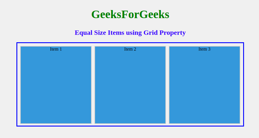
Using Grid Property
The container div, named “grid-container” inside it, creates three divs for three items. Style the “grid-container” by using border, display: flex, and sets width and height. CSS Grid properties, such as grid-template-columns: repeat(3, 1fr), ensure consistent sizing of each grid item.
Example: Illustration of Flexbox items the same size using the grid property – grid-template-columns: repeat().
HTML
<!DOCTYPE html>
<html lang="en">
<head>
<meta charset="UTF-8" />
<meta name="viewport" content=
"width=device-width, initial-scale=1.0" />
<style>
body
{
margin: 0;
padding: 0;
height: 100vh;
background-color: #f0f0f0;
display: flex;
align-items: center;
justify-content: center;
}
h1
{
text-align: center;
font-size: 40px;
color: green;
}
h2
{
text-align: center;
color: rgb(55, 0, 255);
}
.grid-container
{
display: grid;
grid-template-columns: repeat(3, 1fr);
gap: 10px;
border: 3px solid blue;
margin-top: 20px;
padding: 10px;
width: 80vh;
height: 28vh;
}
.grid-item
{
height: 100%;
text-align: center;
background-color: #3498db;
border: 2px solid #ccc;
}
</style>
</head>
<body>
<div class="main">
<h1>GeeksForGeeks</h1>
<h2>Equal Size Items
using Grid Property
</h2>
<div class="grid-container">
<div class="grid-item">Item 1</div>
<div class="grid-item">Item 2</div>
<div class="grid-item">Item 3</div>
</div>
</div>
</body>
</html>
|
Output:
Share your thoughts in the comments
Please Login to comment...