How to Align One Item to the Right using CSS Flexbox ?
Last Updated :
30 Jan, 2024
Alignment of elements can be done using different methods. To align one item to the right we can use justify-content: flex-end property and margin-left: auto property. This property aligns the flex items along the main axis, pushing them to the end of the container.
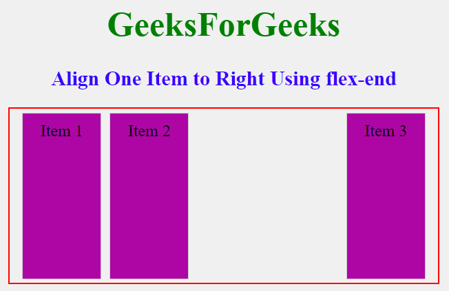
Using justify-content: flex-end Property
The container div contains two flex containers inside (.flex-container1 and .flex-container2). The flex container (flex-container1) has a justify-content value left whereas flex-container2 has a justify-content value flex-end. The property justify-content: flex-end to align items to the right within the flex container.
Example: Illustration of alignment of the one item to the right using justify-content: flex-end Property.
HTML
<!DOCTYPE html>
<html lang="en">
<head>
<meta charset="UTF-8">
<meta name="viewport"
content="width=device-width,
initial-scale=1.0">
<title>Image Without Stretch</title>
<style>
body {
margin: 0;
padding: 0;
height: 100vh;
background-color: #f0f0f0;
display: flex;
align-items: center;
}
h1 {
text-align: center;
font-size: 40px;
color: green;
}
h2 {
text-align: center;
color: rgb(55, 0, 255);
}
.main {
width: 80%;
height: 60%;
margin: 0 auto;
}
.container {
padding: 0 10px;
margin: 0 auto;
border: 2px solid red;
width: 90%;
height: 60%;
display: flex;
align-items: center;
justify-content: space-between;
}
.flex-container1 {
display: flex;
align-items: center;
justify-content: left;
height: 100%;
}
.flex-container2 {
display: flex;
align-items: center;
justify-content: flex-end;
height: 100%;
}
.flex-item {
padding: 10px;
width: 100px;
height: 85%;
font-size: larger;
text-align: center;
background-color: rgb(173, 6, 165);
border: 1px solid #ccc;
margin: 5px;
}
/* Small devices */
@media screen and (max-width: 800px) {
.main {
width: 100%;
margin: 0 10%;
}
.flex-item {
width: 70px;
}
}
</style>
</head>
<body>
<div class="main">
<h1>GeeksForGeeks</h1>
<h2>Align One Item to
Right Using flex-end
</h2>
<div class="container">
<div class="flex-container1">
<div class="flex-item">
Item 1
</div>
<div class="flex-item">
Item 2
</div>
</div>
<div class="flex-container2">
<div class="flex-item">
Item 3
</div>
</div>
</div>
</div>
</body>
</html>
|
Output:
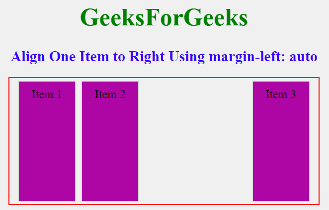
Using margin-left: auto Property
A centered flex layout with a container (flex-container) containing three flex items (flex-item). The first 2 items (item1 and item2) are aligned to the left the container. One of the flex items (Item 3) is aligned to the right within the container using the class .align-right, achieved by applying margin-left: auto.
Example: Illustration of alignment of the one item to the right using CSS Flexbox using margin-left: auto Property.
HTML
<!DOCTYPE html>
<html lang="en">
<head>
<meta charset="UTF-8">
<meta name="viewport"
content="width=device-width,
initial-scale=1.0">
<title>Image Without Stretch</title>
<style>
body {
margin: 0;
padding: 0;
height: 100vh;
background-color: #f0f0f0;
display: flex;
align-items: center;
justify-content: center;
}
h1 {
text-align: center;
font-size: 40px;
color: green;
}
h2 {
text-align: center;
color: rgb(55, 0, 255);
}
.main {
width: 80%;
height: 60%;
margin: 0 auto;
}
.flex-container {
padding: 0 10px;
margin: 0 auto;
border: 2px solid red;
width: 90%;
height: 60%;
display: flex;
align-items: center;
justify-content: space-between;
}
.flex-item {
padding: 10px;
width: 100px;
height: 85%;
font-size: larger;
text-align: center;
background-color: rgb(173, 6, 165);
border: 1px solid #ccc;
margin: 5px;
}
/* Align items to the right */
.align-right {
margin-left: auto;
}
/* Small devices */
@media screen and (max-width: 800px) {
.main {
width: 100%;
margin: 0 10%;
}
.flex-item {
width: 70px;
}
}
</style>
</head>
<body>
<div class="main">
<h1>GeeksForGeeks</h1>
<h2>Align One Item to
Right Using margin-left: auto
</h2>
<div class="flex-container">
<div class="flex-item">
Item 1
</div>
<div class="flex-item">
Item 2
</div>
<div class="flex-item align-right">
Item 3
</div>
</div>
</div>
</body>
</html>
|
Output:
Share your thoughts in the comments
Please Login to comment...