Scatter Plot In Excel
Last Updated :
09 May, 2021
A scatter plot is a mathematical diagram made using the Cartesian coordinates which are used to display typically 2D-data sets. These are also known as scatterplot, scatter graph, scatter chart, scatter gram, or scatter diagram.
In this article we will look into how we can create scatter plot in Excel. To do so follow the below steps:
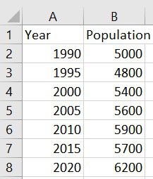
Step 1: Formatting data for Scatter Plot.
We have to make sure that there should be two variables for a set of data.
Step 2: Converting data into Scatter Plot.
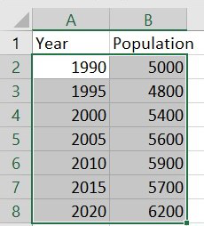
First, highlight the data which we want in the scatter plot.
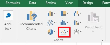
Step 3: Then, click to the Insert tab on the Ribbon. In the Charts group, click Insert Scatter(X, Y) or Bubble Chart.
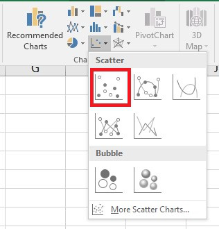
Step 4: In the resulting menu, click Scatter.
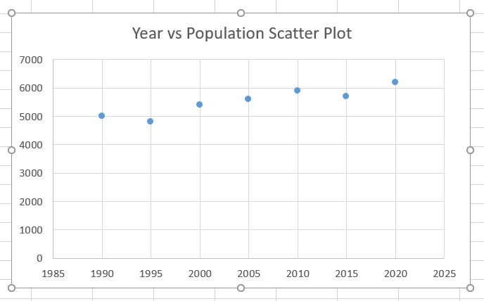
Once we have clicked that, our Scatter Plot will appear.
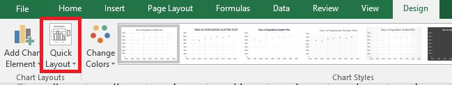
Step 5: Now, to add label on x-axis and y-axis we have to click to the Design tab on the Ribbon. In the Chart Layouts group, click Quick Layout.
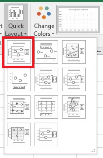
Step 6: In the resulting menu, click Layout 1.
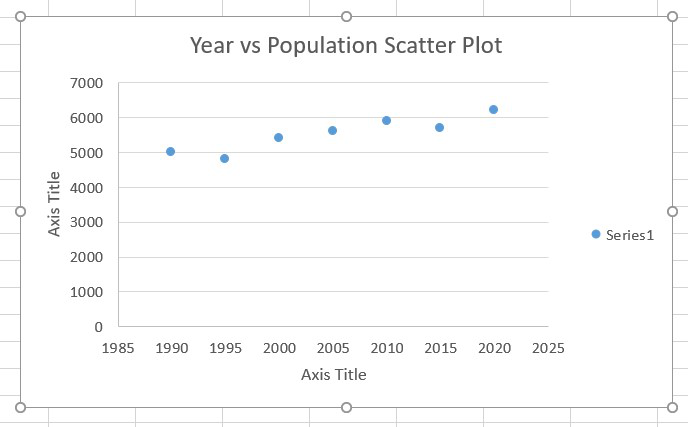
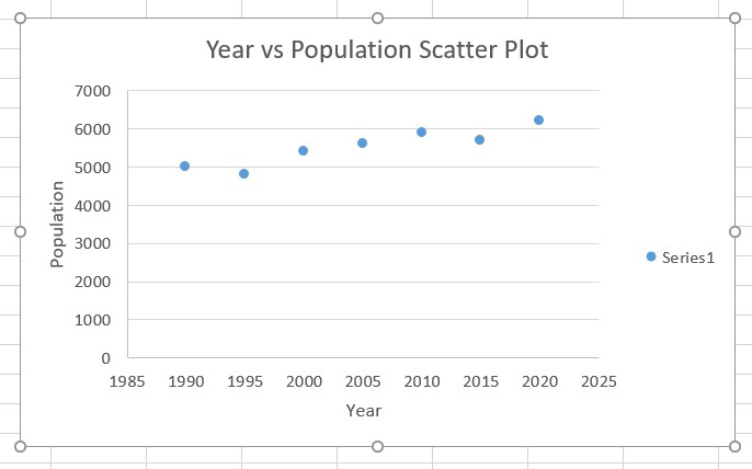
Step 7: Then change the label name of X axis from Axis Title to Year and Y axis from Axis Title to Population.
Like Article
Suggest improvement
Share your thoughts in the comments
Please Login to comment...