How to Disable a Button in React JS ?
Last Updated :
24 Nov, 2023
Disabling a button in React JS means making it unclickable and visually indicating its unavailability. This is done by setting the button’s disabled attribute to true. It’s used for controlled interactions, like form submissions with valid data.
A disabled button becomes unclickable and visually signifies to the user that its functionality is currently unavailable. This common practice helps prevent users from performing invalid or prohibited actions within a specific context.
Syntax:
<button disabled={true}>Disabled Button</button>
Prerequisites:
These are the approaches to disable a button in React JS
Steps to Create React Application:
Step 1: Create a react application by using this command
npx create-react-app disable-button-app
Step 2: After creating your project folder, i.e. disable-button-app, use the following command to navigate to it:
cd disable-button-app
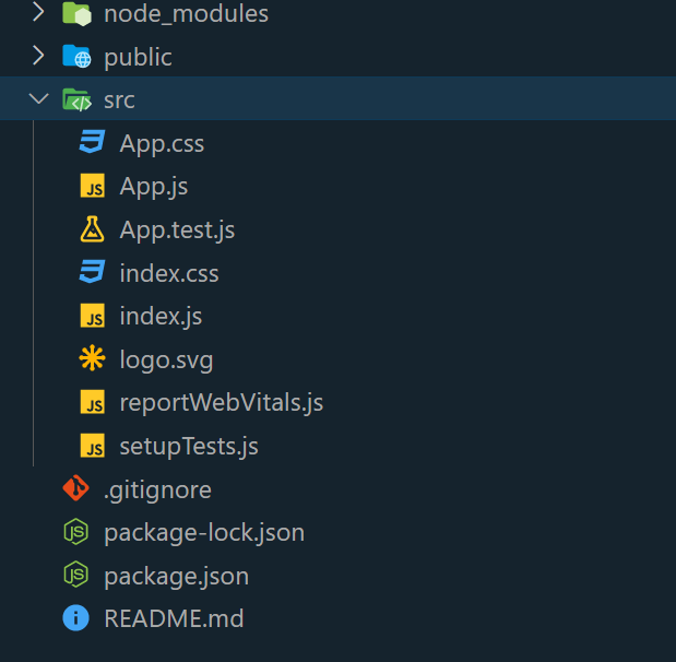
Project Structure:
Approach 1: State Management with Alert Message
The approach involves using React’s state hooks to manage button disabled states. Two functions are created for toggling the disabled state, accompanied by alerts to provide user massage. The buttons’ appearance is determined by conditional internal styling. The internal CSS defines a centered layout with a prominent green heading and distinct styles for disabled (gray, no cursor) and enabled (red, pointer cursor) button states.
Example: This creates a component that displays two buttons, “Disable” and “Enable.” Clicking “Disable” disables the “Disable” button and vice versa. Alert messages confirm the actions.
Javascript
import React, { useState } from 'react';
function App() {
const [isButtonDisabled, setButtonDisabled] = useState(false);
const disableButton = () => {
setButtonDisabled(true);
alert("Button has been disabled!");
};
const enableButton = () => {
setButtonDisabled(false);
alert("Button has been enabled!");
};
return (
<div style={styles.container}>
<h1 style={styles.heading}>Geekforgeeks</h1>
<button
onClick={disableButton}
style={isButtonDisabled ?
styles.disabledButton : styles.enabledButton}
disabled={isButtonDisabled}
>
Disable
</button>
<button
onClick={enableButton}
style={!isButtonDisabled ?
styles.disabledButton : styles.enabledButton}
disabled={!isButtonDisabled}
>
Enable
</button>
</div>
);
}
export default App;
const styles = {
container: {
textAlign: 'center',
margin: 'auto',
padding: '20px',
width: 400,
},
heading: {
fontSize: '34px',
marginBottom: '10px',
color: "green",
borderBottom: "3px solid green",
paddingBottom: 20,
borderRadius: "8px",
},
disabledButton: {
backgroundColor: 'gray',
color: 'white',
cursor: 'not-allowed',
margin: 10,
padding: 15,
borderRadius: "8px",
border: "none",
boxShadow: "0px 0px 10px 0px grey",
},
enabledButton: {
backgroundColor: 'red',
color: 'white',
cursor: 'pointer',
margin: 10,
padding: 15,
borderRadius: "8px",
border: "none",
boxShadow: "0px 0px 10px 0px grey",
},
};
|
Steps to Run the Application: open the application, use the Terminal and enter the command below.
npm start
Output: This output will be visible on the http://localhost:3000/ on the browser window.
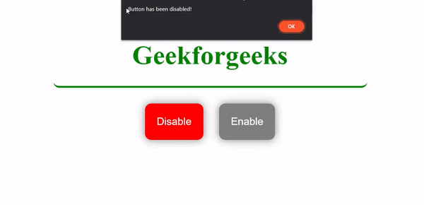
How To Disable A Button In ReactJs Example 1
Approach 2: Conditional Rendering
Conditional rendering in React involves rendering components based on conditions, enabling or disabling UI elements dynamically. Useful for managing component visibility and interactions.
Example: This example creates a form interface with an input field and a submit button. The button is initially disabled when the input field is empty. Once the user enters text, the button becomes enabled, allowing them to submit. Clicking the button triggers an alert showing the input value.
Javascript
import React, { useState } from 'react';
function App() {
const [inputValue, setInputValue] = useState('');
const handleSubmit = () => {
if (inputValue.length > 0) {
alert("Form submitted with value: " + inputValue);
}
};
return (
<div style={styles.container}>
<h1 style={styles.heading}>Geekforgeeks</h1>
<input
type="text"
value={inputValue}
onChange={(e) => setInputValue(e.target.value)}
style={styles.input}
/>
<button
onClick={handleSubmit}
style={inputValue.length === 0
? styles.disabledButton : styles.enabledButton}
disabled={inputValue.length === 0}
>
Submit
</button>
</div>
);
}
export default App;
const styles = {
container: {
textAlign: 'center',
margin: 'auto',
padding: '20px',
},
heading: {
fontSize: '34px',
marginBottom: '10px',
color: "green",
borderBottom: "3px solid green",
paddingBottom: 20,
borderRadius: "8px",
},
input: {
padding: '10px',
marginBottom: '10px',
width: '200px',
borderRadius: 8,
},
disabledButton: {
backgroundColor: 'gray',
color: 'white',
cursor: 'not-allowed',
margin: 10,
padding: 15,
borderRadius: "8px",
border: "none",
boxShadow: "0px 0px 10px 0px grey",
},
enabledButton: {
backgroundColor: 'green',
color: 'white',
cursor: 'pointer',
margin: 10,
padding: 15,
borderRadius: "8px",
border: "none",
boxShadow: "0px 0px 10px 0px grey",
},
};
|
Steps to Run the Application: open the application, use the Terminal and enter the command below.
npm start
Output: This output will be visible on the http://localhost:3000/ on the browser window.
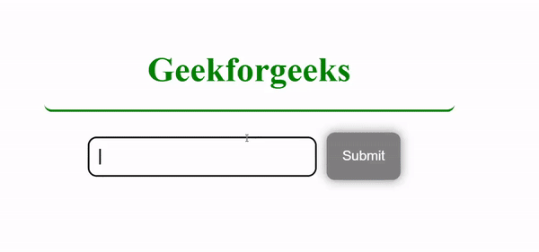
How To Disable A Button In ReactJs Example 2
Share your thoughts in the comments
Please Login to comment...