How to Design a Navbar in Figma?
Last Updated :
14 May, 2024
What is a Navbar ?
A navbar, or navigation bar, is a user interface element that provides access to a website’s main sections. It is a part of a website that helps users easily move around the site by showing links to its main sections, typically found at the top or side. Navbars can be hidden or easy to access, allowing site visitors to navigate to the pages that are most useful or interesting to them. The Navbar can be seen on Web applications and Android applications. Web developers create navbars in HTML and style them in CSS. In order to provide the best user experience navbar can be designed with figma.
What is Figma?
Figma is a tool that designers use to create digital designs, like websites or apps. It helps them make layouts, choose colors, and add interactive features. It’s like a digital canvas where designers can bring their ideas to life and share them with others. Figma is popular with designers, product managers, writers, and developers. It helps users contribute, give feedback, and make better decisions faster.
How to Create a Navbar in Figma?
1. Open Figma: Open Figma in web browser or app. Create a new file or open the existing file where you want to add the navbar.
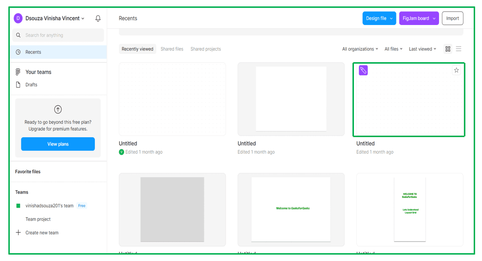
Figma File
2. Create a Frame: First, create a frame where you want your navbar to be placed. You can do this by selecting the Frame tool from the toolbar on the left and dragging to create a rectangle of the desired size on your canvas.
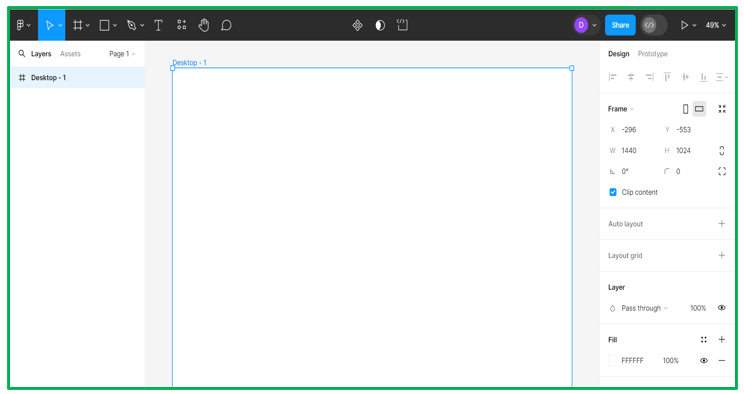
Frame in Figma
3. Design the Navbar: Inside the frame, design your navbar using Figma’s various shape, text, and drawing tools. You can create rectangles for each menu item, add text layers for labels, and include any icons or logos as needed.
a. One can add shape to design the Navbar
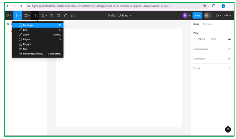
Shapes in Navbar
b. Add shapes to create buttons in navbar by changing the radius
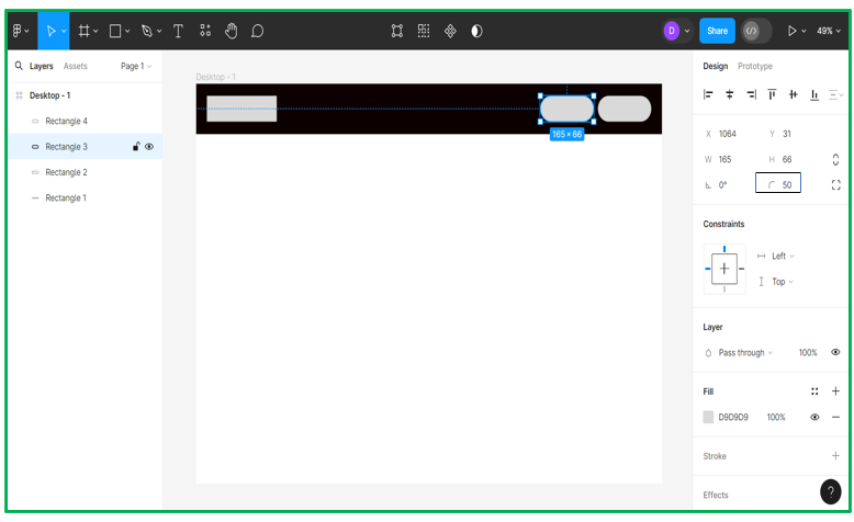
Buttons for Navbar
c. Change the color of shapes by clicking on “Fill”. Also the text can be added by clicking the ‘T’ at left corner and can change font size and font color
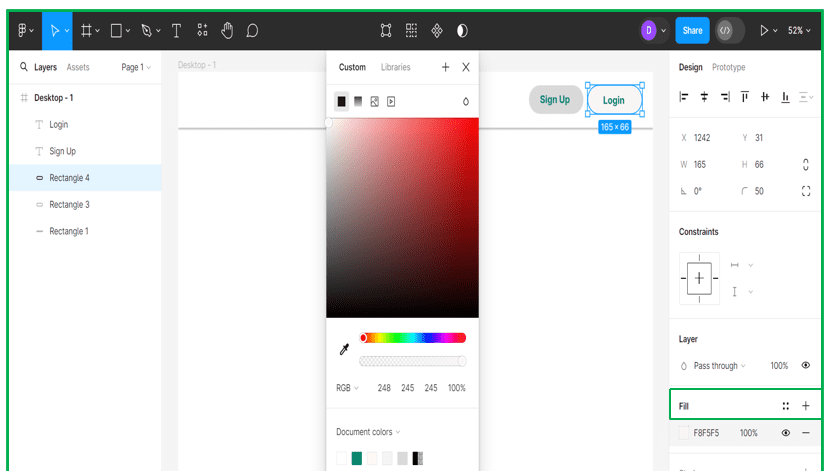
Fill shapes with colors
d. Also images can be added by clicking on arrow icon at left-corrner
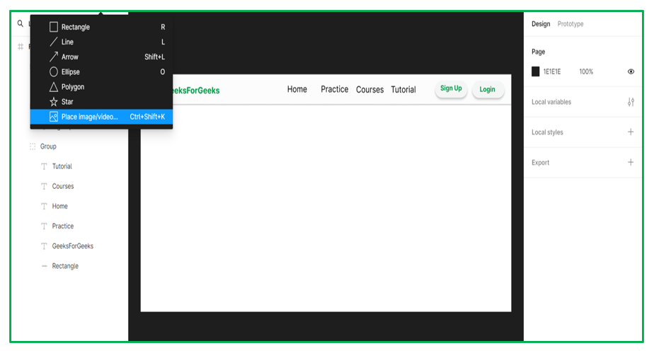
Images in Navbar
4. Test and Adjust: Finally, test your navbar by previewing your design in Figma’s prototype mode or by exporting it to see how it looks. Make any necessary adjustments to spacing, alignment, or styling to ensure it looks and functions as intended.

Navbar in Figma
Properties to design navbar in Figma
- Size and Dimensions: Determine the height and width of the navbar to ensure it is appropriately sized for the content it will contain and fits well within the overall layout of the interface.
- Responsive Design : Responsive Navbar can be designed with Figma. The Navbars can be designed for different screens and devices. Consider how the navbar will behave on smaller screens and how navigation options may need to be adjusted or collapsed for mobile or tablet layouts.
- Accessibility: Make sure the navbar follows accessibility guidelines by using clear color contrast, descriptive labels, and ensuring keyboard and screen reader accessibility.
- Alignment and Spacing: Arrange navigation items and any additional elements within the navbar with proper alignment and spacing. Maintain consistent spacing between items to create a visually balanced layout and make it easy for users to differentiate between different navigation options.
- Color Scheme: Choose navbar colors that match the overall design and offer good readability with enough contrast.
Importance of using Figma to design Navbar
- Collaborative Design: The navigation bar file in Figma allows you to reuse design components across multiple screens and projects, which can help ensure consistency, simplify maintenance, and facilitate team collaboration.
- Alignment of elements: It makes easier for users to find and tap the buttons they need, regardless of where they are on the screen.With Figma, designers can easily create responsive navbar designs that adapt seamlessly to different screen sizes and devices.
- Prototyping Capabilities: Figma provides powerful prototyping tools for creating interactive navbar prototypes. This helps stakeholders visualize navigation, test interactions and gather feedback early for improved navbar design.
- Integration with Development Workflow: Figma integrates well with development workflows, allowing designers to easily generate code snippets from their designs, speeding up the process of implementing the navbar design.
Conclusion
Designing a navbar in Figma involves careful consideration of several key properties to ensure the resulting interface element is both visually appealing and functional. By focusing on aspects such as size and dimensions, typography, color scheme, icons and symbols, alignment and spacing, interactivity, responsive design, and accessibility, designers can create a navbar that enhances the overall user experience.
In Figma, designers have the tools necessary to prototype and iterate on navbar designs, taking advantage of features such as interactive prototypes to test navigation interactions and responsive design features to ensure a seamless experience across various screen sizes and devices.
Share your thoughts in the comments
Please Login to comment...