How to Design a Custom Alert Box using JavaScript ?
Last Updated :
26 Mar, 2024
An alert box is a built-in feature in JavaScript that displays a small window with a message to the user. It’s primarily used for providing information to the user, displaying warnings, or prompting the user for confirmation.
The below approaches can be used to create a custom alert box in JavaScript:
Using JavaScript to toggle display property
- Create the basic HTML structure for the alert box and its content, and include elements for the alert message and the close button.
- In JavaScript, get all the required HTML elements. After that implement event listeners to trigger the alert box’s display.
- When the button is clicked then set the alertBox.style.display = “block”; for showing the alert box and when the close button is clicked set the alertBox.style.display = “none”; to hide it.
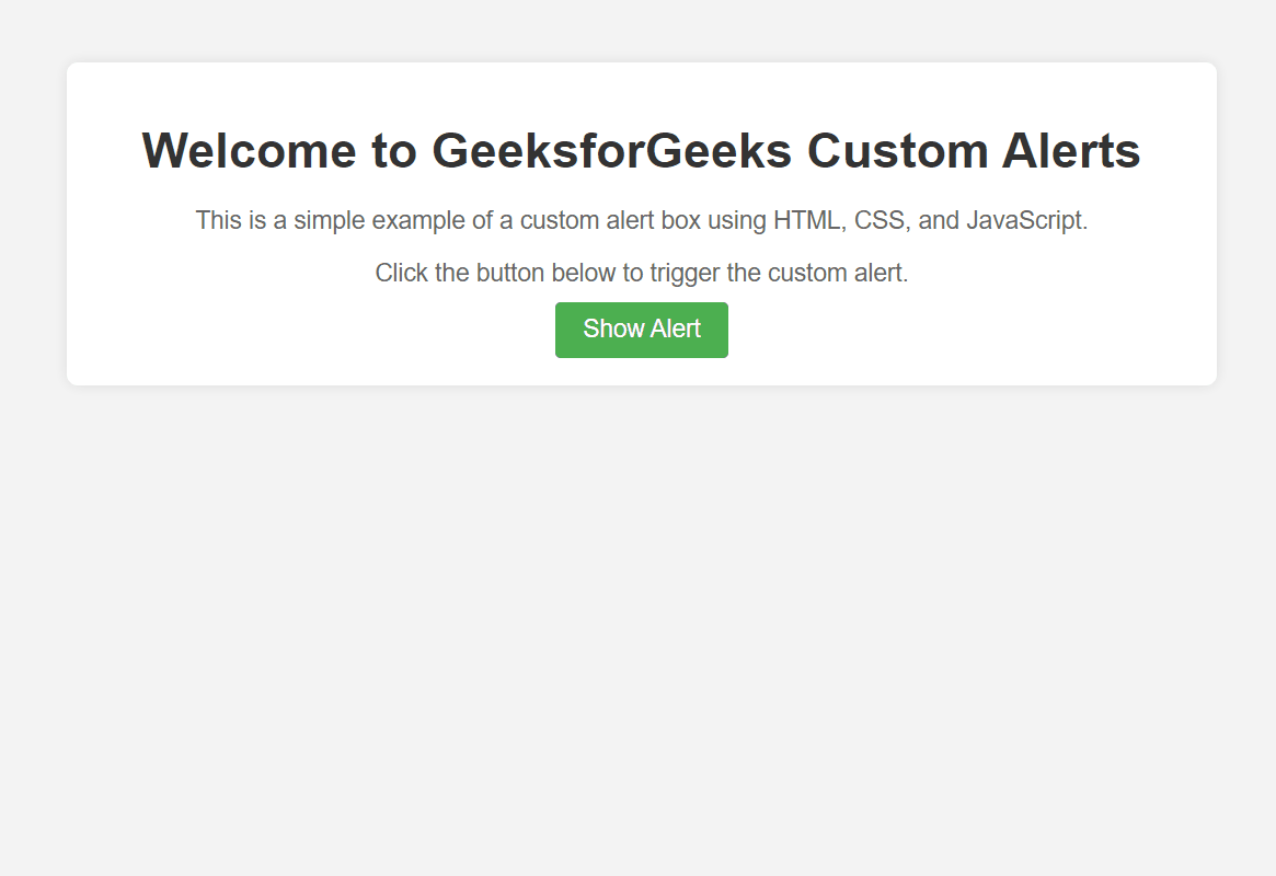
Example: The below example illustrates the implementation to design a custom alert box using JavaScript to toggle the display property.
HTML
<!DOCTYPE html>
<html lang="en">
<head>
<meta charset="UTF-8">
<meta name="viewport" content=
"width=device-width, initial-scale=1.0">
<title>Custom Alert Box</title>
<link rel="stylesheet" href="style.css">
</head>
<body>
<div class="container">
<h1>
Welcome to GeeksforGeeks Custom Alerts
</h1>
<p>
This is a simple example of a custom alert
box using HTML, CSS, and JavaScript.
</p>
<p>
Click the button below to trigger the custom alert.
</p>
<button class="custom-button">
Show Alert
</button>
</div>
<div id="customAlertBox" class="custom-alert">
<div class="custom-alert-content">
<span class="close">×</span>
<p id="alertMessage"></p>
</div>
</div>
<script>
let alertBox =
document.getElementById("customAlertBox");
let alert_Message_container =
document.getElementById("alertMessage");
let custom_button =
document.querySelector(".custom-button");
let close_img =
document.querySelector(".close");
let body =
document.querySelector("body");
custom_button.addEventListener
('click', function () {
alert_Message_container.innerHTML =
"You clicked the button";
alertBox.style.display = "block";
});
close_img.addEventListener
('click', function () {
alertBox.style.display = "none";
});
</script>
</body>
</html>
body {
    font-family: Arial, sans-serif;
    background-color: #f4f4f4;
    margin: 0;
    padding: 0;
}

.container {
    max-width: 800px;
    margin: 50px auto;
    padding: 20px;
    background-color: #fff;
    border-radius: 8px;
    box-shadow: 0 0 10px rgba(0, 0, 0, 0.1);
    text-align: center;
}

h1 {
    font-size: 36px;
    color: #333;
    margin-bottom: 20px;
}

p {
    font-size: 18px;
    color: #666;
    margin-bottom: 10px;
}

.custom-button {
    padding: 10px 20px;
    font-size: 18px;
    background-color: #4CAF50;
    color: white;
    border: none;
    border-radius: 4px;
    cursor: pointer;
    transition: background-color 0.3s;
}

.custom-button:hover {
    background-color: #45a049;
}

.custom-alert {
    display: none;
    position: fixed;
    z-index: 1000;
    left: 0;
    top: 0;
    width: 100%;
    height: 100%;
    overflow: auto;
    background-color: rgba(0, 0, 0, 0.4);
}

.custom-alert-content {
    background-color: #fefefe;
    margin-left: 30rem;
    margin-top: 20rem;
    padding: 20px;
    border: 1px solid #888;
    width: 80%;
    max-width: 400px;
    border-radius: 8px;
    position: relative;

}

.close {
    color: #aaa;
    float: right;
    font-size: 28px;
    font-weight: bold;
}

.close:hover,
.close:focus {
    color: black;
    text-decoration: none;
    cursor: pointer;
}

#alertMessage {
    color: #45a049;
}
Output:
Using SweetAlert2 library
- Create the HTML file with the basic structure including a button to trigger the custom alert box.
- Then import the SweetAlert2 library by adding the appropriate <link> tag in the <head> section of your HTML file for CSS, and <script> tag before the closing <body> tag for JavaScript.
- When the button is clicked, then trigger the SweetAlert2 alert box by calling the Swal.fire() function with some desired options such as title, text, icon, and confirm button text.
Example: The below example illustrates the implementation to design a custom alert box using SweetAlert2 library.
HTML
<!DOCTYPE html>
<html lang="en">

<head>
    <meta charset="UTF-8">
    <meta name="viewport" content=
"width=device-width, initial-scale=1.0">
    <title>Custom Alert Box</title>
    <link rel="stylesheet" href=
"https://cdn.jsdelivr.net/npm/sweetalert2@10">
    <link rel="stylesheet" href="style.css">
</head>

<body>

    <div class="container">
        <h1>
            Welcome to GeeksforGeeks Custom Alerts
        </h1>
        <p>
            This is a simple example of a custom alert
            box using HTML, CSS, and JavaScript.
        </p>
        <p>
            Click the button below to trigger the custom alert.
        </p>
        <button class="custom-button">
            Show Alert
        </button>
    </div>

    <script src=
"https://cdn.jsdelivr.net/npm/sweetalert2@10">
    </script>
    <script>
        let custom_button =
            document.querySelector(".custom-button");
        custom_button.addEventListener
            ('click', function () {
                Swal.fire({
                    title: 'Custom Alert',
                    text: 'You clicked the button',
                    icon: 'info',
                    confirmButtonText: 'OK'
                });
            });
    </script>

</body>

</html>
body {
    font-family: Arial, sans-serif;
    background-color: #f4f4f4;
    margin: 0;
    padding: 0;
}

.container {
    max-width: 800px;
    margin: 50px auto;
    padding: 20px;
    background-color: #fff;
    border-radius: 8px;
    box-shadow: 0 0 10px rgba(0, 0, 0, 0.1);
    text-align: center;
}

h1 {
    font-size: 36px;
    color: #333;
    margin-bottom: 20px;
}

p {
    font-size: 18px;
    color: #666;
    margin-bottom: 10px;
}

.custom-button {
    padding: 10px 20px;
    font-size: 18px;
    background-color: #4CAF50;
    color: white;
    border: none;
    border-radius: 4px;
    cursor: pointer;
    transition: background-color 0.3s;
}

.custom-button:hover {
    background-color: #45a049;
}

.custom-alert {
    display: none;
    position: fixed;
    z-index: 1000;
    left: 0;
    top: 0;
    width: 100%;
    height: 100%;
    overflow: auto;
    background-color: rgba(0, 0, 0, 0.4);
}

.custom-alert-content {
    background-color: #fefefe;
    margin-left: 30rem;
    margin-top: 20rem;
    padding: 20px;
    border: 1px solid #888;
    width: 80%;
    max-width: 400px;
    border-radius: 8px;
    position: relative;

}

.close {
    color: #aaa;
    float: right;
    font-size: 28px;
    font-weight: bold;
}

.close:hover,
.close:focus {
    color: black;
    text-decoration: none;
    cursor: pointer;
}

#alertMessage {
    color: #45a049;
}
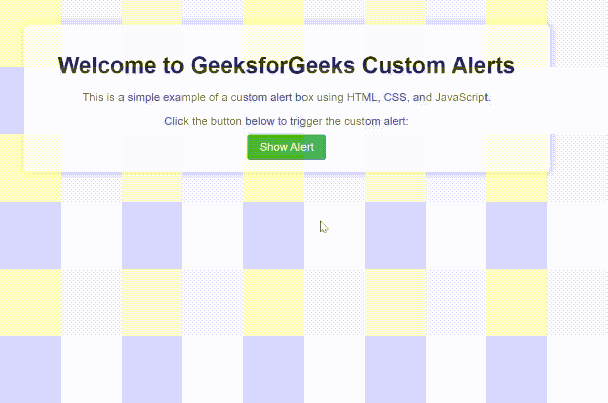
Output:
Output : Using SweetAlert2 library
Share your thoughts in the comments
Please Login to comment...