How to Create Animated Card Layout in Tailwind CSS ?
Last Updated :
14 Feb, 2024
Creating animated card layouts can significantly enhance the user experience of a website, making it more interactive and engaging. Tailwind CSS, known for its utility-first approach, enables developers to build sophisticated animations without leaving the HTML markup. This article will guide you through creating an animated card layout using Tailwind CSS, covering all possible approaches with complete HTML code examples.
Basic Animated Card Layout
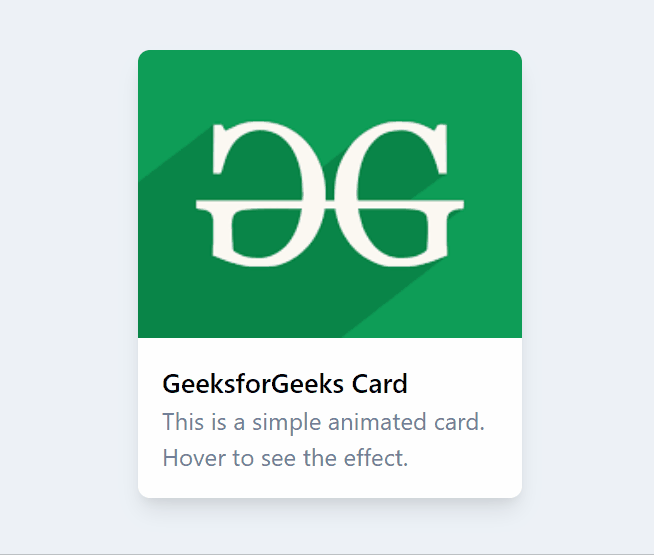
Let’s start with a basic card layout that includes a simple hover animation. The animation will scale the card slightly and change its shadow to give a “lifting” effect when hovered over.
Example:
HTML
<!DOCTYPE html>
<html lang="en">
<head>
<meta charset="UTF-8">
<meta name="viewport" content=
"width=device-width, initial-scale=1.0">
<title>Animated Card Layout in Tailwind CSS</title>
<link href=
rel="stylesheet">
</head>
<body class="bg-gray-200 flex justify-center
items-center h-screen">
<div class="w-64 h-80 bg-white rounded-lg
shadow-lg transform transition duration-500
hover:scale-105 hover:shadow-2xl">
<img class="w-full h-48 object-cover rounded-t-lg" src=
alt="Card Image">
<div class="p-4">
<h3 class="text-lg font-semibold">
GeeksforGeeks Card
</h3>
<p class="text-gray-600">
This is a simple animated card.
Hover to see the effect.
</p>
</div>
</div>
</body>
</html>
|
Output
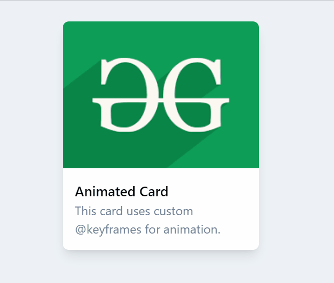
Adding Complex Animations with @keyframes
For more complex animations that can’t be achieved with Tailwind’s built-in utilities, you can use custom CSS with Tailwind’s @apply directive to keep your styling consistent.
Example: HTML and Custom CSS Code
HTML
<!DOCTYPE html>
<html lang="en">
<head>
<meta charset="UTF-8">
<meta name="viewport" content=
"width=device-width, initial-scale=1.0">
<title>Animated Card Layout in Tailwind CSS</title>
<link href=
rel="stylesheet">
<style>
@keyframes fadeInUp {
from {
opacity: 0;
transform: translateY(20px);
}
to {
opacity: 1;
transform: translateY(0);
}
}
.fade-in-up {
animation: fadeInUp 0.5s ease-out forwards;
}
</style>
</head>
<body class="p-4">
<div class="bg-gray-200 flex justify-center
items-center h-screen">
<div class="w-64 h-80 bg-white rounded-lg
shadow-lg overflow-hidden fade-in-up">
<img class="w-full h-48 object-cover" src=
alt="Card Image">
<div class="p-4">
<h3 class="text-lg font-semibold">
Animated Card
</h3>
<p class="text-gray-600">
This card uses custom @keyframes for animation.
</p>
</div>
</div>
</div>
</body>
</html>
|
Output
Share your thoughts in the comments
Please Login to comment...