Create a Responsive Animated Clock in Tailwind CSS
Last Updated :
03 Apr, 2024
We will create a simple Responsive Animated Clock using the Tailwind CSS and JavaScript. We’ll utilize Tailwind CSS for styling to create an attractive user interface and JavaScript for the logic.
Prerequisites:
Approach:
- Create an HTML file named index.html and link the Tailwind CSS stylesheet for styling.
- Use SVG to create the clock face and hands.
- Use CSS to add animation for the movement of clock hands.
- Create a file named script.js which will include all the JavaScript code.
- Implement the function to update the clock hands’ positions every second.
Example: This example shows the implementation of a Responsive Animated Clock using Tailwind CSS and JavaScript.
HTML
<!DOCTYPE html>
<html lang="en">

<head>
    <meta charset="UTF-8">
    <meta name="viewport" content="width=device-width, initial-scale=1.0">
    <title>The Animated Clock</title>
    <link href=
"https://cdn.jsdelivr.net/npm/tailwindcss@2.2.19/dist/tailwind.min.css"
          rel="stylesheet">
    <style>
        @keyframes pulse {
            0% {
                transform: scale(1);
            }

            100% {
                transform: scale(1.05);
            }
        }

        .clock-container {
            background: radial-gradient(circle, #6b46c1, #805ad5, #a78bfa, #d2a8f9);
            box-shadow: 0 4px 6px rgba(0, 0, 0, 0.3);
            width: 300px;
            height: 300px;
            border-radius: 50%;
            display: flex;
            justify-content: center;
            align-items: center;
            position: relative;
            animation: pulse 2s infinite alternate;
        }

        .clock-number {
            fill: #fff;
            font-size: 14px;
            font-weight: bold;
            text-anchor: middle;
        }

        .clock-hand {
            transform-origin: center;
            transition: transform 0.5s ease;
        }

        .hour-hand {
            stroke: #ff9f1a;
            stroke-width: 6;
        }

        .minute-hand {
            stroke: #06d6a0;
            stroke-width: 4;
        }

        .second-hand {
            stroke: #f72585;
            stroke-width: 2;
        }
    </style>
</head>

<body class="bg-gray-100 min-h-screen flex justify-center items-center">
    <div class="clock-container">
        <svg class="w-60 h-60" xmlns="http://www.w3.org/2000/svg"
            viewBox="0 0 100 100">
            <circle cx="50" cy="50" r="48" fill="none" stroke="#fff"
                stroke-width="2" />
            <text x="50" y="15" class="clock-number">12</text>
            <text x="90" y="55" class="clock-number">3</text>
            <text x="50" y="95" class="clock-number">6</text>
            <text x="10" y="55" class="clock-number">9</text>
            <g class="hour-hand clock-hand">
                <line x1="50" y1="50" x2="50" y2="30" class="hour-hand" />
            </g>
            <g class="minute-hand clock-hand">
                <line x1="50" y1="50" x2="50" y2="20" class="minute-hand" />
            </g>
            <g class="second-hand clock-hand">
                <line x1="50" y1="50" x2="50" y2="15" class="second-hand" />
            </g>
        </svg>
    </div>
    <script>
        function updateClock() {
            const now = new Date();
            const hours = now
                .getHours();
            const minutes = now
                .getMinutes();
            const seconds = now
                .getSeconds();
            const hourHand = document
                .querySelector(".hour-hand");
            const minuteHand = document
                .querySelector(".minute-hand");
            const secondHand = document
                .querySelector(".second-hand");
            const hourDegrees = (hours % 12) * 30 + (minutes / 60) * 30;
            const minuteDegrees = minutes * 6 + (seconds / 60) * 6;
            const secondDegrees = seconds * 6;
            hourHand.style.transform = `rotate(${hourDegrees}deg)`;
            minuteHand.style.transform = `rotate(${minuteDegrees}deg)`;
            secondHand.style.transform = `rotate(${secondDegrees}deg)`;
        }
        setInterval(updateClock, 1000);
        updateClock();
    </script>
</body>

</html>
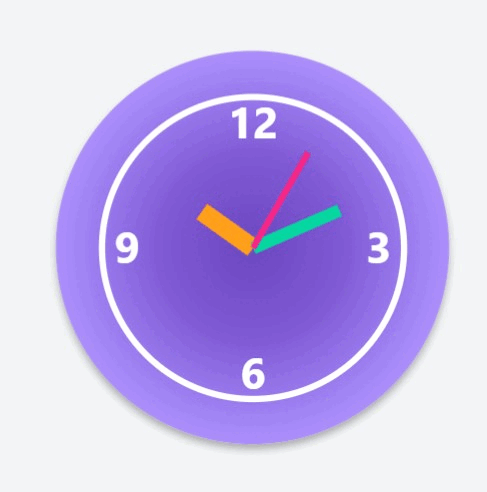
Output:
Share your thoughts in the comments
Please Login to comment...