Create a Animated Product Card using HTML CSS & JavaScript.
Last Updated :
15 Nov, 2023
In this article, we dive into creating a simple animated product card using HTML, CSS, and JavaScript. Here we’re going to create a product card with the product name and price. On hover, it flips and shows detailed information along with a buy button. These cards not only make the website visually appealing but also give more information regarding products within the allocated space on the web page.
Preview:
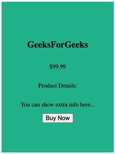
On hover
Prerequisites:
Approach:
- Start by structuring the HTML code of the product card. Create a new container element that represent the card itself. Inside this container, add two elements, one for the front side of the card having class name (“. card-front”) and other for the back side of the card having class name (“. card-back”).
- The front part displays the basic information of the product like name and price, while the back part initially remains hidden. Ensure that the back part of the card remains hidden by default. Use “backface-visibility: hidden” for this purpose.
- Apply a CSS transition property to the card to create a smooth animation when the card flips. This transition will affect the “transform” property. Set “transform” to “rotateY(180deg)” to achieve the side-flip effect when the card is hovered by the user.
- When the user hovers over the card, adjust the “opacity” and “pointer-events” properties to reveal the back side. Set “opacity” to 1 and “pointer-events” to “auto”.
- In your JavaScript file (`script.js`), select the card element from your HTML document using “document.querySelector(“. card”)”. Add event listeners to the card element to detect user interactions such as hovering.
Project Structure:
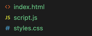
Project structure
Example: Below example helps you create an animated product card using HTML, CSS and JavaScript.
Javascript
const card = document.querySelector('.card');
card.addEventListener('mouseover', function () {
card.style.transform = 'scale(1.2)';
});
card.addEventListener('mouseout', function () {
card.style.transform = 'scale(1)';
});
|
HTML
<!DOCTYPE html>
<html lang="en">
<head>
<meta charset="UTF-8">
<meta name="viewport" content="width=device-width,
initial-scale=1.0">
<link rel="stylesheet" href="styles.css">
<script src="script.js" defer></script>
<title>Animated Product Card</title>
</head>
<body>
<div class="card">
<div class="card-inner">
<div class="card-front">
<h2>GeeksForGeeks</h2>
<p>$99.99</p>
</div>
<div class="card-back">
<h2>GeeksForGeeks</h2>
<p>$99.99</p>
<p>Product Details:</p>
<p>You can show extra info here...</p>
<button class="buy-button">Buy Now</button>
</div>
</div>
</div>
</body>
</html>
|
CSS
body {
display: flex;
justify-content: center;
align-items: center;
height: 100vh;
margin: 0;
}
.card {
width: 300px;
height: 400px;
perspective: 1000px;
}
.card-inner {
width: 100%;
height: 100%;
transform-style: preserve-3d;
transition: transform 0.5s;
}
.card:hover .card-inner {
transform: rotateY(180deg);
}
.card-front,
.card-back {
width: 100%;
height: 100%;
position: absolute;
backface-visibility: hidden;
}
.card-front {
background: #f2f2f2;
display: flex;
flex-direction: column;
justify-content: center;
align-items: center;
transition: transform 0.5s;
}
.card-back {
background: #1abc9c;
transform: rotateY(180deg);
display: flex;
flex-direction: column;
justify-content: center;
align-items: center;
transition: transform 0.5s;
opacity: 0;
pointer-events: none;
}
.card:hover .card-back {
opacity: 1;
pointer-events: auto;
}
.buy-button {
animation: pulse 1s infinite;
}
@keyframes pulse {
0% {
transform: scale(1);
}
50% {
transform: scale(1.2);
}
100% {
transform: scale(1);
}
}
|
Output:
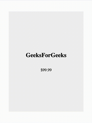
Output
Share your thoughts in the comments
Please Login to comment...