How to Create a Basic Two-Column Layout using Bootstrap 5 ?
Last Updated :
23 Feb, 2024
To create a basic two-column layout using Bootstrap, first, we have to enclose your content within a container, then create two divs with classes like col or col-xx, where xx represents the breakpoint for responsive behavior. Place your content inside these columns, and Bootstrap will handle the layout, adapting it for various screen sizes.
Using Grid System
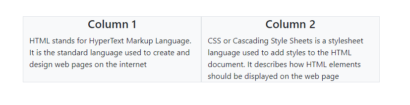
In this approach, Bootstrap’s grid system is utilized to create a two-column layout. Each column is defined using the col-md-6 class, ensuring equal width on medium-sized screens and larger. Background color and borders are added using Bootstrap utility classes bg-light and border, respectively, to visually distinguish the columns.
Example: Implementation to create a basic two-column layout using the grid system.
HTML
<!DOCTYPE html>
<html lang="en">
<head>
<meta charset="UTF-8">
<meta name="viewport"
content="width=device-width, initial-scale=1.0">
<title>Two-Column Layout</title>
<link href=
rel="stylesheet">
</head>
<body>
<div class="container mt-5">
<div class="row">
<div class="col-md-6 bg-light border">
<h4 class="text-center">Column 1</h4>
HTML stands for HyperText Markup Language.
It is the standard language used to create
and design web pages on the internet
</div>
<div class="col-md-6 bg-light border">
<h4 class="text-center">Column 2</h4>
CSS or Cascading Style Sheets is a stylesheet
language used to add styles to the HTML document.
It describes how HTML elements should be
displayed on the web page
</div>
</div>
</div>
</body>
</html>
|
Output:
Flex Box Approach
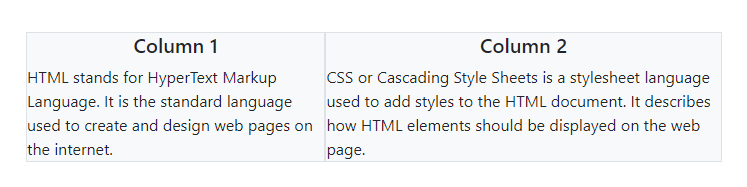
In this layout, the flexbox approach is used to create a two-column structure. The parent container is styled with the d-flex class to enable flexbox. Each column div is given the flex-grow-1 class to ensure they occupy equal space within the flex container. Additionally, Bootstrap’s utility classes like bg-light and border are utilized for styling backgrounds and borders respectively, resulting in a visually appealing two-column layout.
Example: Implementation to create a basic two-column layout using flexbox approach.
HTML
<!DOCTYPE html>
<html lang="en">
<head>
<meta charset="UTF-8">
<meta name="viewport" content="width=device-width, initial-scale=1.0">
<title>Two-Column Layout</title>
<link href=
rel="stylesheet">
</head>
<body>
<div class="container mt-5">
<div class="d-flex">
<div class="flex-grow-1 bg-light border">
<h5 class="text-center">Column 1</h5>
HTML stands for HyperText Markup Language.
It is the standard language used to create
and design web pages on the internet.
</div>
<div class="flex-grow-1 bg-light border">
<h5 class="text-center">Column 2</h5>
CSS or Cascading Style Sheets is a stylesheet
language used to add styles to the HTML document.
It describes how HTML elements should be
displayed on the web page.
</div>
</div>
</div>
</body>
</html>
|
Output:
Share your thoughts in the comments
Please Login to comment...