How to Create a Four-Column Layout with Bootstrap ?
Last Updated :
12 Apr, 2024
In Bootstrap, creating a column layout is important for organizing content into a structured grid system. A four-column layout allows for efficient arrangement of content, such as displaying courses, products, or services, with flexibility in responsiveness for various screen sizes.
Below are the approaches to create a four-column layout with bootstrap:
Using Grid Classes
In this approach, we are using Bootstrap’s Grid Classes to create a four-column layout. Each column is defined using the col-sm class, and the gx-0 class is used to remove the gutter (space) between columns. The content of each column is styled using Bootstrap’s utility classes for background color (bg-primary, bg-secondary, bg-success, bg-danger) and text color (text-white).
Example: The below example uses Grid Classes to Create a Four-Column Layout with Bootstrap.
HTML
<!DOCTYPE html>
<html>

<head>
    <title>Using Grid Classes</title>
    <link href=
"https://cdn.jsdelivr.net/npm/bootstrap@5.3.0/dist/css/bootstrap.min.css"
          rel="stylesheet">
</head>

<body>

    <div class="container text-center mt-4">
        <h1 class="text-success">GeeksforGeeks</h1>
        <h3>Using Grid Classes</h3>
    </div>

    <div class="container mt-4">
        <div class="row gx-0">
            <div class="col-sm">
                <div class="bg-primary text-white p-3">
                    <h4>Java</h4>
                    <p>Java</p>
                </div>
            </div>
            <div class="col-sm">
                <div class="bg-secondary text-white p-3">
                    <h4>Python</h4>
                    <p>Python</p>
                </div>
            </div>
            <div class="col-sm">
                <div class="bg-success text-white p-3">
                    <h4>HTML</h4>
                    <p>HTML</p>
                </div>
            </div>
            <div class="col-sm">
                <div class="bg-danger text-white p-3">
                    <h4>CSS</h4>
                    <p>CSS</p>
                </div>
            </div>
        </div>
    </div>
</body>

</html>
Output:

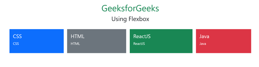
Using FlexBox Classes
In this approach, we are using Bootstrap’s Flexbox utility classes like d-flex, flex-wrap, and justify-content-center to create a four-column layout. Each column is defined as a flex item with the flex-fill class, allowing them to expand to fill the available space evenly. The m-2 class adds a margin around each column for spacing.
Example: The below example uses FlexBox to Create a Four-Column Layout with Bootstrap.
HTML
<!DOCTYPE html>
<html>

<head>
    <title>Using Flexbox</title>
    <link href=
"https://cdn.jsdelivr.net/npm/bootstrap@5.3.0/dist/css/bootstrap.min.css"
          rel="stylesheet">
</head>

<body>
    <div class="container text-center mt-4">
        <h1 class="text-success">GeeksforGeeks</h1>
        <h3>Using Flexbox</h3>
    </div>
    <div class="container mt-4">
        <div class="d-flex flex-wrap
                    justify-content-center">
            <div class="bg-primary text-white
                        p-3 flex-fill m-2">
                <h4>CSS</h4>
                <p>CSS</p>
            </div>
            <div class="bg-secondary text-white
                        p-3 flex-fill m-2">
                <h4>HTML</h4>
                <p>HTML</p>
            </div>
            <div class="bg-success text-white
                        p-3 flex-fill m-2">
                <h4>ReactJS</h4>
                <p>ReactJS</p>
            </div>
            <div class="bg-danger text-white
                        p-3 flex-fill m-2">
                <h4>Java</h4>
                <p>Java</p>
            </div>
        </div>
    </div>
</body>

</html>
Output:
Share your thoughts in the comments
Please Login to comment...