How to Change Chart Style in Excel?
Last Updated :
30 Aug, 2023
Chart styles are like a handy toolkit for making your charts look awesome. They give you a bunch of cool styles with colors, patterns, labels, and titles. Basically, all the things that make your chart easy on the eyes and extra useful for understanding data trends. These styles also supercharge your data analysis.
The easiest way to give a chart a makeover is by using the ready-made layouts that Excel offers. Just pick one that suits your fancy. You can also remove these styles when and as required.
How to Change Chart Style in Excel
In this example, we will create a chart and change its style. For this, we will be using random sales data for different courses.
Step 1: Create a Dataset
In this step, we will be creating the dataset using the following random sales data for different courses.

Fig 1 – Dataset
Step 2: Go to Insert Tab and Select Chart
Now, we will be inserting the chart for our dataset. In order to do this, we need to Select Data > Insert > Charts > Bar Chart.
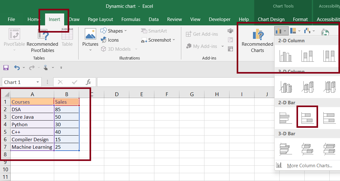
Insert Chart
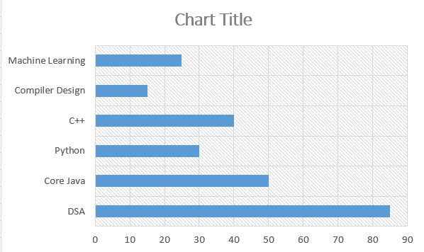
By doing this, Excel will automatically insert a bar chart for our dataset.
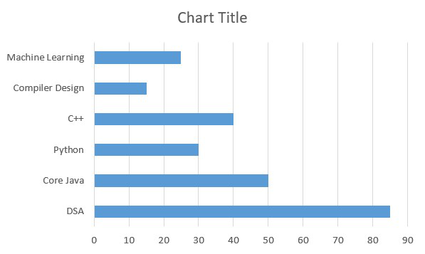
Fig 3 – Bar Chart
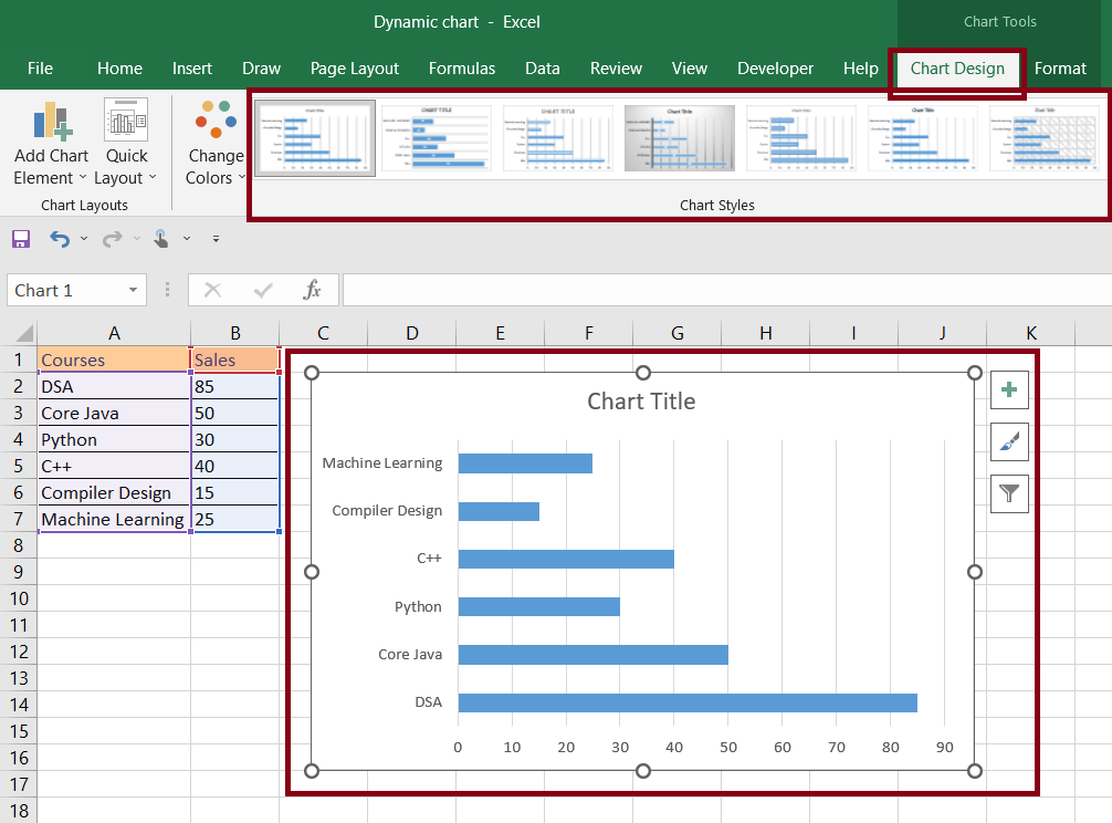
Step 3: Formatting Chart
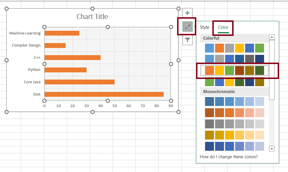
In this step, we will format the chart styles. For this we will be using the built-in excel chart designs. For this Select Chart > Chart Design > Chart Style.
Changing chart style
We can also change the style from the Chart Style icon beside the chart as shown below in the diagram.
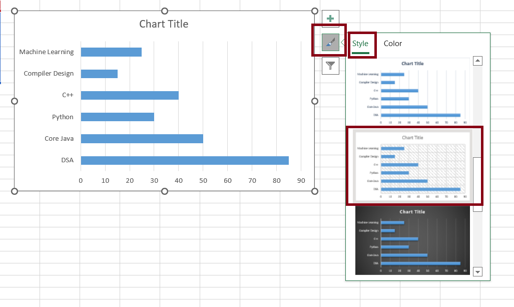
Using chart style icon
We will choose the style of chart according to our own requirements. (You can select your own chart style and design). We will be using the following design for our bar chart.
Inserted chart design
How to Change Chart Colour in Excel
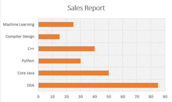
Once we are done with the chart design, we can also change the chart color. In the sidebar of the chart appearing when you click on chart, you will see color option. Click on it in the style box and select your desired colour.
Select Chart> Click on Colurs in Style Box> Select Colour
Change chart colour
Formatting Chart
In this step, we will format the chart. This will enhance our chart and also provide information that will help to analyze the chart easily.
Adding Chart Title
In order to add a title to the chart, double-click on the Chart Title view and, add whatever title you want.
add title
Adding Axis
In order to add an axis, we need to click on the plus(+) button beside the chart and check the axis titles checkbox and add the axis name.
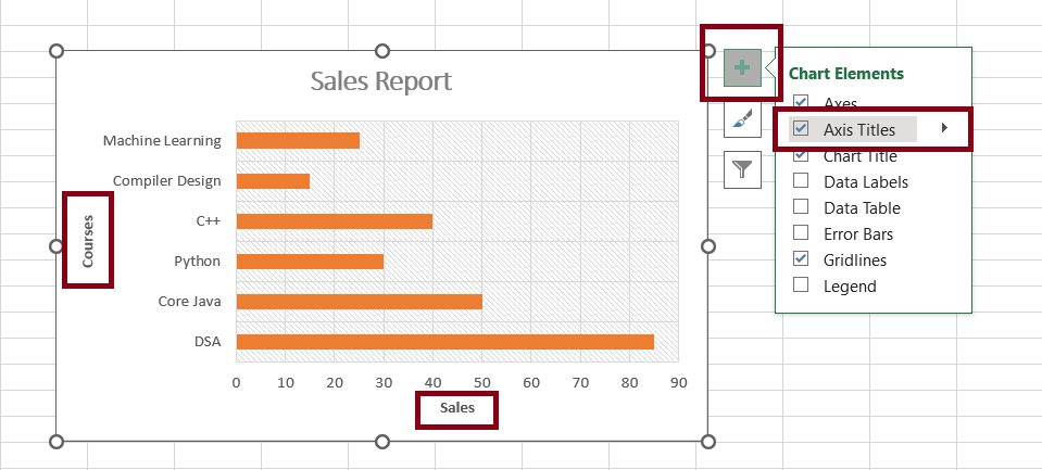
add axis
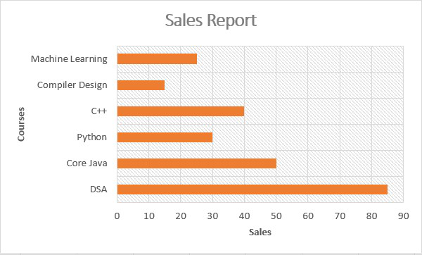
Output
Different Chart Styles
Below are some different Chart Styles available in Excel 2016.
With Gridlines
This style elevates the gridlines’ prominence, complemented by vibrant and contrasting colors. The bars, now double in size, demand attention, making this style suitable for emphasizing data variations.
Vertical Data Labels
A shift to a more minimalist approach, this style reduces gridline width and opts for vertical data labels. While these styles are numbered, their simplicity resonates with those seeking a clean yet informative display.
Shaded Columns
Embracing subtle sophistication, this style transforms ordinary columns into shaded entities adorned with delicate lines. This approach, suitable for displaying minimal data, adds an elegant touch to your chart.
Subdued Gray Background
A serene backdrop set the stage for this style, as bars unite seamlessly, forming an interconnected tapestry. This understand elegance is perfect for conveying within data points.
Gentle Hue for Columns
Leveraging soft colors, this delicately adorns columns, rendering them as independent entities. The refined presentation ensures a balanced aesthetic while promoting distinct data interpretation.
Illuminated Gridlines
In this iteration, luminous gridlines are juxtaposed with highlighted data bars. Here, the option to concela gridlines creates a clean and uncluttered chart background.
FAQs on Change Chart Style in Excel
What is a Chart style in Excel?
A Chart style in Excel refers to a predefined set of formatting choices that dictate the colors, patterns, fonts, and overall appearance of your charts. Changing chart-styles allows you to quickly alter the visual representation of your data to suit different presentation needs.
How to Change the chart style in Excel?
Follow the below steps to change chart style in Excel:
Step 1: Select the Chart that you want to modify.
Step 2: Now Click on the “Chart Design” tab that appears after selecting the Chart.
Step 3: In the “Chart Style” group, there are various pre-designed styles represented by thumbnails.
Step 4: Select the Chart style you want to apply. The Chart will instantly update to reflect the new style.
Can we customized chart styles other than pre-defined options?
Excel have a huge range of pre-defiend chart styles, you can customize these styles to match your prefences. You cna also adjust colors, fonts, and other elements to create a unique look for your chart.
Is Changing the Chart style reversible?
Yes, Changing the chart style is reversible. You can always switch back to the previous style or try out different styles until you finds the one that best suits your presentation goal.
Share your thoughts in the comments
Please Login to comment...