How to Add Effects to Tooltips ?
Last Updated :
19 Mar, 2024
Tooltips are small informational pop-ups that appear when users hover over or interact with certain elements, providing additional context or explanations.
Below are the approaches to add Effects to tooltips using CSS:
CSS Transition Effects
- In the CSS, the transition effect allows you to change the property values smoothly over a specified duration, creating a smooth transition effect of the HTML Element. This is useful when you want to makes the UI interactive, such as hover effects, menu animations, or toggling HTML elements.
- It can be used to
- Change the color or size of a button on hover
- Create a slide-in or fade-in effect for elements appearing on the page
Example: Implementation of Tooltip with Transition Effect
HTML
<!DOCTYPE html>
<html lang="en">
<head>
<meta charset="UTF-8">
<meta name="viewport"
content="width=device-width, initial-scale=1.0">
<title>ToolTip CSS Transition Effects</title>
<link rel="stylesheet" href="style.css">
</head>
<body>
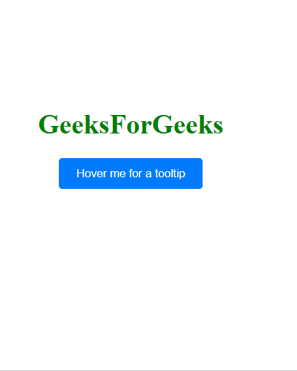
<div class="container">
<h1>GeeksForGeeks</h1>
<button class="tooltip-trigger">
Hover me for a tooltip
</button>
<span class="tooltip-content">
CSS Transition: Tooltip
</span>
</div>
</body>
</html>
body {
    display: flex;
    justify-content: center;
    align-items: center;
    height: 100vh;
    margin: 0;
}
h1{
    color: green;
    text-align: center;
    margin-top: 0;
}
.container {
    position: relative;
    text-align: center;
}

.tooltip-trigger {
    cursor: pointer;
    padding: 10px 20px;
    background-color: #007bff;
    color: #fff;
    border: none;
    border-radius: 4px;
    transition: background-color 0.3s ease;
}

.tooltip-trigger:hover {
    background-color: #0056b3;
}

.tooltip-content {
    visibility: hidden;
    opacity: 0;
    position: absolute;
    top: calc(100% + 10px);
    left: 50%;
    transform: translateX(-50%);
    background-color: #bd2323;
    color: #fff;
    padding: 8px;
    border-radius: 4px;
    white-space: nowrap;
    transition: opacity 0.3s ease, visibility 0s linear 0.3s;
}

.container:hover .tooltip-content {
    visibility: visible;
    opacity: 1;
    transition-delay: 0s;
}
Output:

transition effect
CSS Animation Effects
- In the CSS, the animations allow you to create complex, multi-step animations by defining a sequence of styles and applying them over time. Animations are defined using keyframes, which specify the styles at specific points in the animation sequence.
- It can be used to
- Create a loading animation for a website
- Animate a progress bar or counter
- Create a slideshow or carousel effect for a group of images
Example: Implementation of Tooltip with Animation Effect
HTML
<!DOCTYPE html>
<html lang="en">
<head>
    <meta charset="UTF-8">
    <meta name="viewport"
          content="width=device-width, initial-scale=1.0">
    <title>ToolTip CSS Transition Effects</title>
    <link rel="stylesheet" href="style.css">
</head>
<body>

    <div class="container">
        <h1>GeeksForGeeks</h1>
        <button class="tooltip-trigger">
              Hover me for a tooltip
          </button>
        <span class="tooltip-content">
              CSS Animation: Tooltip
          </span>
    </div>

</body>
</html>
h1 {
    color: green;
    text-align: center;
    margin-top: 0;
  }

  body {
    display: flex;
    justify-content: center;
    align-items: center;
    height: 100vh;
    margin: 0;
  }

  .container {
    position: relative;
    text-align: center;
  }

  .tooltip-trigger {
    cursor: pointer;
    padding: 10px 20px;
    background-color: #007bff;
    color: #fff;
    border: none;
    border-radius: 4px;
    transition: background-color 0.3s ease;
  }

  .tooltip-trigger:hover {
    background-color: #0056b3;
  }

  .tooltip-content {
    visibility: hidden;
    opacity: 0;
    position: absolute;
    top: calc(100% + 10px);
    left: 50%;
    transform: translateX(-50%);
    background-color: #bd2323;
    color: #fff;
    padding: 8px;
    border-radius: 4px;
    white-space: nowrap;
  }

  .container:hover .tooltip-content {
    visibility: visible;
    animation: fadeIn 5s ease, pop-up 0.2s ease-in-out forwards;
  }

  @keyframes fadeIn {
    0% {
      opacity: 0;
    }
    100% {
      opacity: 1;
    }
  }

  @keyframes pop-up {
    0% {
      transform: translateY(10px);
    }
    100% {
      transform: translateY(0);
    }
  }
Output:

animation
- In the CSS, the transform effects allow you to manipulate elements in 2D or 3D space. You can rotate, scale, skew, or translate elements using the transform property. Transforms are often used in combination with transitions or animations to create engaging visual effects.
- It can be used to
- Rotate an element to create a 3D effect.
- Make an element large or small to create a zoom effect.
- Translate an element to move it around the page.
Example: Implementation of Tooltip with Transformation Effect
HTML
<!DOCTYPE html>
<html lang="en">
<head>
    <meta charset="UTF-8">
    <meta name="viewport"
          content="width=device-width, initial-scale=1.0">
    <title>ToolTip CSS Transition Effects</title>
    <link rel="stylesheet" href="style.css">
</head>
<body>

    <div class="container">
        <h1>GeeksForGeeks</h1>
        <button class="tooltip-trigger">
              Hover me for a tooltip
          </button>
        <span class="tooltip-content">
              CSS Transform: Tooltip
          </span>
    </div>

</body>
</html>
h1 {
    color: green;
    text-align: center;
    margin-top: 0;
  }

  body {
    display: flex;
    justify-content: center;
    align-items: center;
    height: 100vh;
    margin: 0;
  }

  .container {
    position: relative;
    text-align: center;
  }

  .tooltip-trigger {
    cursor: pointer;
    padding: 10px 20px;
    background-color: #007bff;
    color: #fff;
    border: none;
    border-radius: 4px;
  }

  .tooltip-trigger:hover {
    background-color: #0056b3;
  }

  .tooltip-content {
    visibility: hidden;
    opacity: 0;
    position: absolute;
    top: calc(100% + 10px);
    left: 50%;
    transform: translate(-50%, 10px) scale(0.8);
    transition: transform 0.3s ease, opacity 0.3s ease;
    background-color: #bd2323;
    color: #fff;
    padding: 8px;
    border-radius: 4px;
    white-space: nowrap;
  }

  .container:hover .tooltip-content {
    visibility: visible;
    opacity: 1;
    transform: translate(-50%, 0);
  }
Output:
transform
Share your thoughts in the comments
Please Login to comment...