How To Add Blur Effects to Images in CSS ?
Last Updated :
14 Mar, 2024
Adding blur effects to the images in web applications enhances the visual appearance of the content. We can add blur effects using various CSS properties.
Below are the approaches to add blur effects to images in CSS:
Using CSS filter property
Apply a blur effect to the image using the CSS filter property with the blur function. The blur(3px) value specifies a 3-pixel blur radius, creating a visually blurred appearance for the image.
Syntax:
img {
   filter: brightness(20%) blur(20px);
}
Example: The below example uses the CSS filter property to add blur Effects to Images.
HTML
<!DOCTYPE html>
<html lang="en">
<head>
<meta charset="UTF-8">
<meta name="viewport"
content="width=device-width, initial-scale=1.0">
<title>Document</title>
<style>
h1 {
color: green;
text-align: center;
}
h3 {
text-align: center;
}
.image-container {
text-align: center;
}
.blurred-image {
filter: blur(3px);
width: 400px;
height: auto;
}
</style>
</head>
<body>
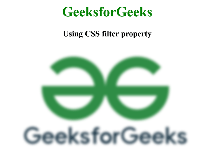
<h1>GeeksforGeeks</h1>
<h3>Using CSS filter property</h3>
<div class="image-container">
<img class="blurred-image" src=
"https://media.geeksforgeeks.org/wp-content/uploads/20240305215328/gfglogo.png"
alt="GeeksforGeeks Logo">
</div>
</body>
</html>
Output:
Using backdrop-filter Property
The “backdrop-filter” property applies a blur effect to the background of an element. The backdrop-filter: blur(3px); value specifies a 3-pixel blur radius, creating a visually blurred overlay for the images within the image containers. The containers have a relative position, and a pseudo-element with backdrop-filter is added to add the blur effect.
Syntax:
backdrop-filter: none|filter|initial|inherit;
Example: The below example uses the CSS backdrop-filter Property to add blur Effects to Images.
HTML
<!DOCTYPE html>
<html lang="en">

<head>
    <meta charset="UTF-8">
    <meta name="viewport"
          content="width=device-width, initial-scale=1.0">
    <title>Using Backdrop-filter Property</title>
    <style>
        h1 {
            color: green;
            text-align: center;
        }

        h3 {
            text-align: center;
        }

        .image-row {
            display: flex;
            justify-content: space-around;
            margin-top: 20px;
        }

        .image-container {
            text-align: center;
            position: relative;
            width: 300px;
            height: 250px;
            margin-right: 10px;
        }

        .blur-image {
            width: 100%;
            height: 100%;
        }

        .blur-overlay {
            content: "";
            position: absolute;
            top: 0;
            left: 0;
            right: 0;
            bottom: 0;
            background: inherit;
            backdrop-filter: blur(3px);
        }
    </style>
</head>

<body>
    <h1>GeeksforGeeks</h1>
    <h3>Using Backdrop-filter Property</h3>
    <div class="image-row">
        <div class="image-container">
            <img src=
"https://media.geeksforgeeks.org/wp-content/uploads/20240305215328/gfglogo.png"
                 alt="GeeksforGeeks Logo" class="blur-image">
            <div class="blur-overlay"></div>
        </div>
        <div class="image-container">
            <img src=
"https://media.geeksforgeeks.org/wp-content/cdn-uploads/20190710102234/download3.png"
                 alt="Another Image" class="blur-image">
            <div class="blur-overlay"></div>
        </div>
    </div>
</body>
Output:
-min.png)
Share your thoughts in the comments
Please Login to comment...