Grid layouts are the building blocks of final amazing-looking designs. Creating symmetric and unified designs using grids is very important. Effective use of grids helps designers in creating designs that are simple for end users to scan and use. Grids ensure consistency across different platforms by adjusting to different screen sizes and orientations. In this article, we’ll dive deep into the concept of grids and understand how to use this tool to create consistent and unified designs. In this article, we’ll cover Grid System In UI Design.
![Grid System In UI Design [Beginner's Guide]](https://media.geeksforgeeks.org/wp-content/uploads/20230209170229/Grid-System-In-UI-Design.gif)
Grid System In UI Design [Beginner’s Guide]
Depending upon screen sizes, we have some guidelines to use grids. These guidelines are globally accepted, and help in better articulation of designs concerning specific screen sizes.
The topic we’ll be looking at to understand grids better:
- What is a grid?
- Basic terminologies used in grids
- Types of grids with examples
- How to use grids
- Benefits of using grids
What is a Grid?
So to start with, let’s understand What is a Grid?
Grid is a collection of rows and columns along with margins, and spacing between each row and column. A designer can always tweak the number of rows or columns required and also the margin and spacing between each of these rows and columns.
The optimal use of grids serves as a guiding layout for overall designs. It helps to create consistent templates and standards. Using baselines (columns and rows) and padding( gutters and margins) it becomes easy to configure multiple screens at once. Grid ensures a balanced hierarchy of screen elements. Grid systems have different types of grids(which we’ll have a look at later in this article).
Let’s look into some basic terminologies used in grid systems:
- Columns: The vertical containers that hold some element like images, or text. Occupies most of the area in a grid. Depending on the screen the number of columns varies.
For example, Mobile screens have 4 columns in a grid and laptop/desktop screens have 12 columns in a grid. Below is an example of how columns look.
- Rows: The Horizontal containers that hold some element like images, or text. It is similar to a column but is not mostly used unless required.
- Gutters: The spaces between 2 columns or rows also called “Alleys”. Gutters have set values but depending upon the screen they also vary. Large screens such as laptops or desktops have wider gutters whereas small screens such as mobile phones have thinner gutters. A combination of columns and gutters takes up the horizontal width of the screen.
- Margins: The spacing on the left and right of the screen where no screen element is present. Margins help in making the screen feel dense but not cluttered. The size of the margins may or may not be the same as the gutter, generally is it more than gutters. It marks the boundary for screen elements. Helps in fixing the layout.

Terminologies used in Grid System
These were some basic terminologies a designer should know before using a grid system. One thing to keep in mind is that “Elements don’t need to end at the same marking but all elements should start at the same marking” when using a grid system.
Types of Grid Systems
As the grid is flexible to create a similar layout for different size devices. It is also available in different ways to use multiple kinds of Grid systems. Now let’s look at the different types of grids system in UI Design that we have and how to use them:
1. Symmetrical Grids: This types of grid system in UI Design are evenly spread, which means all the elements are aligned with the center. Such grid systems consist of an equal number of rows and columns. These look very pleasing to the eye and elements are evenly spread on the screen. Give a formal and clean look to the designs.
- Column Grid: The most commonly used grid type, where a frame is split into multiple columns separated with gutters. It is pleasing to the eye and creates a balanced visual hierarchy. Screen elements like text, images, and buttons are aligned using these columns. Column grids are mostly used in magazines and newspapers. Margins are fixed and independently sized.

Column Grid
- Pixel grid: It is a type of symmetrical grid, where the layout is fixed having columns and rows that make it appear like a grid cage. It feels like one has super zoomed into Figma or just like our math elementary notebook. This grid type helps in creating pixel-perfect designs, each box denotes a pixel itself. Designers occasionally close in to make pixel-by-pixel adjustments to the millions of pixels that make up digital screens.
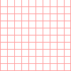
Pixel Grid
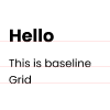
- Baseline grid: It is also a type of symmetrical grid, where the layout is fixed having only horizontal lines as a guide, a ruled notebook is a straightforward illustration of a baseline grid. To make sure that the lines of text in each column align consistently across a spread, baseline grids are frequently used in conjunction with column grids.
- Modular grid: It is another type of symmetrical grid that appears to be very pleasing to the eye. Modular grid got the name because of the “Modules” which are created by the intersection of columns and rows that are very well organized and placed using gutters. Margins are consistent which gives a boxy look, this type is generally used by business magazines.

- Manuscript grid: It is a type of symmetrical grid, also known as a “Single columned” or “one-columned” grid as well. As the name suggests, the manuscript grid has only one column that guides the layout. This grid type is often used for books, especially folk or traditional books. Due to its appearance, it makes reading easier by using short lines with fixed margins from all sides.

2. Asymmetrical Grid: This type of Grid System in UI Design are opposite to symmetric grids as there is no restriction of the grid being aligned to the center. It is also called the broken glass grid, as pieces are unevenly placed which gives a funky, modern, and abstract look to the designs.
- Hierarchical grid: It is a type of asymmetrical grid, where the layout is not fixed. A hierarchical grid is entirely freeform, made up of two or more grids that are overlaid, or contain other grid components within themselves. To avoid having a boxy vibe, many contemporary website interfaces use hierarchical grid layouts. As it is asymmetrical it is more modern and abstract, setting a playful mood on websites when used.

These are some popular types of grids that are used based on different requirements and needs. It is good to know about each of these so that as a designer one can utilize and leverage the best guiding layout grid system.
To know the optimal usage of a grid system, knowing how to use the grid is very important. As a beginner using a grid can be very overwhelming and confusing but not to worry, We’re here to rescue you. Now let’s look into how to use the grid to create an organized and consistent layout.
How To Use Grids?
1. Know your requirements: This is generally seen when beginners directly jump onto using grids without knowing the requirement, the device, and which type of grid to use. Later in design and further development, this can be very confusing to resolve.
There are a few frameworks that are already defined to use grid systems optimally. Such as 12 cols, 6 cols, 4 cols, and 3 colors even 2 and 1 col grids, here 12,6,4,3,2, and 1 are the number of grids in which the screen is divided. But not only this can be used, but there might also be a screen that requires an 8-col grid and it is completely okay to use a customized grid that suits the need. Not only grids but keep in mind the screens as well, using the same grids for multiple devices might not be a good option.
2. Take care of text alignment: Make sure that all the text irrespective of the font weight and size, everything should be placed on a fixed baseline. This is a part of the layout as well and maintaining a grid layout along with text hierarchy would make the content and website/app appear more pleasing to the eyes.
3. Emphasize breaking the grid: It is a rule that says while using a grid it is mandatory to place all elements inside the grid boundary but nowadays it is more popular to break the grid to emphasize certain elements. When something is out of alignment or disturbing the layout it gets noticed easily, a similar trend is getting by breaking grid boundaries.
4. Maintain gutter balance: Equally, pay attention to both vertical and horizontal grid alignments. For example, if you are using a gutter of 20px between 2 vertical columns keep the same gutter between horizontal rows as well. Doing this would make the content on the screen very well organized even if not symmetric.
5. Use 8pt grid: Using baseline numbers and their multiple promotes layout to fit as per screen sizes. Such as the 8pt grid, which is the most popular. An 8pt grid is currently widely used because it allows designs to grow well on retina screens like iPhones and TV screens and works with both vector and pixel-based graphics.
6. Know where to start: Always remember to place the content on the screen using the grid as a guideline, start with a grid, not with the gutter. Keep content aligned with the start and end of a column’s edge, module, or pixel. This might not sound critical from a design perspective but it is very helpful to guide a developer on how and where to place media content like images and video. As developers also do follow the grid system which codes your designs.
7. Use grid generators: There are good options available online for generating a grid based on the screen sizes. This can be very useful for the times when you are just starting with visual designs. Using them speeds up the process and ensures the layout is optimized for use.
Benefits of Using Grids
Keeping these points in mind would help create a better and optimal grid system for your designs. There are a few which I mentioned but there are multiple do’s and don’t for using the grid system effectively. To conclude the articles, let’s look into what are some key benefits of using a grid system.
- Ensures consistency: Grid layouts provide a defined structure to designs that optimize information accessibility and responsiveness, serving both an aesthetic and practical purpose for UX/UI designers. Fixed margins and layout speed up the element layering on the screen, and one doesn’t have to check alignments again and again.
- Better scanning: As the information on the screen is well organized, scanning becomes easier. A good layout guides eye movement that avoids the user’s struggle of getting lost in the content.
- Responsiveness: Optimal use of a grid system for multiple devices, promotes responsiveness. For example to replicate a design from big to small or small to the big screen, one just has to adjust grids and place content accordingly.
- Easy to modify and reuse: Good guiding layout ensures easy modification and reusability. Digital products keep on changing such as new updates or UI modifications keep on coming every 6 months. So for quick modification, the grid works as a skeleton.
Conclusion
Grid System in UI Design actually works as best friends to budding designers as they guide the design through a defined set of lines and boxes. It creates a framework for building a flexible layout for multiple devices. Once you get familiar with layouts you might not use them always but using a grid in the initial days sets a good foundation. So here it is for this article, We hope this would be useful for you to understand how important these grid systems are for a beginner.
Related Articles:
FAQs on Grid Systems in UI Design
What is Grid System in UI Design?
Grid System is a series of horizontal and vertical line that creates a framework to build a User Interface for multiple devices. Designers create Grids for better layouts which allow users to use the interface in a better way by adapting to multiple screen sizes.
What are the types of Grid in UI Design?
There are many types of grids in the process of UI Design, some of them are
1. Symmetrical Grids
2. Asymmetrical Grid
3. Column Grid
4. Pixel Grid
5. Manuscript grid
What is the use of a Grid System in UI Design
A Grid System in UI is used to make a proper structure of the layout of the product and align the elements on a screen. Grid System creates a framework that is used to maintain efficiency, alignment and provide great user experience.
Share your thoughts in the comments
Please Login to comment...