Flutter – OctoImage Widget
Last Updated :
22 Dec, 2022
The OctoImage widget in Flutter requires an ImageProvider to display images in an application. The images in the OctoImage widget can be supplied with a Progress indicator or a Place holder for loading the Image in it. An OctoImage widget makes use of the Octosets which are nothing but the combination of predefined placeholders, imagebuilder, and error widgets. There are two ways to use the OctoImage widget as shown below:
1. Using OctoImage:
OctoImage(
  image: NetworkImage(
      'IMAGE URL'),
  placeholderBuilder: OctoPlaceholder.blurHash(
    'PLACEHOLDER',
  ),
  errorBuilder: OctoError.icon(color: Colors.red),
  fit: BoxFit.cover,
);
2. Using Octosets:
OctoImage.fromSet(
  fit: BoxFit.cover,
  image: NetworkImage(
    'IMAGE URL',
  ),
  octoSet: OctoSet.circleAvatar(
    backgroundColor: Colors.red,
    text: Text("M"),
  ),
);
In this article, we will explore the OctoImage widget in detail using a simple application. To build the application follow the below steps:
- Add the dependency into the pubspec.yaml file.
- Import the dependency to the main.dart file.
- Use a StatelessWidget to give structure to the application
- Use the OctoImage widget to design the body of the Application with Images
- Add a Progress Indicator to use while loading the image
- Add an error widget to handle errors
Now, let’s explore these steps in detail.
Adding the Dependency:
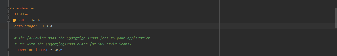
Add the octo_image dependency to the pubspecy.yaml file as shown below:
Importing the Dependency:
The octo_image dependency can be imported into the main.dart file as shown below:
import 'package:octo_image/octo_image.dart';
Structuring the Application:
Use a StatelessWidget to extend the structure of the application to add an appbar and a body as shown below:
Dart
class OctoImagePage extends StatelessWidget {
@override
Widget build(BuildContext context) {
return Scaffold(
appBar: AppBar(
title: Text('GeeksForGeeks'),
backgroundColor: Colors.green,
),
body: ListView(
children: [
_customImage(),
SizedBox(height: 16),
_simpleBlur(),
SizedBox(height: 16),
_circleAvatar(),
],
),
);
}
|
Using the OctoImage Widget:
A simple way to use the OctoImage widget as discussed above is as follows:
Dart
OctoImage(
image: NetworkImage(
'IMAGE URL'),
placeholderBuilder: OctoPlaceholder.blurHash(
'PLACEHOLDER',
),
errorBuilder: OctoError.icon(color: Colors.red),
fit: BoxFit.cover,
);
|
We will be adding three different Network Images to depict the use of three different Progress indicator provided by the OctoImage widget:
- blurHash: It blurs the image while it’s loading and can be used as shown below:
Dart
Widget _simpleBlur() {
return AspectRatio(
aspectRatio: 269 / 173,
child: OctoImage(
image: NetworkImage(
'IMAGE URL'),
placeholderBuilder: OctoPlaceholder.blurHash(
'PLACE HOLDER',
),
errorBuilder: OctoError.icon(color: Colors.red),
fit: BoxFit.cover,
),
);
}
|
- circularProgressIndicator: As the name suggests it shown a circular indicator while loading an image and can be used as follows:
Dart
Widget _customImage() {
return SizedBox(
height: 200,
child: OctoImage(
image: NetworkImage('IMAGE URL'),
progressIndicatorBuilder: (context, progress) {
double value;
if (progress != null && progress.expectedTotalBytes != null) {
value =
progress.cumulativeBytesLoaded / progress.expectedTotalBytes;
}
return CircularProgressIndicator(value: value);
},
errorBuilder: (context, error, stacktrace) => Icon(Icons.error),
),
);
}
|
- circleAvatar: This indicator creates a circular avatar to which a custom text can be added while it’s loading and can be used as follows:
Dart
Widget _circleAvatar() {
return SizedBox(
height: 200,
child: OctoImage.fromSet(
fit: BoxFit.cover,
image: NetworkImage(
'IMAGE URL',
),
octoSet: OctoSet.circleAvatar(
backgroundColor: Colors.red,
text: Text("CUSTOM TEXT WHILE LOADING IMAGE"),
),
),
);
}
}
|
Handling Errors:
A simple way to handle error in the OctoImage Widget is to make use of the error widget as shown below:
Dart
OctoImage(
image: image,
errorBuilder: (context, error, stacktrace) =>
const Icon(Icons.error),
);
|
Or the following way can also be used without the need for a OctoError as shown below:
Dart
OctoImage(
image: image,
errorBuilder: OctoError.icon(),
),
|
Example:
Dart
import 'package:flutter/material.dart';
import 'package:octo_image/octo_image.dart';
void main() {
runApp(MyApp());
}
class MyApp extends StatelessWidget {
@override
Widget build(BuildContext context) {
return MaterialApp(
title: 'OctoImage',
theme: ThemeData(),
home: OctoImagePage(),
);
}
}
class OctoImagePage extends StatelessWidget {
@override
Widget build(BuildContext context) {
return Scaffold(
appBar: AppBar(
title: Text('GeeksForGeeks'),
backgroundColor: Colors.green,
),
body: ListView(
children: [
_customImage(),
SizedBox(height: 16),
_simpleBlur(),
SizedBox(height: 16),
_circleAvatar(),
],
),
);
}
Widget _customImage() {
return SizedBox(
height: 200,
child: OctoImage(
progressIndicatorBuilder: (context, progress) {
double value;
if (progress != null && progress.expectedTotalBytes != null) {
value =
progress.cumulativeBytesLoaded / progress.expectedTotalBytes;
}
return CircularProgressIndicator(value: value);
},
errorBuilder: (context, error, stacktrace) => Icon(Icons.error),
),
);
}
Widget _simpleBlur() {
return AspectRatio(
aspectRatio: 269 / 173,
child: OctoImage(
image: NetworkImage(
placeholderBuilder: OctoPlaceholder.blurHash(
'LEHV6nWB2yk8pyo0adR*.7kCMdnj',
),
errorBuilder: OctoError.icon(color: Colors.red),
fit: BoxFit.cover,
),
);
}
Widget _circleAvatar() {
return SizedBox(
height: 200,
child: OctoImage.fromSet(
fit: BoxFit.cover,
image: NetworkImage(
),
octoSet: OctoSet.circleAvatar(
backgroundColor: Colors.red,
text: Text("Gal"),
),
),
);
}
}
|
Output:
Share your thoughts in the comments
Please Login to comment...