Explain the components of Bootstrap
Last Updated :
07 May, 2024
Bootstrap components are pre-styled UI elements like buttons, forms, navbars, and more, built with HTML, CSS, and JavaScript. They provide a consistent and responsive design framework, facilitating rapid development of web applications with minimal customization required.

Bootstrap components
List of components:
| Component | Description |
|---|
| Jumbotron | It simply puts extra attention to particular content or information by making it larger and more eye-catching. |
| Alerts | It is a popup with a predefined message that appears after a particular action. |
| Buttons | Customized buttons used to perform an action in forms, dialogue boxes, etc. They come in multiple states, sizes, and predefined styles. |
| Button group | A group of buttons aligned in a single line, arranged vertically or horizontally. |
| Badge | A labeling component used to add additional information. |
| Progress Bar | Used to show the progress of a particular operation with a custom progress bar. It may have text labels, stacked bars, and animated backgrounds. |
| Spinner | Displays the loading state of websites or projects. Built with HTML and CSS, doesn’t require JavaScript. |
| Scrollspy | Keeps updating the navigation bar to the currently active link based on the scroll position in the viewport. |
| List group | Displays an unordered series of content in a proper way. |
| Card | Provides a customizable, extensible, and flexible content container. |
| Dropdown | Drops the menu in the format of a list of links. Contextual and toggleable overlays. |
| Navs | Creates a basic and simple navigation menu with a .nav base class. |
| Navbar | The navigation bar at the top of a website or webpage. |
| Forms | Used to take multiple inputs at once from the user. Bootstrap has two layouts available: stacked and inline. |
| Input groups | Extend form controls by adding a button, button group, or text on either side of inputs. |
| Breadcrumb | Provides the location of the current page in a navigational hierarchy and adds separators through CSS. |
| Carousel | A slideshow of image or text content built with CSS 3D and JavaScript. |
| Toast | Displays a message for a small amount of time, usually a few seconds. Alert messages designed to imitate push notifications popular in desktop and mobile systems. |
| Tooltip | Provides small information about the element/link when the mouse hovers over it. |
| Popovers | Displays extra information about the element/link when clicked on it. |
| Collapse | A JavaScript plugin used to show or hide content. |
| Modal | A small popup window positioned over the actual window. |
| Pagination | Used to easily navigate between different pages, typically presented as a large block of connected links for accessibility. |
| Media Object | Used for repetitive and complex components like tweets or blogs. Images or videos are placed/aligned to the left or right of the content. |
Examples of Bootstrap components
Example 1: In this example, we includes Bootstrap components: a navigation bar (nav), an alert, and a modal triggered by a button. It utilizes Bootstrap’s CSS and JavaScript libraries for styling and functionality.
HTML
<!DOCTYPE html>
<html>
<head>
<title>Components of BootStrap</title>
<meta charset="utf-8" />
<meta name="viewport" content="width=device-width, initial-scale=1" />
<link rel="stylesheet" href=
"https://maxcdn.bootstrapcdn.com/bootstrap/4.3.1/css/bootstrap.min.css" />
<script src=
"https://ajax.googleapis.com/ajax/libs/jquery/3.3.1/jquery.min.js">
</script>
<script src=
"https://cdnjs.cloudflare.com/ajax/libs/popper.js/1.14.7/umd/popper.min.js">
</script>
<script src=
"https://maxcdn.bootstrapcdn.com/bootstrap/4.3.1/js/bootstrap.min.js">
</script>
</head>
<!-- A nav code-->
<br />
<h3>Nav:</h3>
<ul class="nav">
<li class="nav-item">
<a class="nav-link active" href="#">Active link</a>
</li>
<li class="nav-item">
<a class="nav-link"
href="#provide link url here">
First link
</a>
</li>
<li class="nav-item">
<a class="nav-link"
href="#provide link url here">
second link
</a>
</li>
<li class="nav-item">
<a class="nav-link disabled"
href="#provide link url here"
tabindex="-1"
aria-disabled="true">Disabled</a>
</li>
</ul>
<!-- A nav code-->
<!-- A small alert code-->
<h3>Alert:</h3>
<div class="alert alert-info" role="alert">
A simple alert!
</div>
<!-- A small alert code-->
<h3>Modal:</h3>
<!-- Button trigger modal-->
<button type="button"
class="btn btn-success"
data-toggle="modal"
data-target="#exampleModal">
geeksforgeeks
</button>
<!-- Modal -->
<div class="modal fade"
id="exampleModal"
tabindex="-1"
aria-labelledby="exampleModalLabel"
aria-hidden="true">
<div class="modal-dialog">
<div class="modal-content">
<div class="modal-header">
<h5 class="modal-title" id="exampleModalLabel">
geeksforgeeks
</h5>
<button type="button"
class="close"
data-dismiss="modal"
aria-label="Close">
<span aria-hidden="true">×</span>
</button>
</div>
<div class="modal-body">
Hello, thanks for checking
out geeksforgeeks!
</div>
<div class="modal-footer">
<button type="button"
class="btn btn-secondary"
data-dismiss="modal">
Close
</button>
<button type="button" class="btn btn-primary">
Save
</button>
</div>
</div>
</div>
</div>
<!-- A button trigger modal-->
</html>
Output:

Bootstrap components Example Output
Example 2: This example we showcases a Bootstrap Jumbotron with centered text displaying information about GeeksforGeeks and a brief tutorial on Bootstrap.
HTML
<!DOCTYPE html>
<html lang="en">

<head>
    <title>Bootstrap Example</title>
    <meta charset="utf-8" />
    <meta name="viewport"
          content="width=device-width, initial-scale=1" />
    <link rel="stylesheet"
          href=
"https://maxcdn.bootstrapcdn.com/bootstrap/4.5.2/css/bootstrap.min.css" />
</head>

<body>
    <div class="container">
        <div class="jumbotron">
            <h1 class="text-center text-success">
                GeeksforGeeks
            </h1>

            <h3>Bootstrap Jumbotron Tutorial</h3>


            <p>
                Bootstrap is a free and open-source
                tool collection for creating responsive
                websites and web applications. It is
                the most popular HTML, CSS, and
                JavaScript framework for developing
                responsive, mobile-first websites.
            </p>

        </div>
    </div>
</body>

</html>
Output:

Bootstrap components Example Output
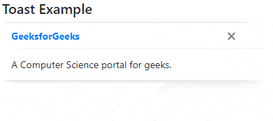
Example 3: This example illustrates the use of Bootstrap toast.
HTML
<!DOCTYPE html>
<html lang="en">
<head>
<title>Bootstrap Toast Example</title>
<meta charset="utf-8" />
<meta name="viewport"
content="width=device-width, initial-scale=1" />
<link rel="stylesheet"
href=
"https://maxcdn.bootstrapcdn.com/bootstrap/4.5.2/css/bootstrap.min.css" />
<script src=
"https://ajax.googleapis.com/ajax/libs/jquery/3.5.1/jquery.min.js">
</script>
<script src=
"https://cdnjs.cloudflare.com/ajax/libs/popper.js/1.16.0/umd/popper.min.js">
</script>
<script src=
"https://maxcdn.bootstrapcdn.com/bootstrap/4.5.2/js/bootstrap.min.js">
</script>
</head>
<body>
<div class="container">
<h5>Toast Example</h5>
<div class="toast" data-autohide="false">
<div class="toast-header">
<strong class="mr-auto text-primary">
GeeksforGeeks
</strong>
<button type="button"
class="ml-2 mb-1 close"
data-dismiss="toast">
×
</button>
</div>
<div class="toast-body">
A Computer Science portal for geeks.
</div>
</div>
</div>
<script>
$(document).ready(function () {
$(".toast").toast("show");
});
</script>
</body>
</html>
Output:
Bootstrap components Example Output
Share your thoughts in the comments
Please Login to comment...