Design Animated Google Loader using HTML and CSS
Last Updated :
07 Mar, 2024
The Google Loader consists of 4 circles with blue, red, yellow, and green colors. You can easily create them using HTML and CSS, and animate them to move the same as in the final output. The animation is just translating the circle in the Y axis with .25s time delay. For non-stop and fluid animation we make the animation infinite and alternate.
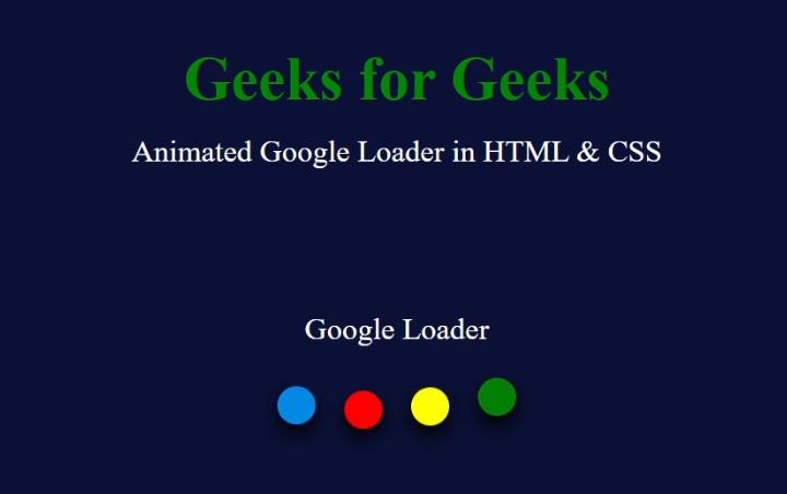
Output Preview
Approach to Design Animated Google Loader
The below steps shows the approach taken:
- Create the required circles under a container in HTML.
- Give the container and the circles styling such as color and margin.
- Add the wave animation by moving each circle up and down with delayed timing. The animation must be infinite and alternate.
Example: Create a HTML file with name index.html and CSS file with name style.css and paste the following code.
HTML
<!DOCTYPE html>
<html lang="en">
<head>
<title>Google Loader</title>
<link rel="stylesheet" href="style.css" />
</head>
<body>
<header>
<h1>Geeks for Geeks</h1>
<p>Animated Google Loader in HTML & CSS</p>
</header>
<main>
<p>Google Loader</p>
<div class="circle"></div>
<div class="circle"></div>
<div class="circle"></div>
<div class="circle"></div>
</main>
</body>
</html>
|
CSS
* {
margin: 0;
padding: 0;
box-sizing: border-box;
}
body {
display: flex;
justify-content: center;
min-height: 100vh;
background: #0b1136;
color: white;
}
header {
display: flex;
align-items: center;
flex-direction: column;
position: absolute;
top: 10%;
}
header h1 {
font-size: 4rem;
color: #008800;
}
header p {
margin-top: 20px;
font-size: 2rem;
}
main {
display: flex;
justify-content: center;
align-items: center;
column-gap: 30px;
}
main p {
font-size: 2rem;
position: absolute;
top: 40%;
}
main .circle {
height: 40px;
width: 40px;
border-radius: 50%;
background-color: #008ae6;
box-shadow: 0 10px 20px rgb(0, 0, 0);
animation: loader .8s ease-in-out infinite alternate;
}
.circle:nth-child(2) {
animation-delay: -0.25s;
}
.circle:nth-child(3) {
background: red;
animation-delay: -0.5s;
}
.circle:nth-child(4) {
background: yellow;
animation-delay: -0.75s;
}
.circle:nth-child(5) {
background: green;
animation-delay: -1s;
}
@keyframes loader {
from {
transform: translateY(-10px);
}
to {
transform: translateY(10px);
}
}
|
Output:
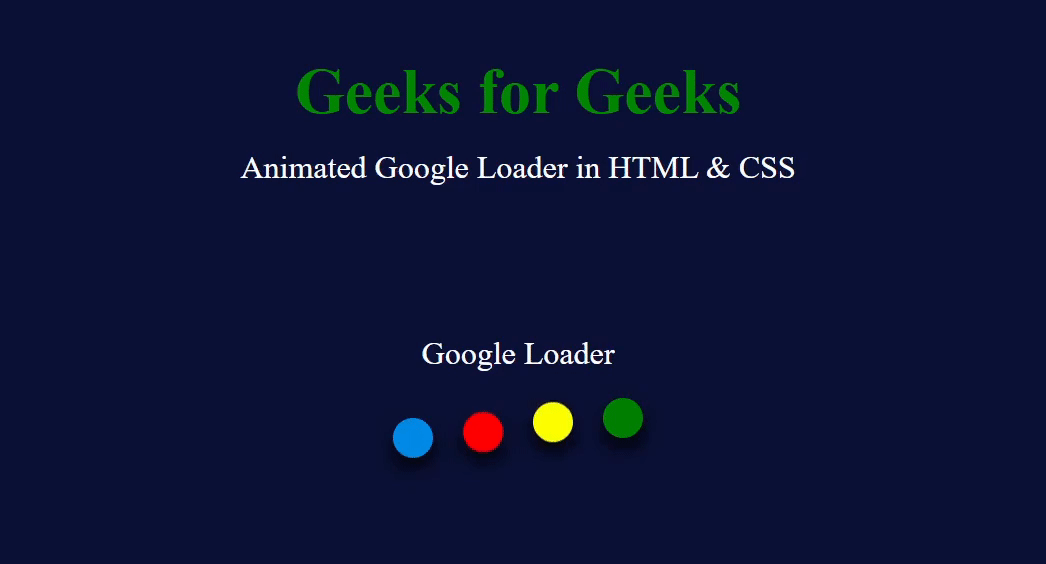
Output of Animated Google Loader
The Google Loader is very easy to create and animate in HTML and CSS. The HTML provides the structure of the loader and the CSS provides the styling and animating the loader. The animation must have the proper timing and translate value to look like a wave.
Share your thoughts in the comments
Please Login to comment...